We know how important it is for your store to look polished and consistent. This guide provides recommended image sizes and best practices tailored specifically for the Hyper theme, based on its layout system, section settings, and responsive behavior.
Hyper relies heavily on aspect ratio settings and height controls, so image preparation should align with those options.
#Recommended image sizes for different sections & blocks
On the Hyper theme, we recommend you apply the particular image sizes to different sections as follows:
We recommend uploading separate images for desktop and mobile to ensure the best composition and avoid unwanted cropping on smaller screens.
Option
Height
Behavior
Adapt to image
Auto
Height adapts to the aspect ratio of first image block
Extra small
350px
Cropped to fixed height
Small
450px
Cropped to fixed height
Medium
550px
Cropped to fixed height
Extra medium
650px
Cropped to fixed height
Large
700px
Cropped to fixed height
Extra large
750px
Cropped to fixed height
Option
Height
Auto
Auto
Inherits the desktop height setting (including ratio or fixed height)
Small
300px
Cropped to fixed height
Medium
400px
Cropped to fixed height
Large
500px
Cropped to fixed height
Extra large
600px
Cropped to fixed height
Adapt to image
Auto
Height adapts to the aspect ratio of first image block
How it works:
Adapt to image: Preserving the original proportions of your first image block. All other tabs will follow the same aspect ratio as the first image block.
Fixed height options: Selecting a predefined height (e.g., Small, Medium, Large) ensures consistent section height but may crop images depending on their original ratio.
Using separate desktop and mobile images is strongly recommended to ensure optimal composition on different screen sizes.
Option
Height
Behavior
Adapt to image
Auto
Follows the image’s original aspect ratio (no fixed height)
Extra small
350px
Cropped to fixed height
Small
450px
Cropped to fixed height
Medium
550px
Cropped to fixed height
Extra medium
650px
Cropped to fixed height
Large
700px
Cropped to fixed height
Extra large
750px
Cropped to fixed height
Option
Height
Auto
Auto
Inherits the desktop height setting (including ratio or fixed height)
Small
300px
Cropped to fixed height
Medium
400px
Cropped to fixed height
Large
500px
Cropped to fixed height
Extra large
600px
Cropped to fixed height
Adapt to image
Auto
Uses the mobile image’s own aspect ratio (independent from desktop)
How it works:
Adapt to image: The section height is determined by the image’s aspect ratio. This helps preserve proportions and reduces unexpected cropping.
Fixed height options: Selecting a predefined height (e.g., Small, Medium, Large) ensures consistent section height but may crop images depending on their original ratio.
Adapt to first image: Preserving the original proportions of your first image slide. All other slides will follow the same aspect ratio as the first image.
Small / Medium / Large: Applying fixed heights, so images may be cropped depending on their ratio.
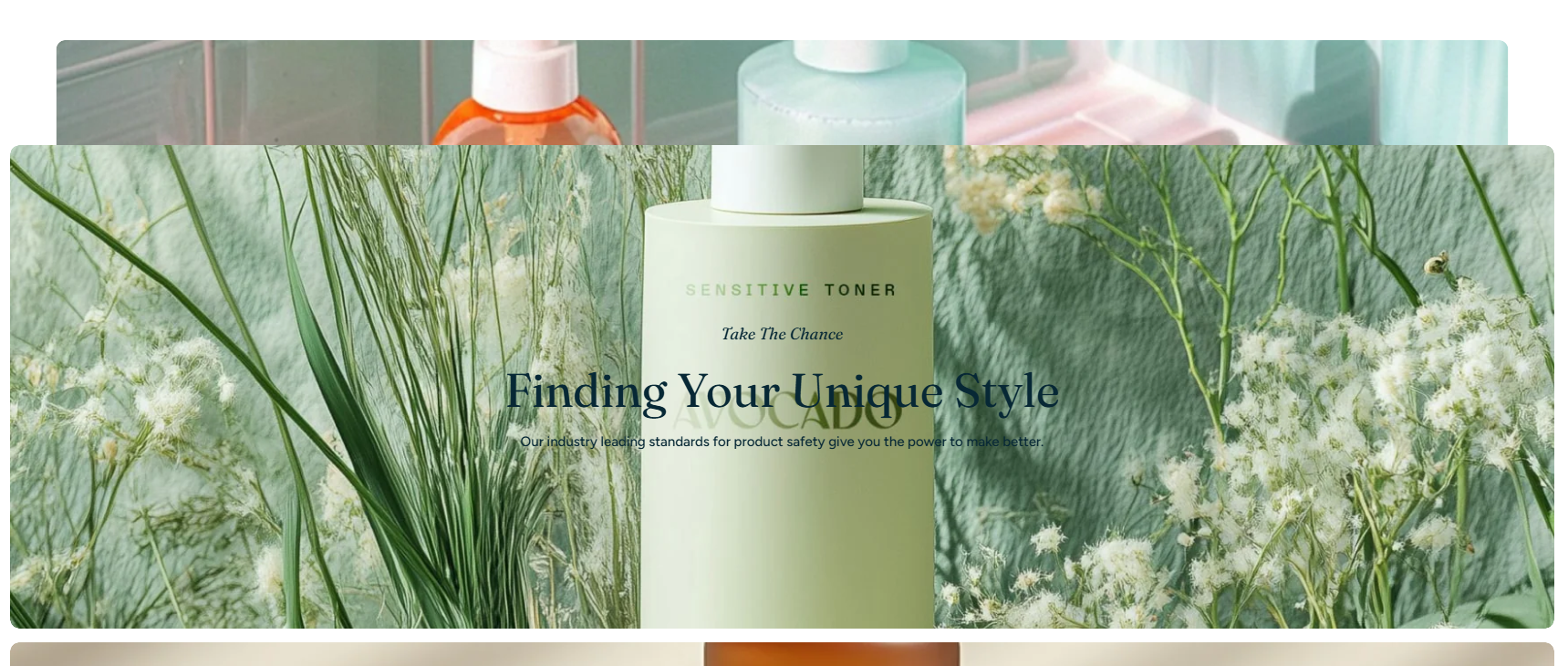
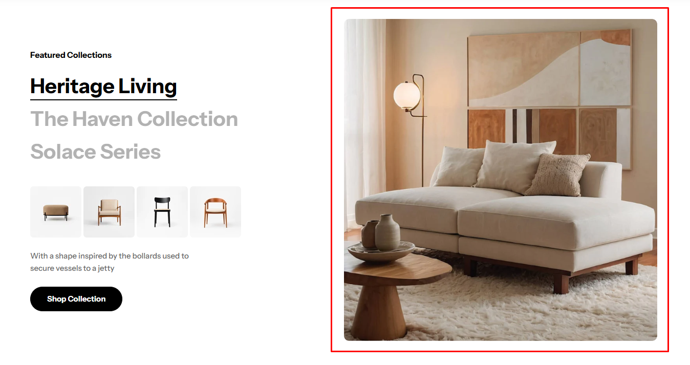
Recommended image size: 600 × 540 px or 900 x 810 px
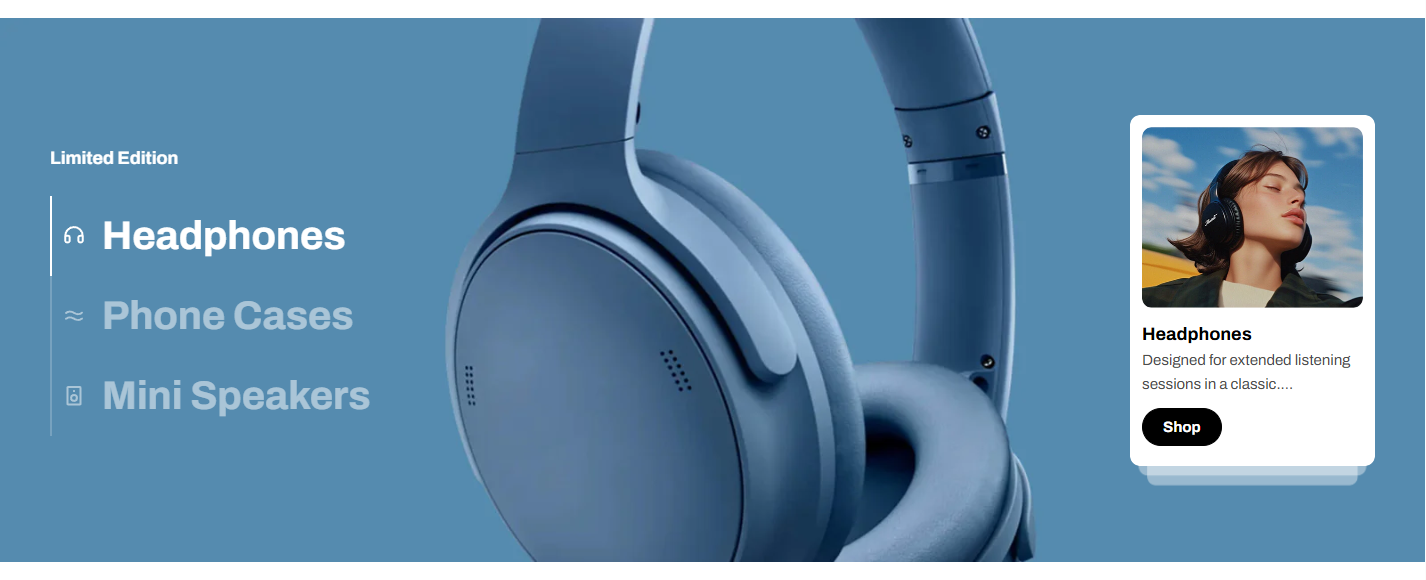
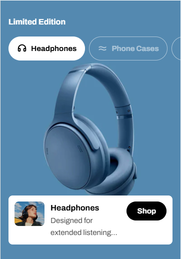
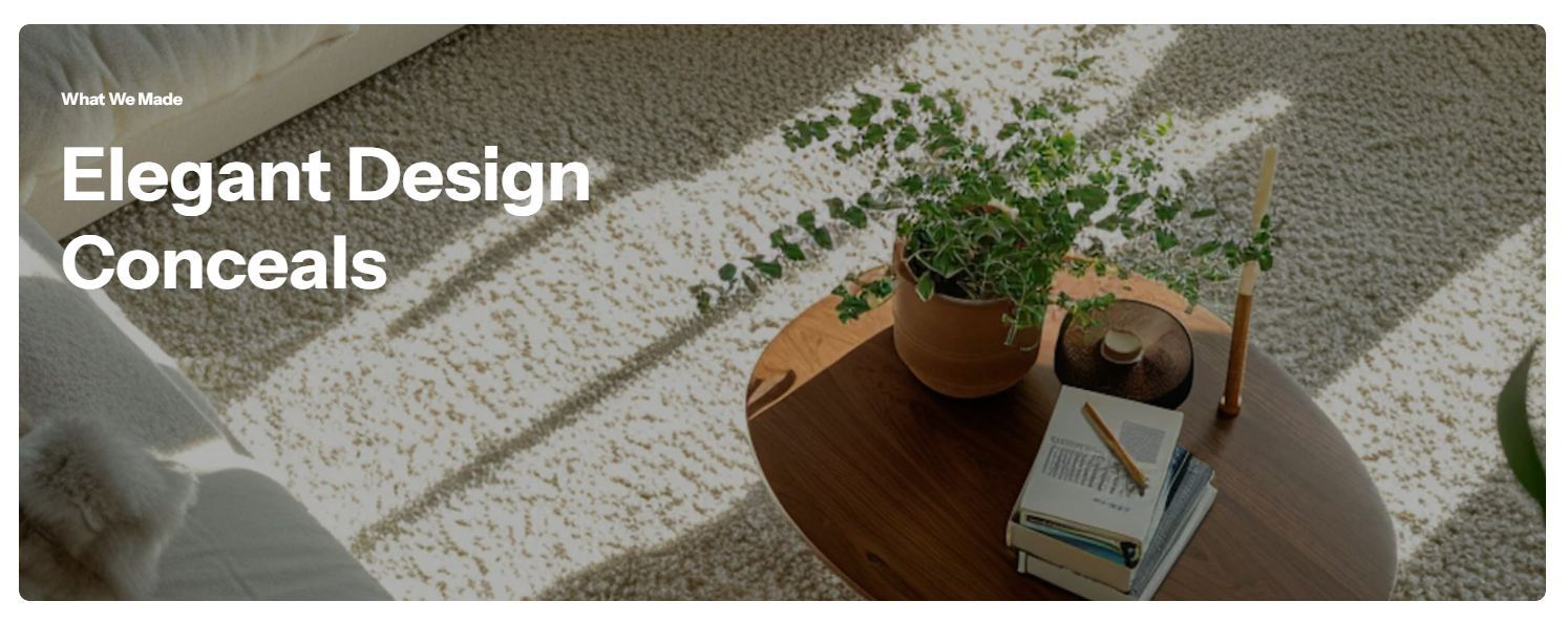
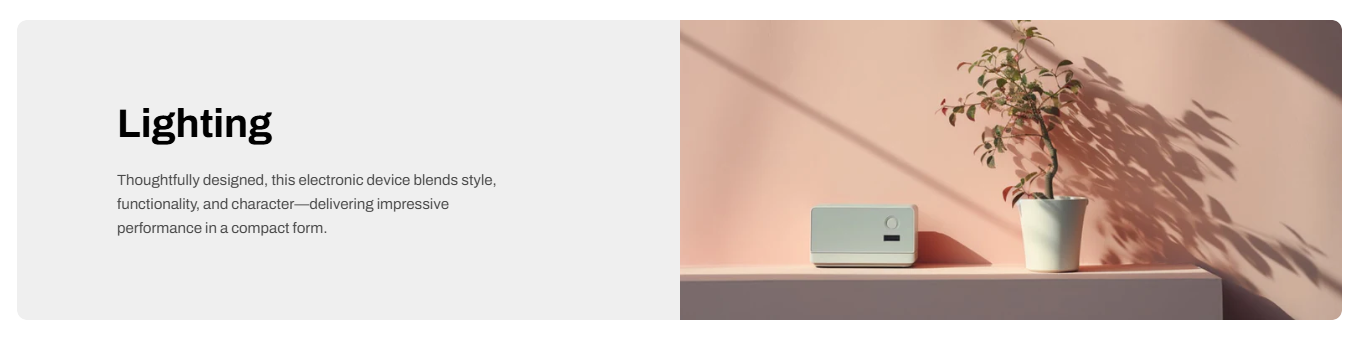
The image ratio in this section is set to adapt to the first block’s image. This means all other blocks will follow the same aspect ratio as the first image.
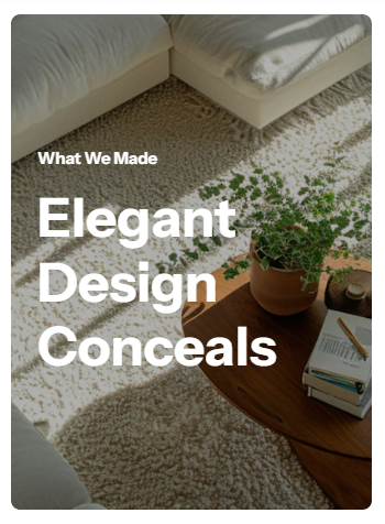
The image ratio in this section is set to adapt to the first slide item’s image. This means all other slides will follow the same aspect ratio as the first image.
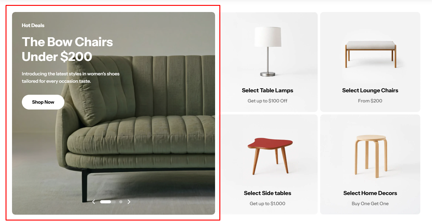
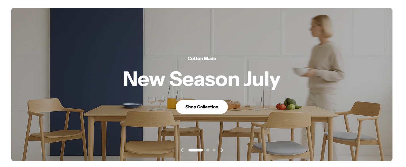
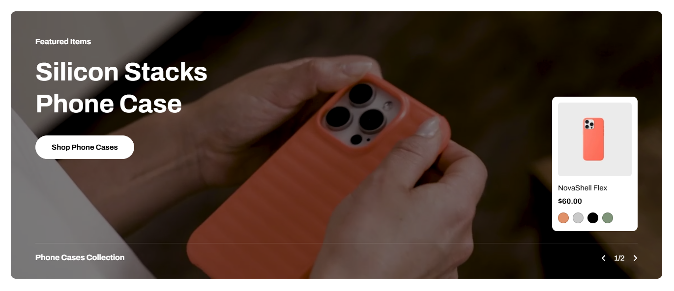
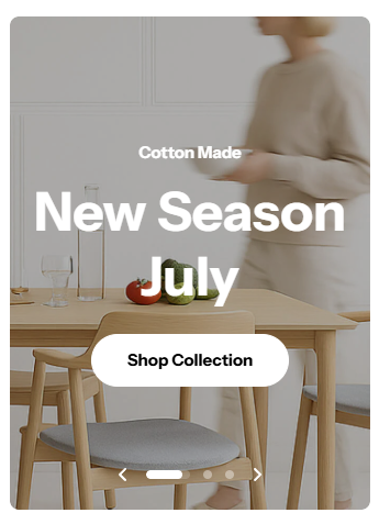
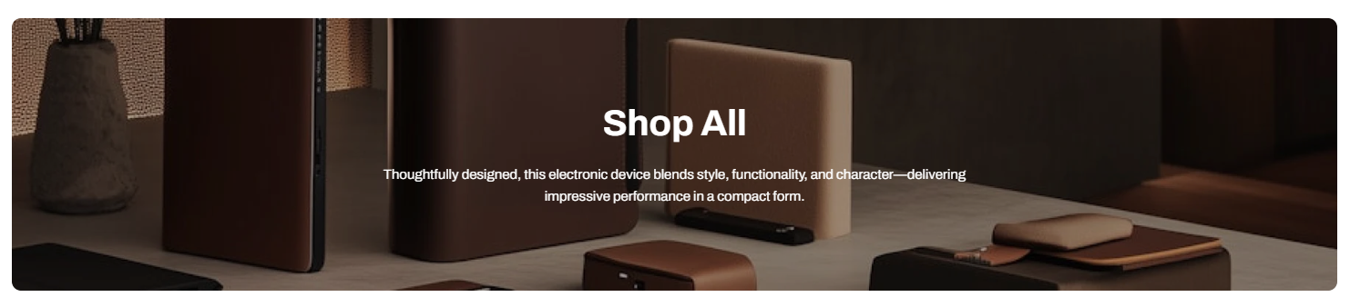
#8. Slideshow / Slideshow with product / Scrolling banner
For these sections, the Hyper theme provides flexible height options and supports separate images for desktop and mobile to ensure the best visual presentation across devices.
We strongly recommend uploading separate images for desktop and mobile. If the same image is used, it will be center-cropped on mobile, which may cut off important details.
Adapt to first image: Preserving the original proportions of your first image slide. All other slides will follow the same aspect ratio as the first image.
Small / Medium / Large: Applying fixed heights, so images may be cropped depending on their ratio.
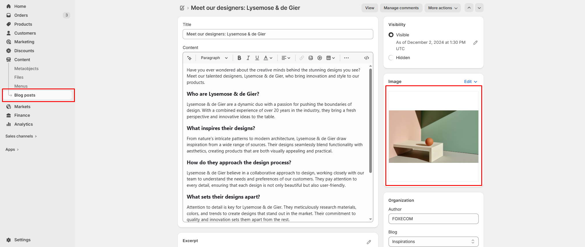
To set the blog post featured image, go to Online Store > Blog posts in your Shopify admin. Then open the post and locate the Featured image field on the right-hand side to upload your image.
On your website, the blog post featured image is displayed in two places:
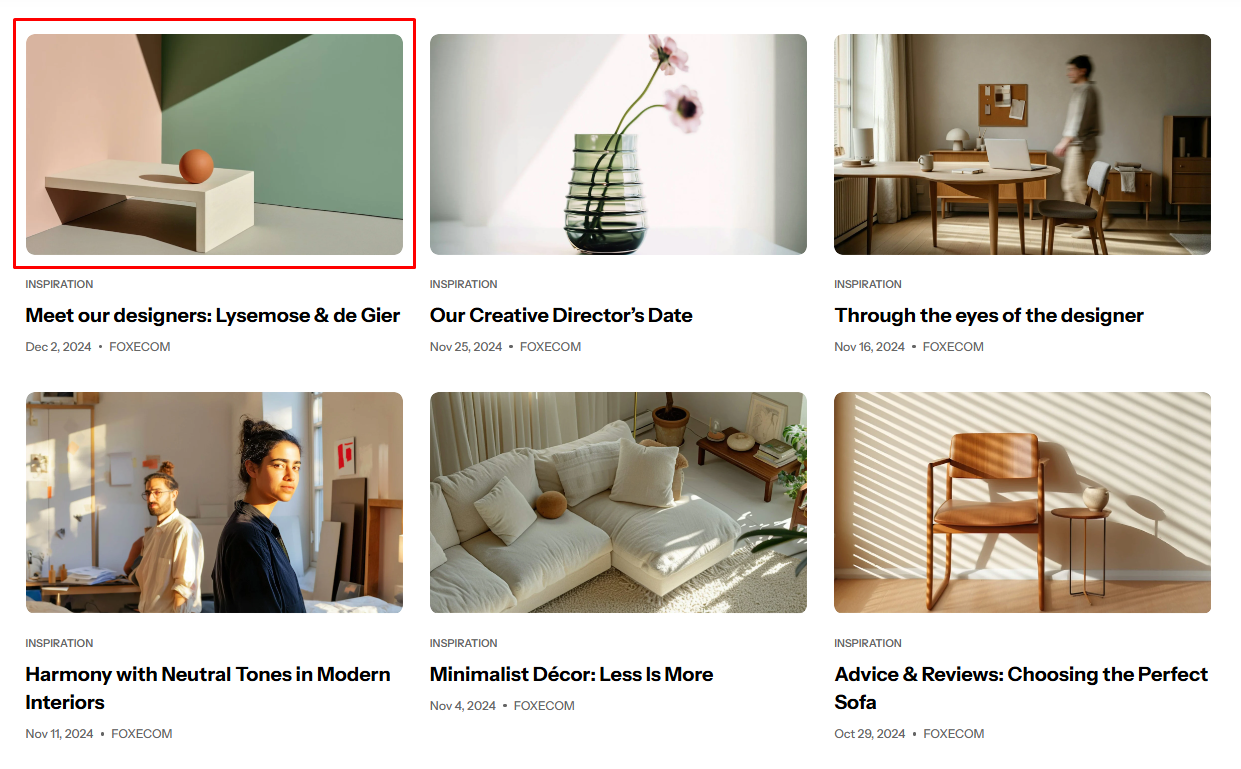
Post’s thumbnail image (Blog listing page):
Displayed in blog cards. The appearance depends on Theme settings > Blog cards > Image ratio.
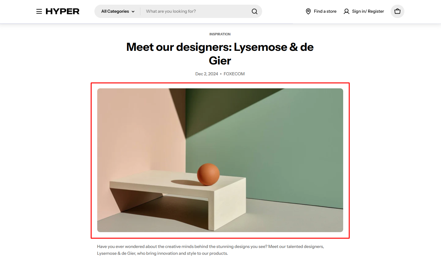
Post’s featured image banner (Blog post page):
Displayed as the main image at the top of the article. This is controlled by the Image ratio setting in the blog post template.
You can choose images with square, portrait, or landscape ratios to achieve the best visual result.
The recommended sizes are:
Square (1:1): at least 2000 x 2000 px
Portrait (3:4): at least 2000 × 2667 px
Landscape (4:3): at least 2400 x 1800 px
You can also use Adapt to image to preserve the original image ratio.
2680 × 600 px (for image position: Top, Bottom, or Use image as background)
1340 × 600 px (for image position: Left or Right)
Mobile image: 686 × 440 px
Use images with the correct dimensions based on the selected image position.
Option
Height
Behavior
Adapt to image
Auto
Follows the image’s original aspect ratio (no fixed height)
Extra small
300px
Cropped to fixed height
Small
450px
Cropped to fixed height
Medium
550px
Cropped to fixed height
Extra medium
650px
Cropped to fixed height
Large
800px
Cropped to fixed height
Option
Height
Auto
Extra small: 220 px Small: 337.5 px Medium: 412.5 px Extra medium: 487.5 px Large: 600 px
Inherits the desktop height setting (including ratio or fixed height)
Adapt to image
Auto
Uses the mobile image’s own aspect ratio (independent from desktop)
How it works:
Adapt to image: The section height is determined by the image’s aspect ratio, preserving its original proportions and minimizing cropping.
Fixed height options: Selecting a predefined height (e.g., Small, Medium, Large) ensures consistent section height but may crop images depending on their original ratio.
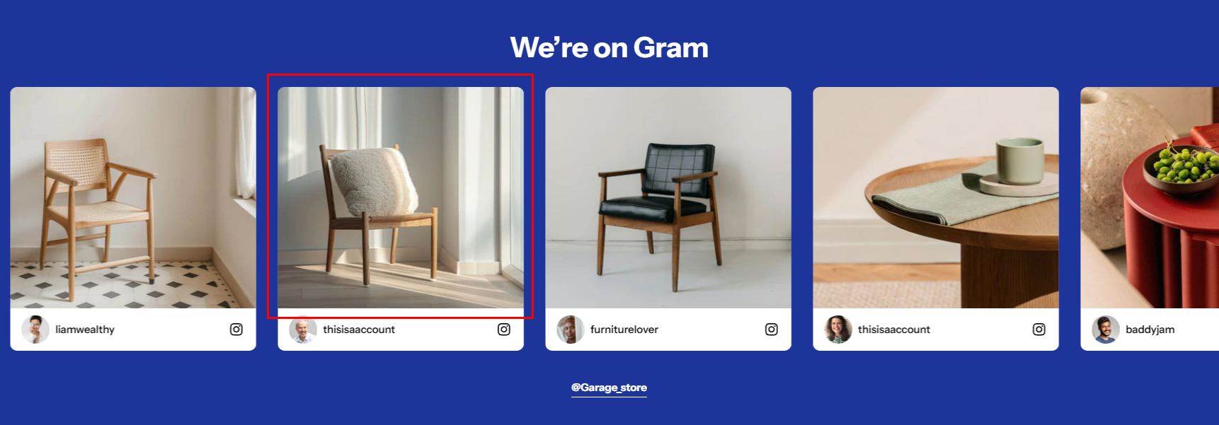
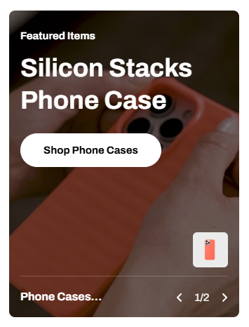
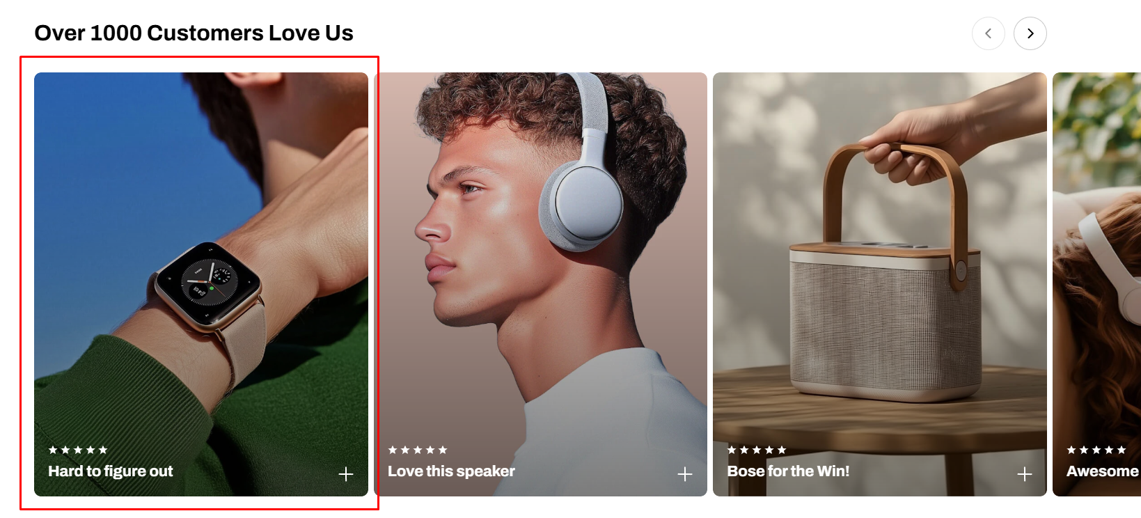
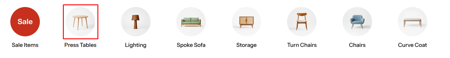
#12. Collection list slider / Collection list / Collection list banner (Collection card images)
Recommended image sizes:
Square (1:1)(Recommended): 1000 × 1000 px
Portrait (3:4): 1000 × 1333 px
Landscape (4:3): 1333 × 1000 px
Adapt to image: keeps original ratio (may look inconsistent)
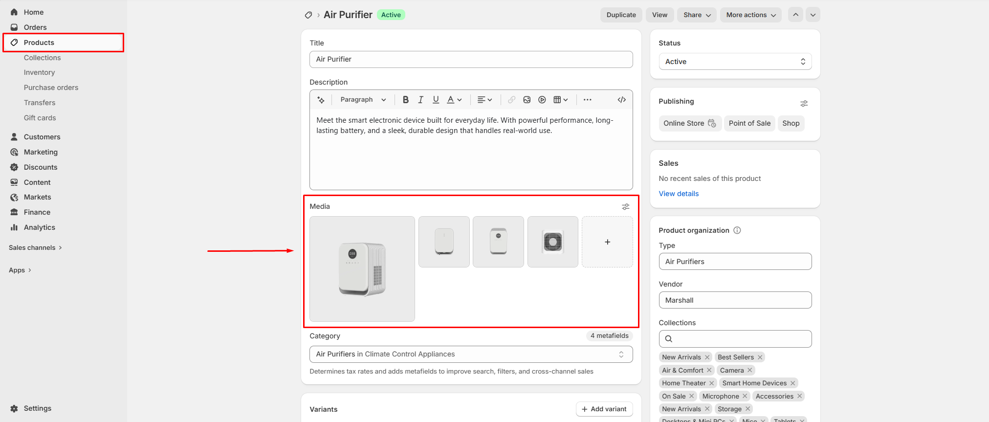
From the Products tab in your Shopify admin, you can easily add new products along with their images. These products will automatically appear across product-related sections in your Hyper theme, such as Featured Collection, Multiple Product Bundles, Favorite Products, Product Bundles, Bundle Selection, and Recently Viewed Products.
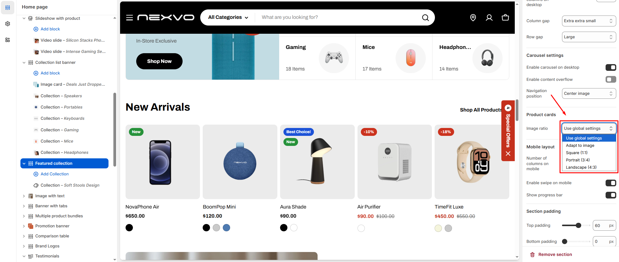
Within Theme settings or individual section settings, you can also control how product images are displayed. Available image ratio options include:
Adapt to image
Square
Portrait
Landscape
These settings allow you to present your product images in the format that best fits your store’s design.
For optimal display quality on the Hyper theme, we recommend the following image sizes:
Square (1:1): at least 2000 x 2000 px
Portrait (3:4): at least 2000 × 2667 px
Landscape (4:3): at least 2400 x 1800 px
These are general recommendations to ensure your images look sharp and consistent across all sections.