
Theme Sections
Collapsible tabs
3 min read
_FwblfVNi.jpg)
How to add a Collapsible tabs section to your Shopify store
- In the theme editor (Customize), click Add section.
- Locate Collapsible tabs.
- Make necessary changes.
- Save.
How to edit a Collapsible tabs section
Section settings
Section header
| Setting | Description |
|---|---|
| Desktop padding bottom | Add spacing below the section (Small / Medium / Large). |
| Content spacing | Adjust the gap between blocks within the section. |
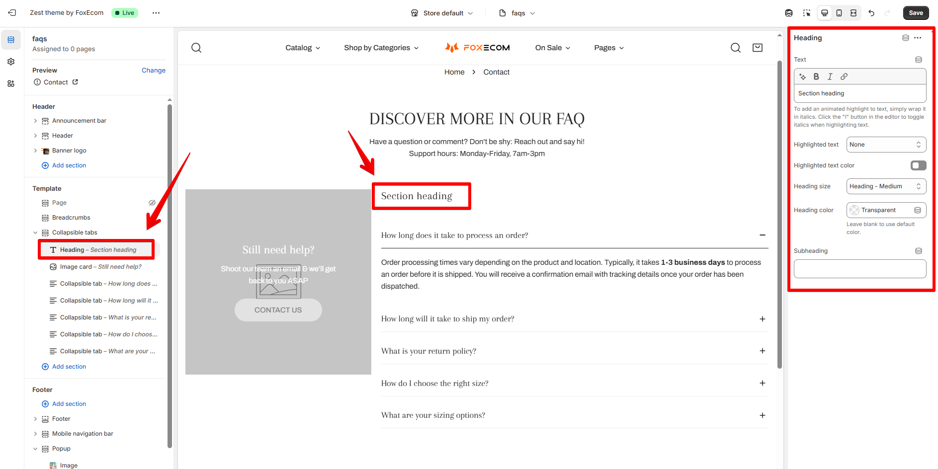
| Heading | Enter a main title of the section. ✍️ Want to add highlighted text to the heading? Learn more: Highlight text |
| Heading size | Controls heading scale — Base, Large, XL, etc. |
| Heading color | Choose a custom text color or leave blank for default. |
| Subheading | Optional subtitle displayed below the heading. |
| Description | Add body text, such as contact hours or additional guidance. |
Collapsible tab
| Setting | Description |
|---|---|
| Font family | Choose to use headings font or body font to the collapsible tabs' titles. ✍️ Set fonts in the Theme settings >Typography |
| Heading size | Size of the heading text. |
| Column gap | Adjust the gap between the Image card and Collapsible tabs. |
| Content width | Control the width of the content (Narrow width/ Full width). |
Block settings
| Setting | Description |
|---|---|
| Text | The heading content. |
| Heading size | Size of the heading text. |
| Heading color | Optional custom color. |
| Setting | Description |
|---|---|
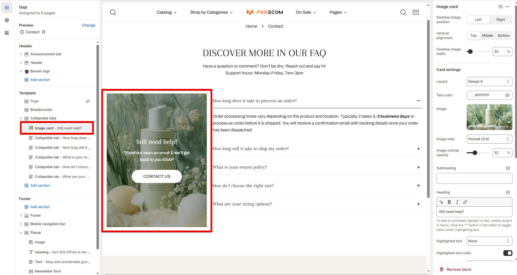
| Image | Upload or select from free images. |
| Desktop image position | Left / Right of collapsible tabs. |
| Desktop image width | Adjust image size (e.g., 33%). |
| Vertical alignment | Align image Top/ Middle/ Bottom. |
| Layout | Choose from card design presets. |
| Image overlay opacity | Set overlay transparency. |
| Text color | Change color of the text over image. |
| Heading / Description | Add text and a message. |
| Button label & link | Add a CTA like "Contact us". |
| Button style | Choose between white, outline, solid, etc. |
| Setting | Description |
|---|---|
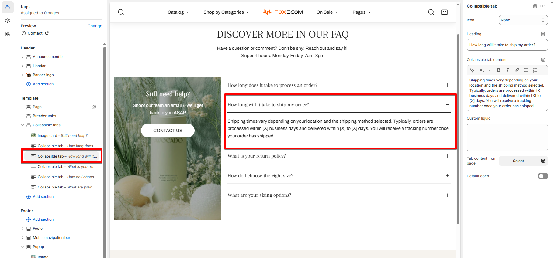
| Icon | Add an optional icon to the tab. |
| Heading | Displayed as the tab title (e.g. a question). |
| Collapsible tab content | Rich text editor for the answer. Supports bold, links, etc. |
| Tab content from page | Pull tab content from an existing Shopify page. |
| Default open | Optionally set a tab to be expanded by default. |
Best practices
- Use short, clear headings for each collapsible tab.
- Enable “Default open” on the most common question.
- Add an image card with contact details or a CTA to guide users.
Last updated