
Theme Sections
Favorite collection
2 min read
_3Q894sFI.jpg)
This section is available on ✨ Zest version 9.0.0 onwards. See our Changelog
How to add a Favorite collection section to your Shopify store
- In the theme editor (Customize) > click Add section
- Select Favorite collection.
- Make necessary changes.
- Save the settings.
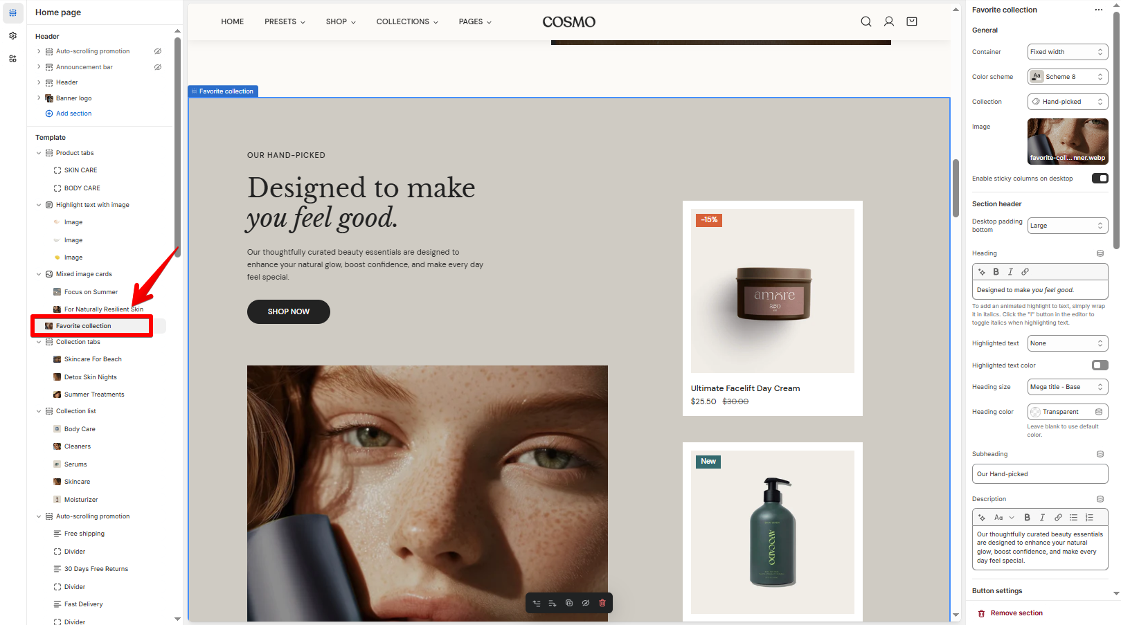
How to edit a Favorite collection section
Section settings
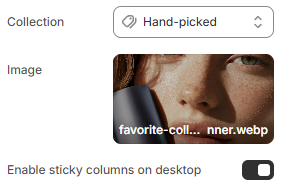
General
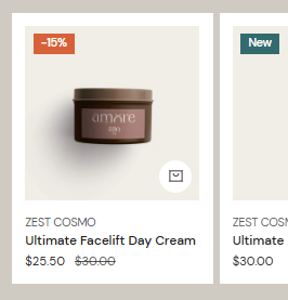
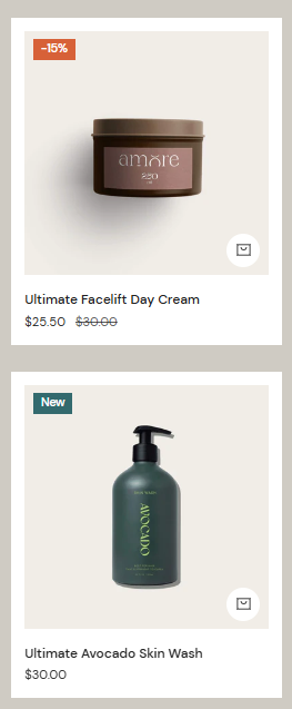
- Select the Collection of products you want to display.
- Upload a custom Image to visually represent the collection.
- Enable the Enable sticky columns on desktop option to keep the collection fixed while scrolling.
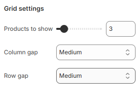
Grid settings
- Use the Products to show slider to select the number of products displayed in the section (2 - 12).
- You can modify the Column gap and Row gap between each product cards for a balanced layout.
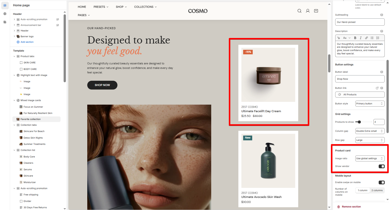
Product card
- Select the product card's Image ratio as:
- Use global settings
- Adapt to image
- Square (1:1)
- Portrait (3:4)
- Landscape (4:3)
- Enable or disable the Show vendor option display or hide product vendors on the product cards.
Mobile layout
Last updated