
Pages Global Sections
Header
4 min read
_cRKOYJnW.jpg)
How to edit Header section
- Go to Online Store > Themes > Customize.
- Choose Header section.
- Make necessary changes > Save.
General


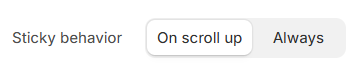
- On scroll up: The header appears only when the user scrolls up (good for saving screen space).
- Always: The header stays fixed at the top of the page at all times.
See Changelog.
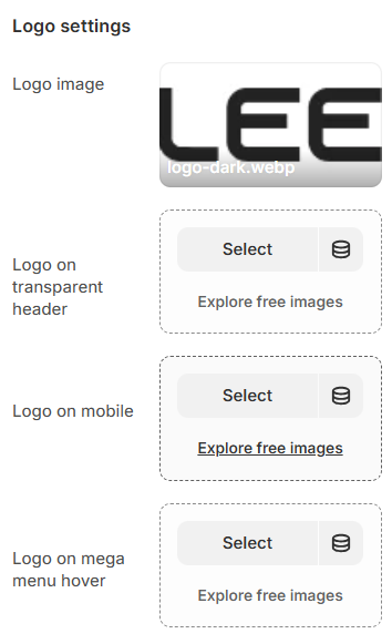
Logo settings
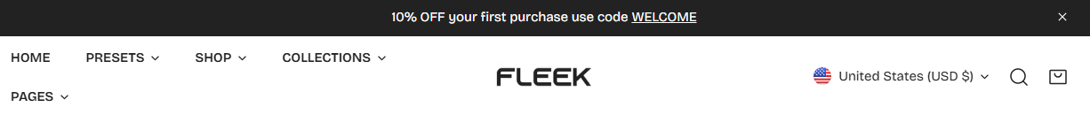
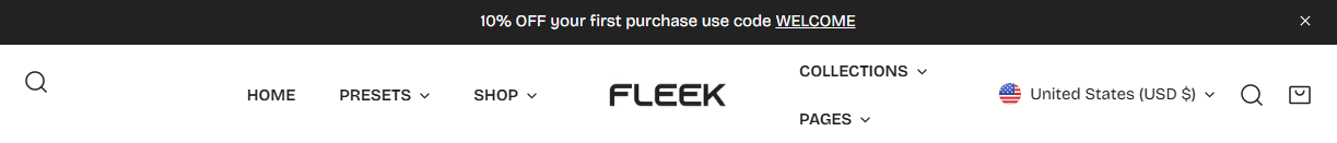
- Logo image: This is the main logo that appears in your website's header.
- Logo on transparent header: If you enable a transparent header, this option allows you to set a different logo specifically for that view.
- Logo on mobile: This option lets you upload a separate logo for mobile devices.
- Logo on mega menu hover: This setting allows you to upload a specific logo that appears when users hover over a mega menu (if enabled).
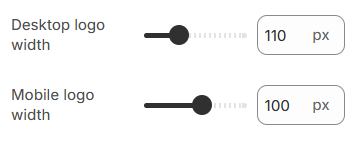
- Desktop logo width: This slider adjust the size of the logo displayed on desktop screens (50 - 250px).
- Mobile logo width: This slider controls the size of the logo on mobile devices (30 - 150px).
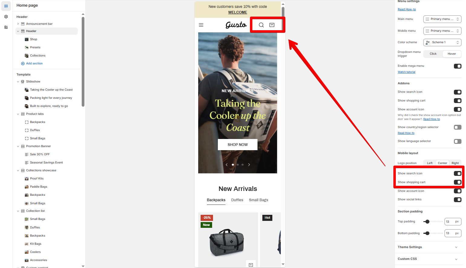
Menu settings
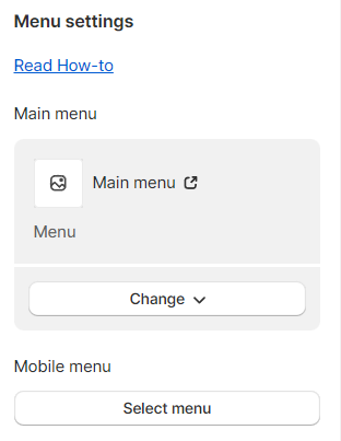
To add, remove, or edit menus in your Shopify store, see Editing menus
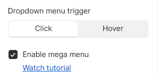
- Dropdown menu trigger: Set the menu's dropdown to be opened by clicking or hovering on the menu items.
- Enable mega menu if you want. See Add a banner to mega menu
Addons
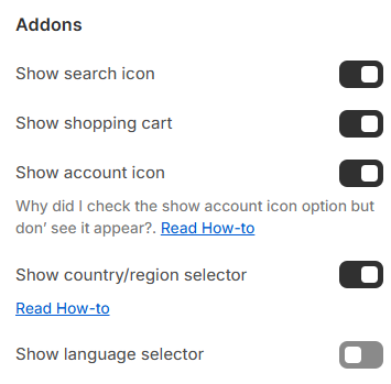
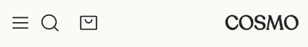
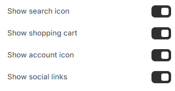
- Show search icon: When enabled, a search icon appears in the header, allowing users to search your website easily.
- Show shopping cart: When enabled, a shopping cart icon appears in the header.
- Show account icon: When enabled, an account icon appears in the header.
- To set your Customer account preferences, see this article.
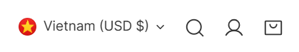
- Show country/region selector: When enabled, a dropdown menu appears in the header for users to select their country or region.
Countries/ Regions
- Show language selector: When enabled, a language switcher appears in the header, allowing users to change the website language.
Languages
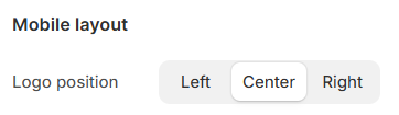
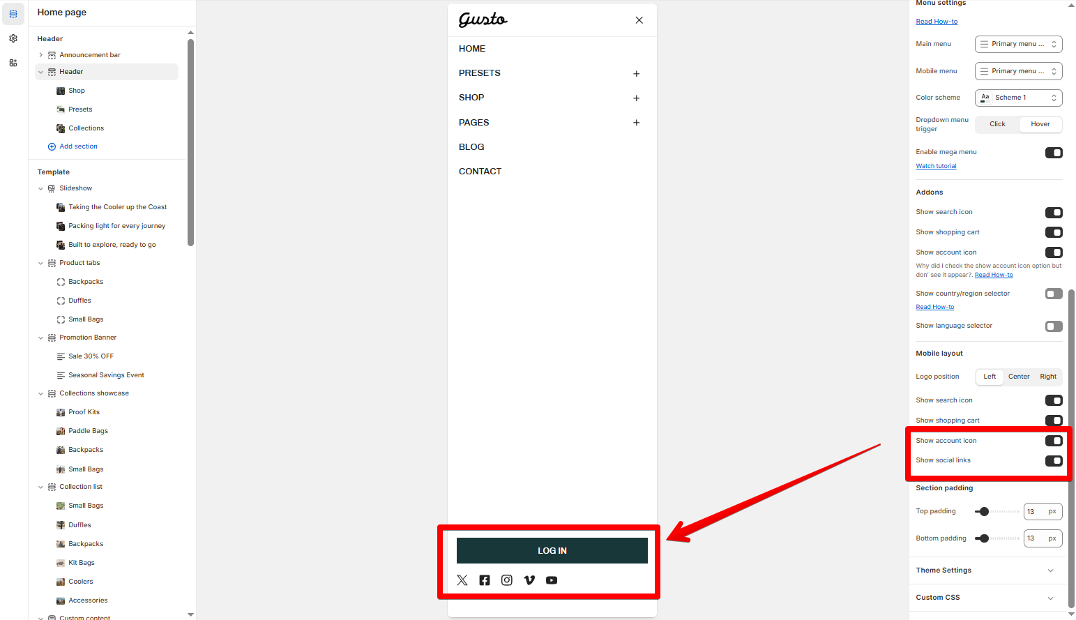
Mobile layout
- Left: Logo left, hamburger left, menu icon right
- Center: Logo center, hamburger left, menu icon right.
- Right: Logo right, hamburger left, menu icon left.
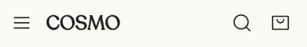

- Show search icon: When enabled, a search icon appears in the mobile header.
- Show shopping cart: When enabled, a shopping cart icon appears in the mobile header.
- Show account icon: When enabled, an account icon appears in the mobile header.
- Show social links: When enabled, social media icons (such as Facebook, Instagram, Twitter, etc.) appear in the mobile header.
Last updated