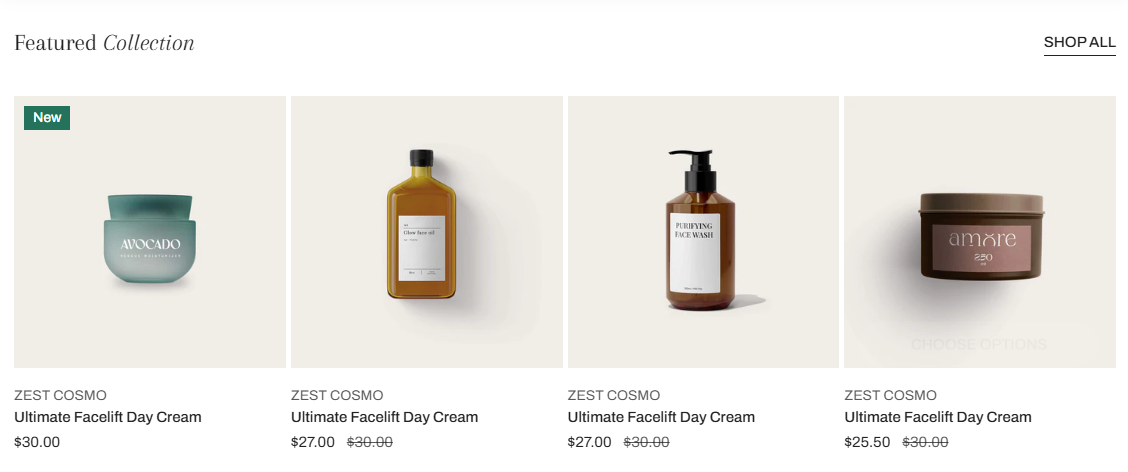
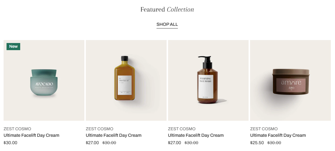
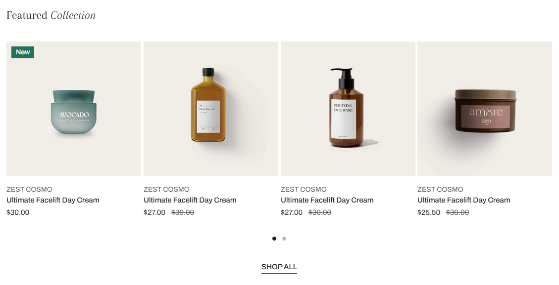
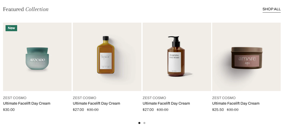
Featured collection
Featuring collections can help merchants promote sales and new collections. This article will show you how to add and customize your featured collection section in Zest.
# How to add a Featured collection section to your Shopify storeSteps
In the theme editor (Customize) , click Add section.
Locate the Featured collection.
Make necessary changes.
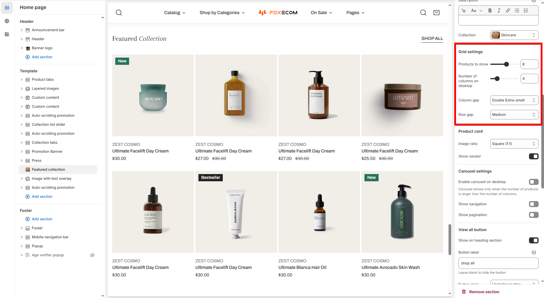
Save. # How to customize your Featured collection section# Section settings # ⚙️ Grid settings
Setting Description Layout Choose to display the section header with the View all button in horizontal or vertical layout. Collection Choose the collection whose products will appear in the grid. Products to show Limit the number of products displayed. Number of columns on desktop Set how many products display per row (2–12 columns). Column / Row gap Control spacing between items in the grid.
# 🛍️ Product card settings
Setting Description Image ratio Inherit global settings or choose a fixed ratio for product cards' image. Show vendor Toggle whether to display the product’s vendor name.
To set up other addons, such as badges, buttons, etc. to the product cards, check out this article:
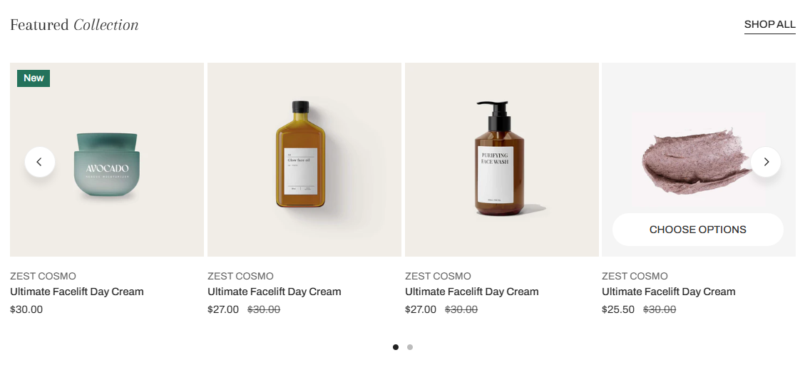
# 🎠 Carousel settings
Setting Description Enable carousel on desktop Turns the static grid into a scrollable carousel (only if items > columns). Show navigation / pagination Adds arrows or page dots to the carousel.
Setting Description Show on heading section Enables the “View all” link next to your heading. Button label Customize the CTA.
Default Show on heading section
# 📱 Mobile layout
Setting Description Enable swipe on mobile Allow horizontal swipe navigation. Number of columns Choose 1 or 2 columns on mobile.
Last updated about 1 month ago

_XHtOZPAd.jpg)