
Pages Global Sections
Footer
5 min read
_78g2gXV8.jpg)
What is the footer section?
How to edit the Footer section on your Shopify store
- In the theme editor (Customize), click Footer
- Make necessary changes.
- Save the settings.
Section settings
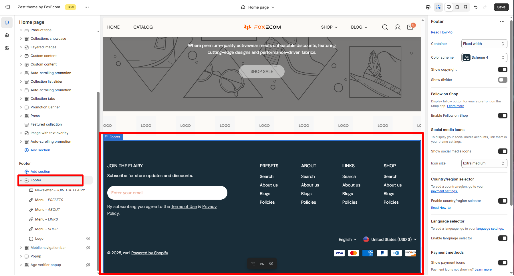
General
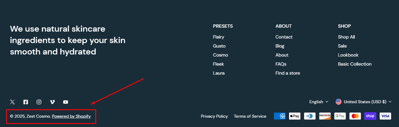
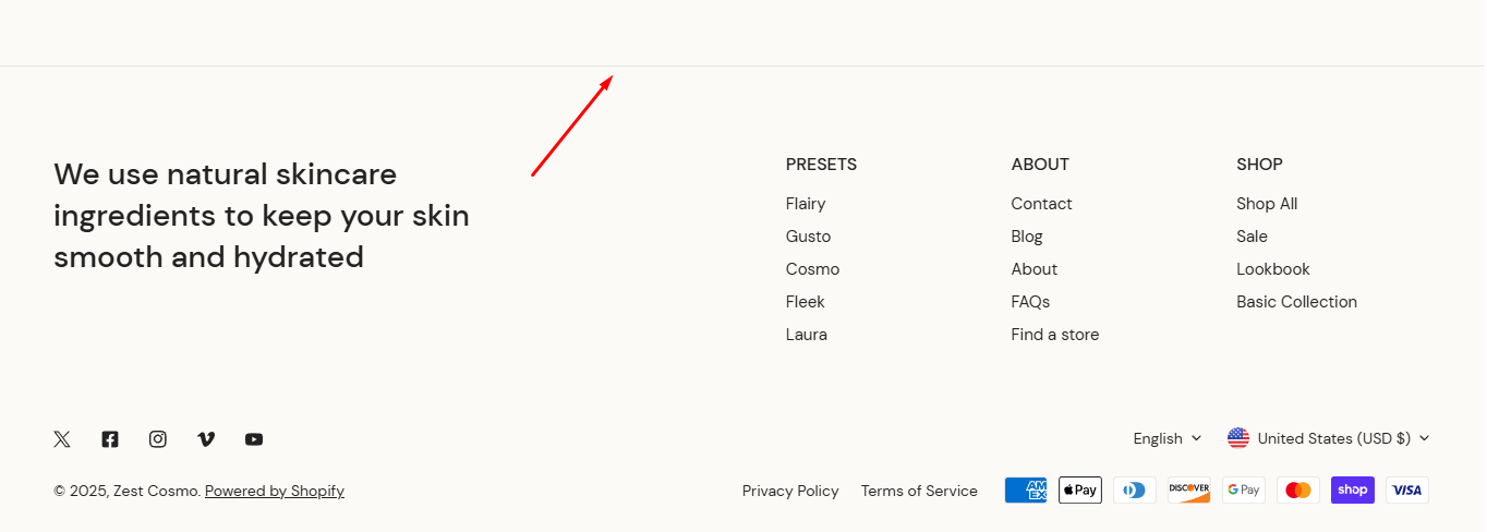
A Copyright notice informs the public that the work is protected by copyright. To know more about copyright, see Copyright.
Learn more:Change the copyright text at the footer
Follow on Shop

Follow on Shop allows customers to follow your store on the Shop app. When a customer follows your store, they can receive personalized recommendations and notifications about your products. This helps you to create a more personalized shopping experience for your customers.
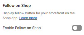
To enable the Follow on Shop button, you need to have the Shop channel installed, and Shop Pay activated on your store.
Add-ons

- Social media icons: To display icons for any social media platforms that you've entered a profile link for in your theme settings > Social media.
- In the Social media icons settings, you can also change the Icon size:
- Extra-small
- Small
- Extra-medium
- Medium
- Large
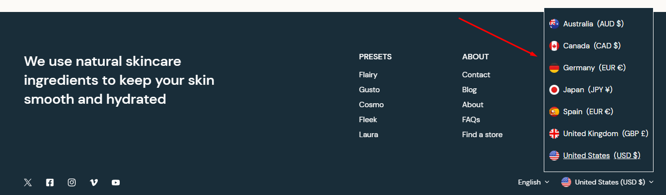
- Country/region selector: To add a country/region selector to your footer.
Countries/ Regions
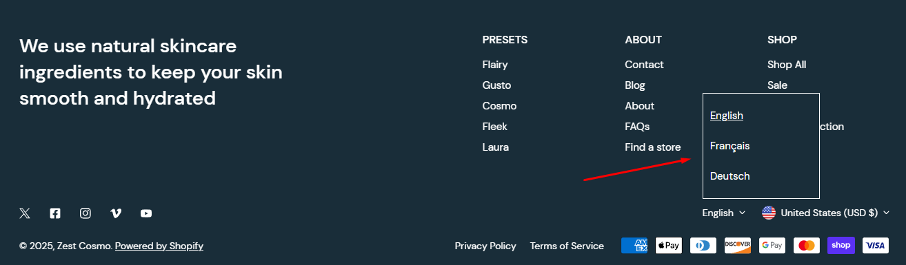
- Language selector: To add a language selector to your footer.
Languages
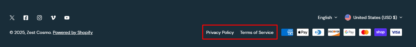
Payment methods

Providing various purchasing methods makes checkout easier for your customers and enhances your brand perception. To see how to set up alternative payment methods for your store, see Payments.
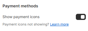
If your payment icons are not appearing, learn more: Show Payment icons on the Footer
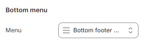
Bottom menu
You can select Menu which is suitable for the Bottom menu. See How to Create a menu in Shopify.
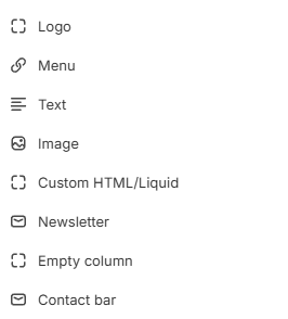
Block settings
Menu
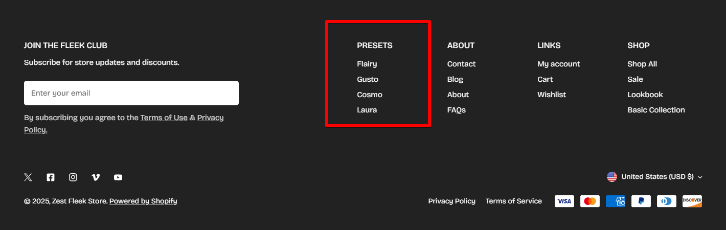
- Heading: Set a custom title for the menu block (e.g., Quick Links).
- Heading size: Select the size of the heading text.
- Heading - Medium
- Heading - Large
- Heading - Extra large
- Heading - Extra extra large
- Mega title - Base
- Menu: Choose which menu to display in the footer.
- Column width: Adjust the width of the menu column as a percentage of the total footer width (10 - 60%).
Contact bar
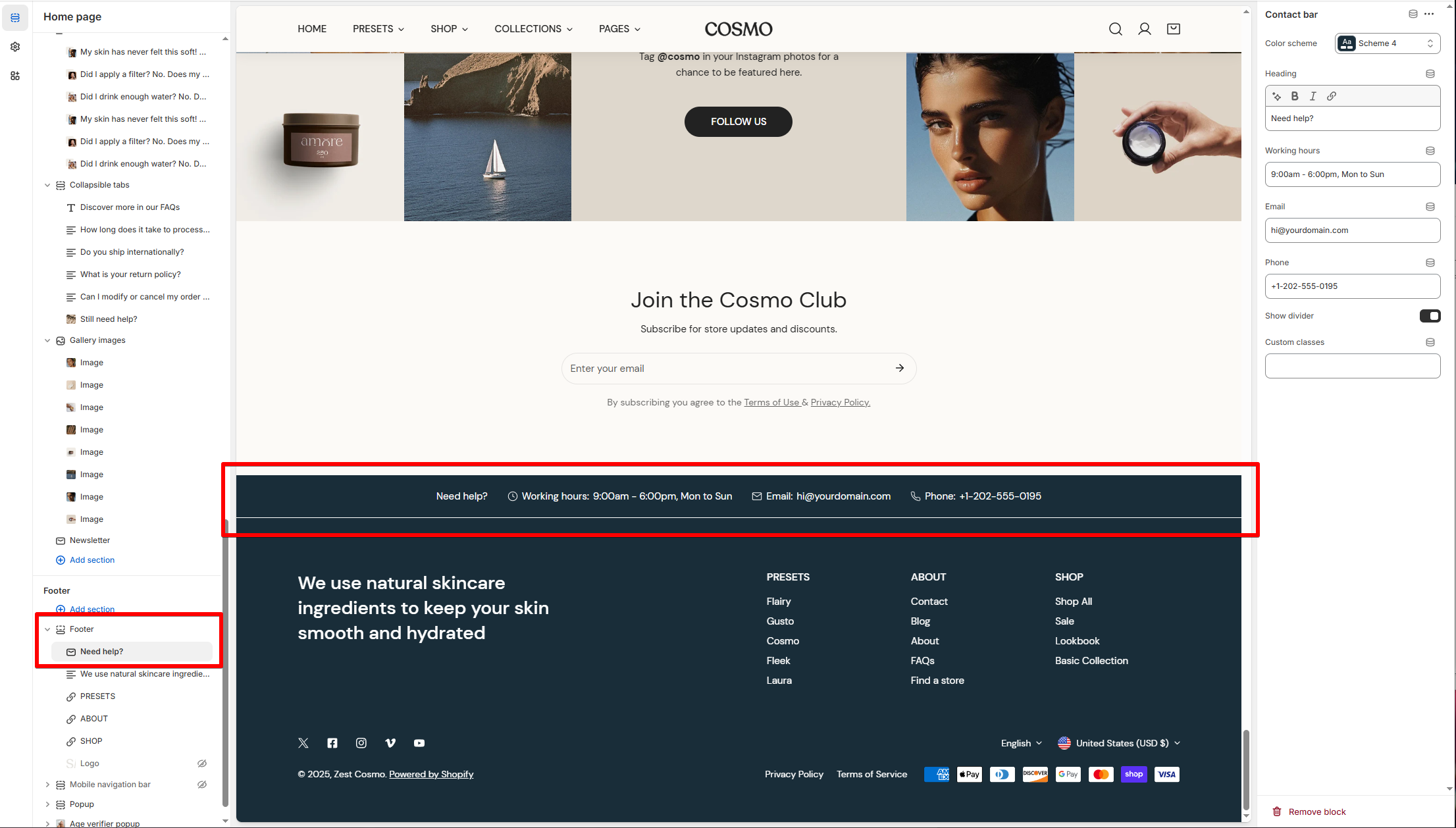
- Color scheme: Choose a predefined color scheme to match your store’s design.
- Heading: Set the title for the contact block (e.g., Need help?).
- Working hours: Add your business hours to inform customers when support is available (e.g., Example: 9:00 AM - 6:00 PM, Mon to Sun).
- Email: Enter your customer support email address.
- Phone: Add a contact phone number for customer support.
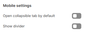
- Show divider: Adds a visual divider line above the contact bar for better separation.
- Custom classes: Add custom CSS classes for additional styling. This is useful for developers or advanced users who want to modify the appearance with custom CSS.
Newsletter
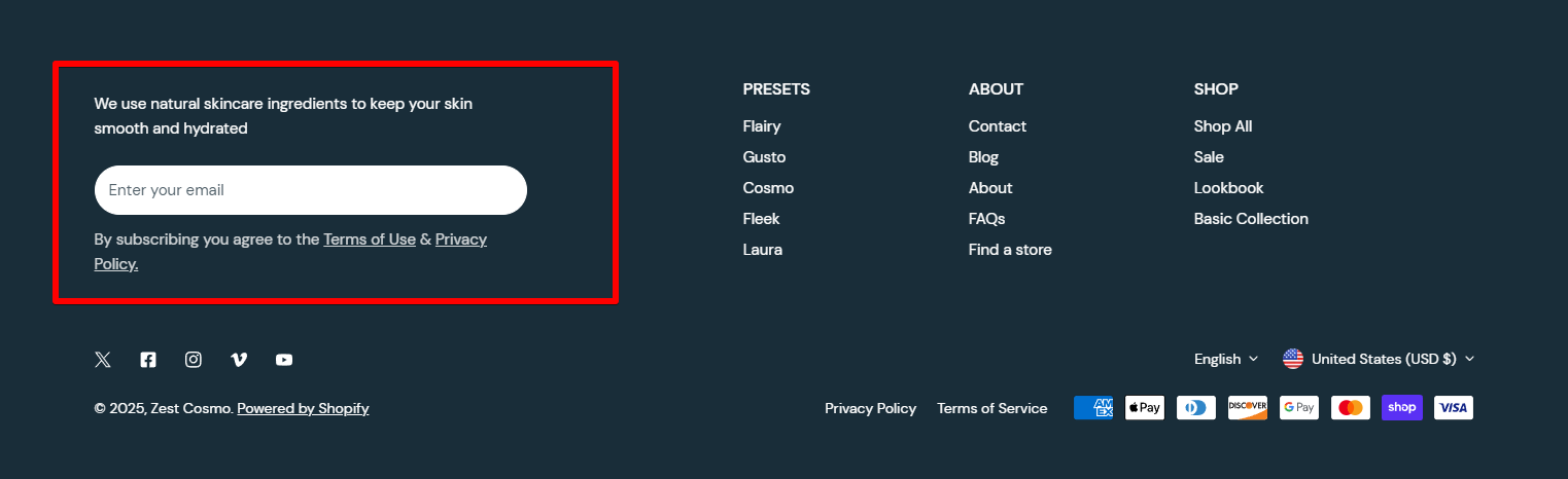
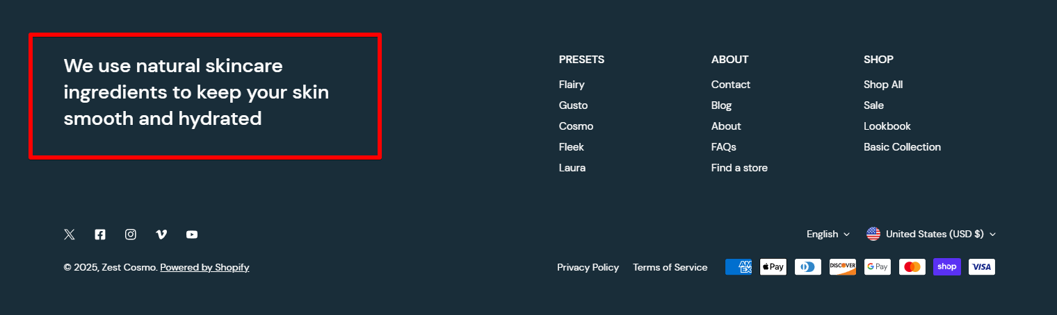
Text
Empty column
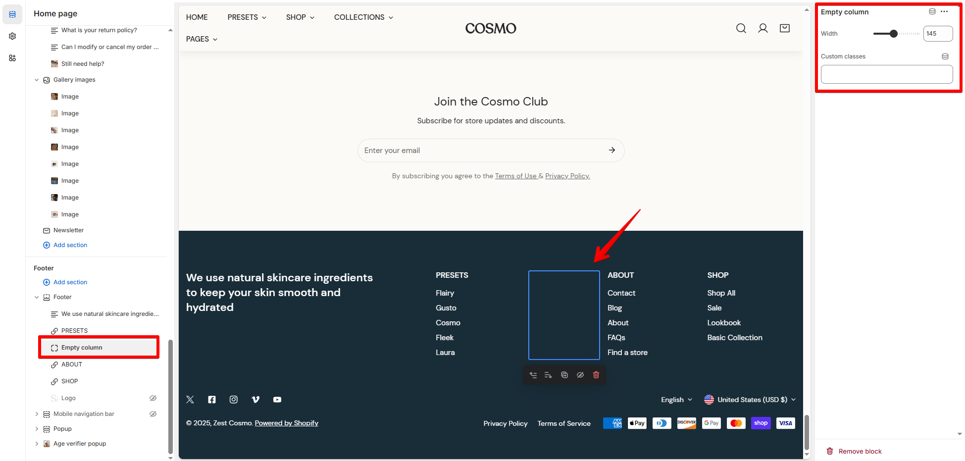
- Width: Adjust the width of the empty column to create spacing between elements (30 - 300px).
- Custom classes: Add custom CSS classes for additional styling. This is useful for developers or advanced users who want to modify the appearance with custom CSS.
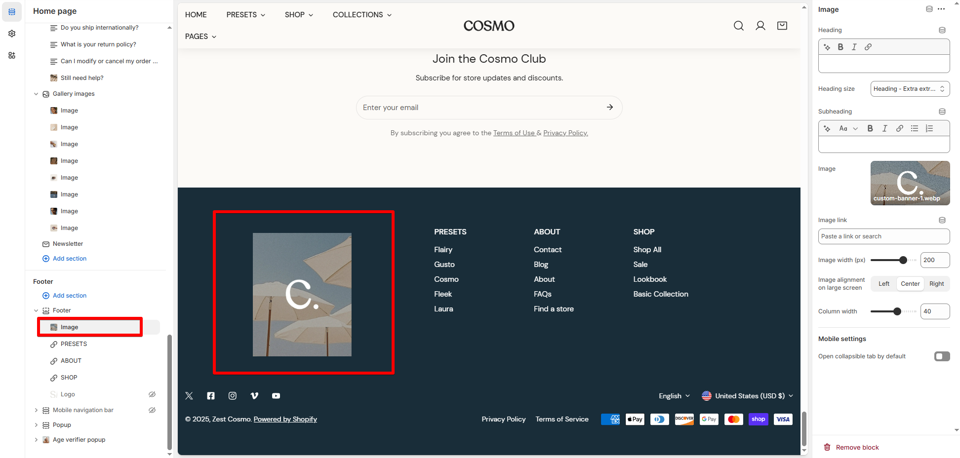
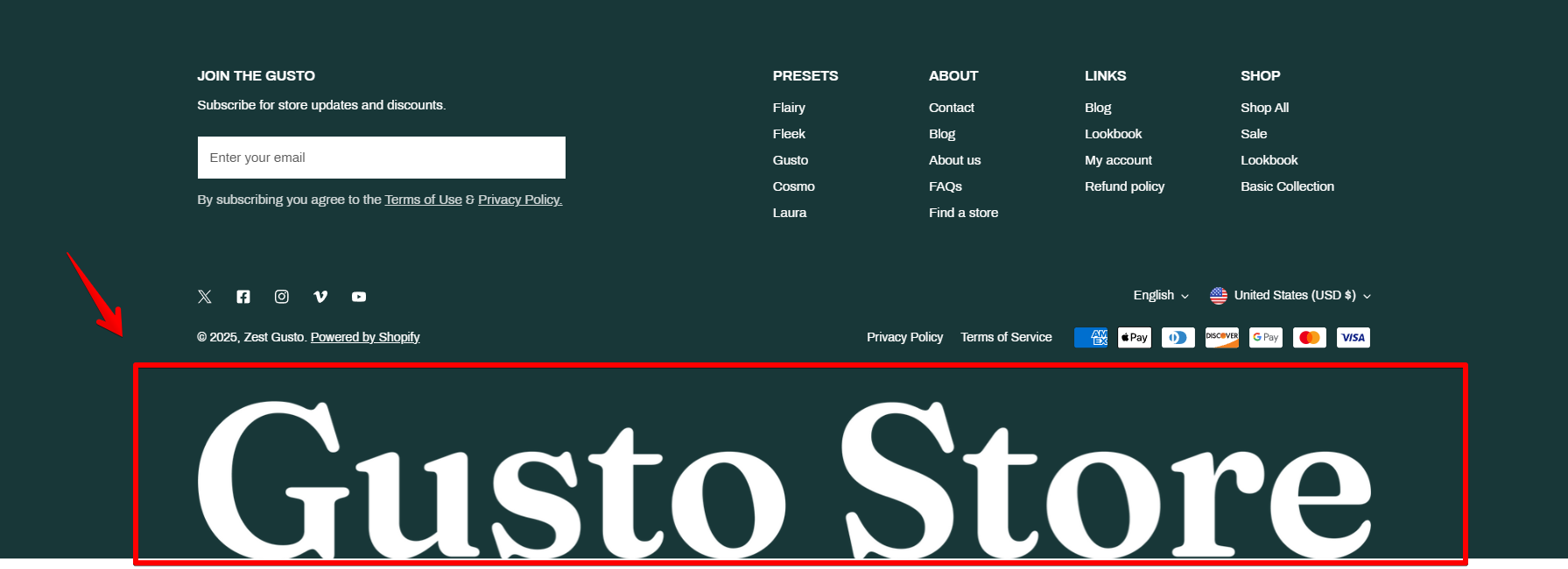
Image
Custom HTML/Liquid
Logo
See Changelog.
Last updated