Promotion banner

Create an eye-catching Promotion banner section to showcase special offers, discounts, or announcements effectively.

This section is available on ✨ Zest version 9.0.0 onwards. See our Changelog

The Promotion Banner section allows you to highlight important announcements, sales, or special offers on your website. You can customize the banner with text, styles, and a call-to-action button to grab your visitors' attention effectively.

In this article, we will show you how to add a Promotion banner section.

How to add a Promotion banner section to your Shopify store

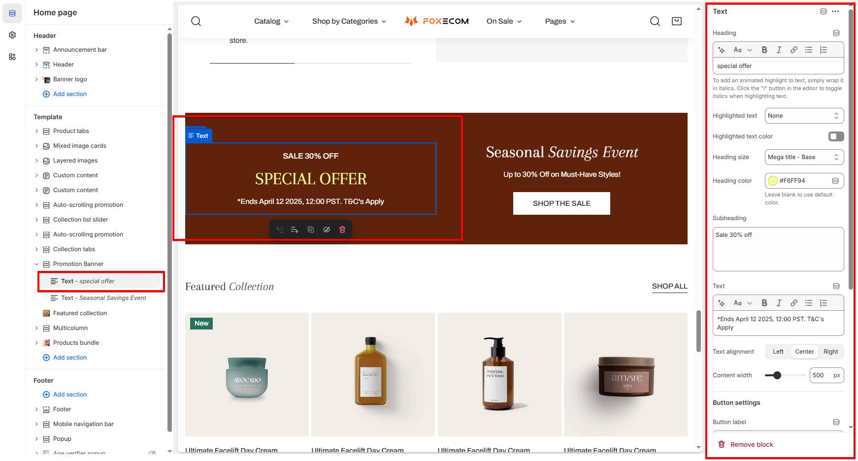
How to edit a Promotion banner section

Section settings

General

See how to adjust the Container settings

See how to adjust the Color scheme settings

Section padding

See how to adjust the Section padding settings

Section divider

See how to adjust the Section divider settings

Custom attributes

See how to adjust the Custom attributes settings

Animations

See how to adjust the Animations settings

Block settings

You can add a maximum of 2 Text blocks to the Promotion banner section.

General

Use the provided text fields to add a suitable Heading, Subheading, and Description.

  • Leave them blank if you do not want to display them

Change the Heading size to the desired size:

  • Heading - Medium

  • Heading - Large

  • Heading - Extra large

  • Heading - Extra extra large

  • Mega title - Base

You can also change the Heading color:

  • Leave it blank if you do not want to use the default color setting in the Color scheme.

Use the Text alignment option to align your text Left, Center, or Right to fit your banner’s layout.

Adjust the Content width of the text block to control how much space it takes up in the banner (370 - 870px).

Button settings

You can also display a call-to-action button to redirect customers to your desired pages.

The Button label field sets the text displayed on the button

  • Leave this blank if you do not want to display the button.

Enter the URL where users will be directed when they click the button to the Button link field.

Choose a desired Button style to match your design:

  • Primary button

  • Secondary button

  • White button

  • Underline button

Custom attributes

See how to adjust the Custom attributes settings

Animations

See how to adjust the Animations settings

Last updated

Was this helpful?