
Theme Sections
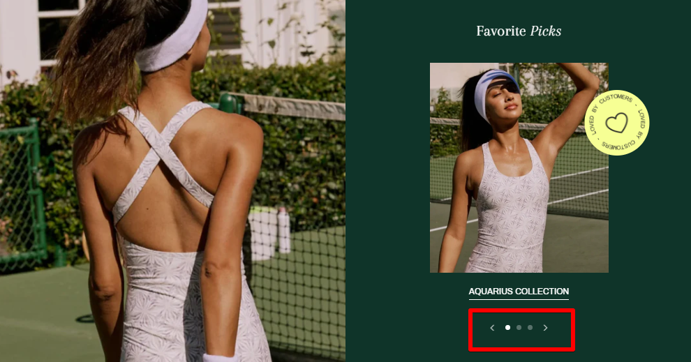
Collection list slider
2 min read
_6IRuzdHL.jpg)
How to add a Collection list slider to your Shopify store
- In the theme editor (Customize) > click Add section.
- Select Collection list slider.
- Make necessary changes.
- Save the settings.
How to edit a Collection list
Section settings
Large image
- Image ratio: Control the ratio of the large image on the left (Adapt to image/ Square/ etc.).
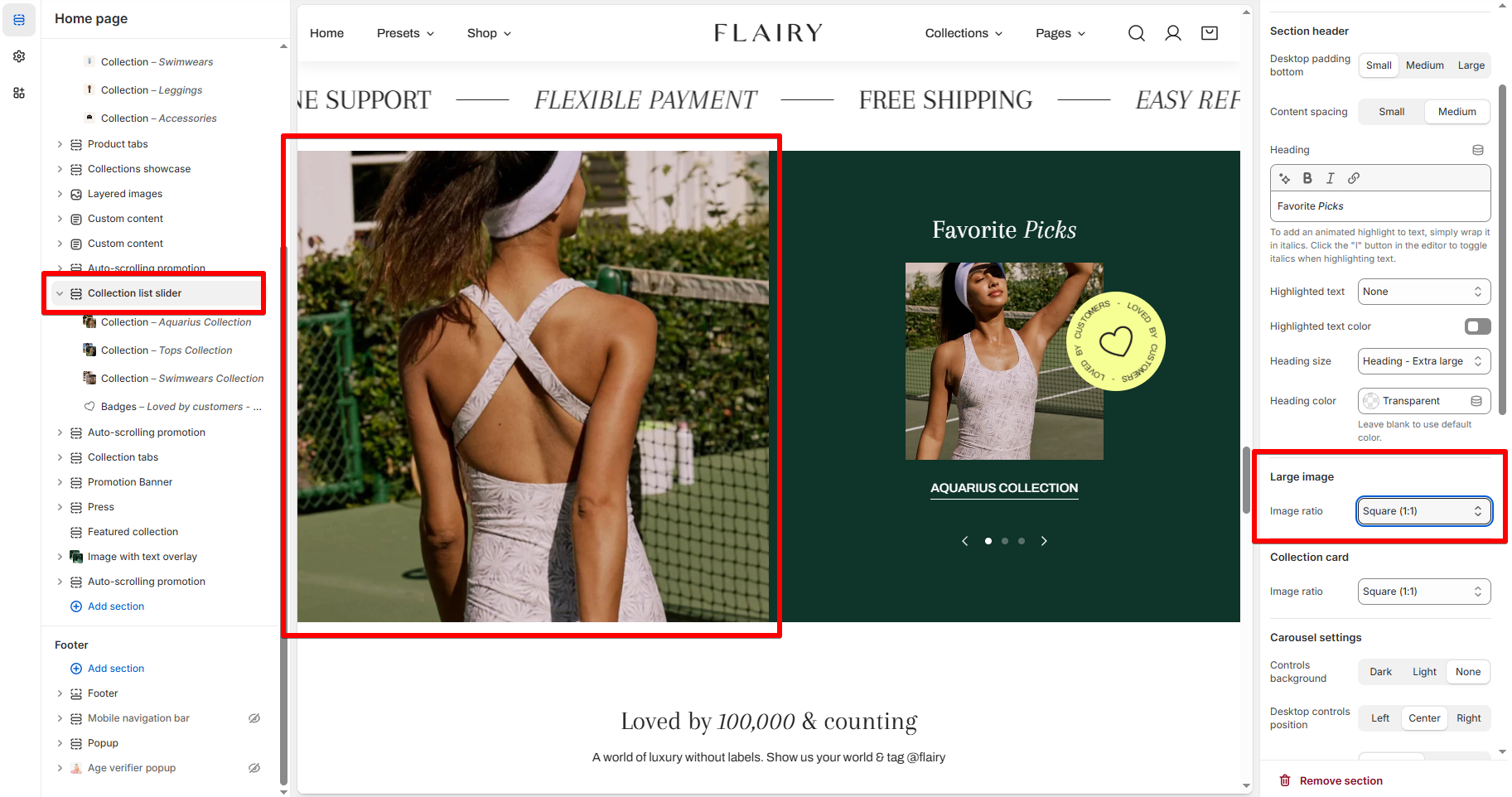
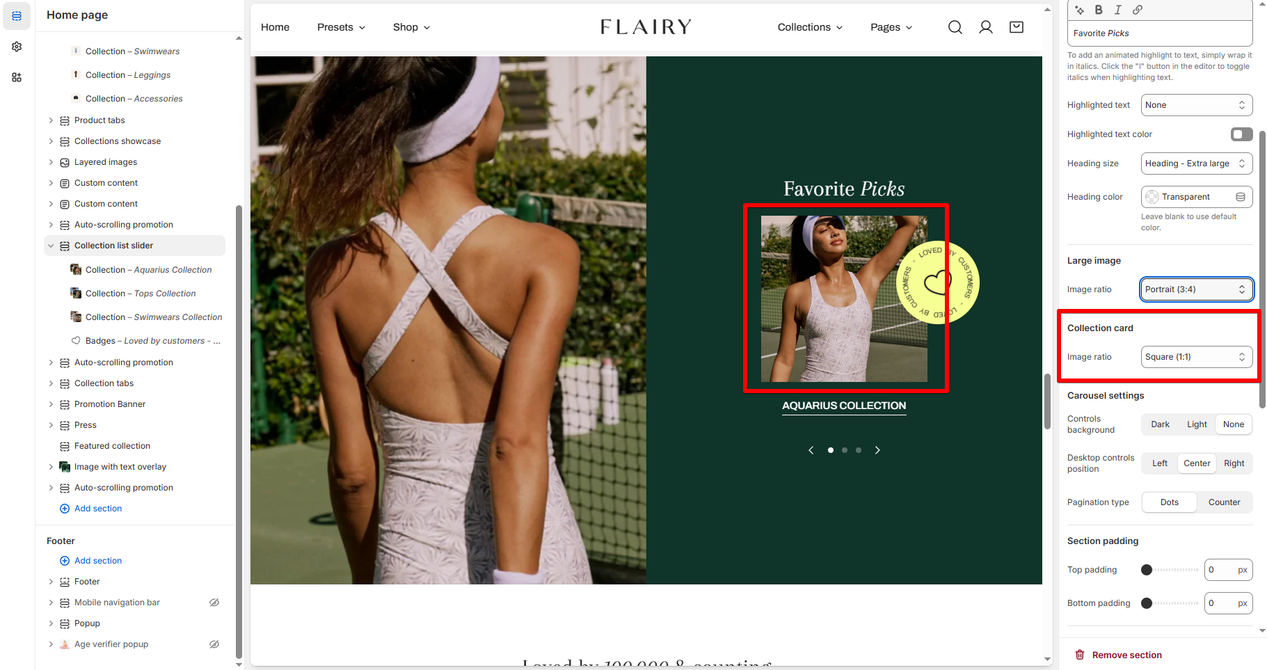
Collection card
- Image ratio: Control the ratio of the collection image on the right (Adapt to image/ Square/ etc.).
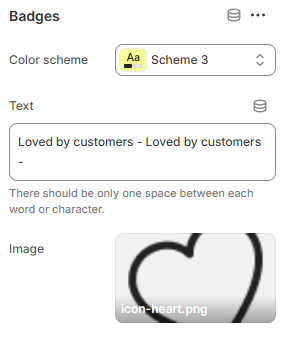
Carousel settings
- Controls background: Customize the background for the navigation controls
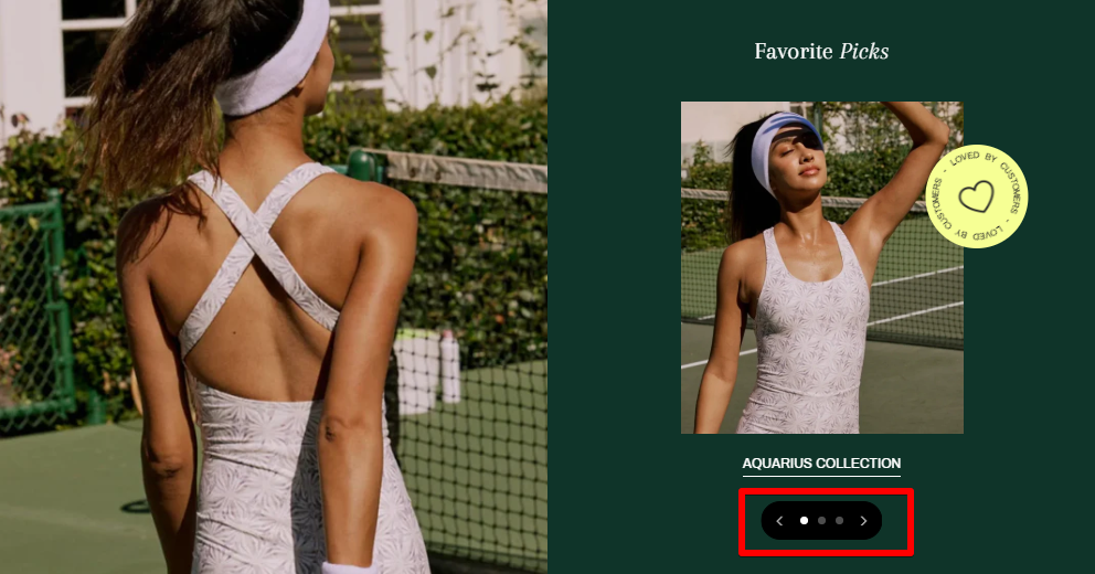
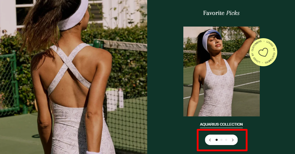
- Desktop controls position: Adjust the placement of the controls on the desktop
- Pagination type: Set pagination type as Dots/ Counter


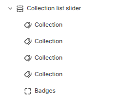
Block settings
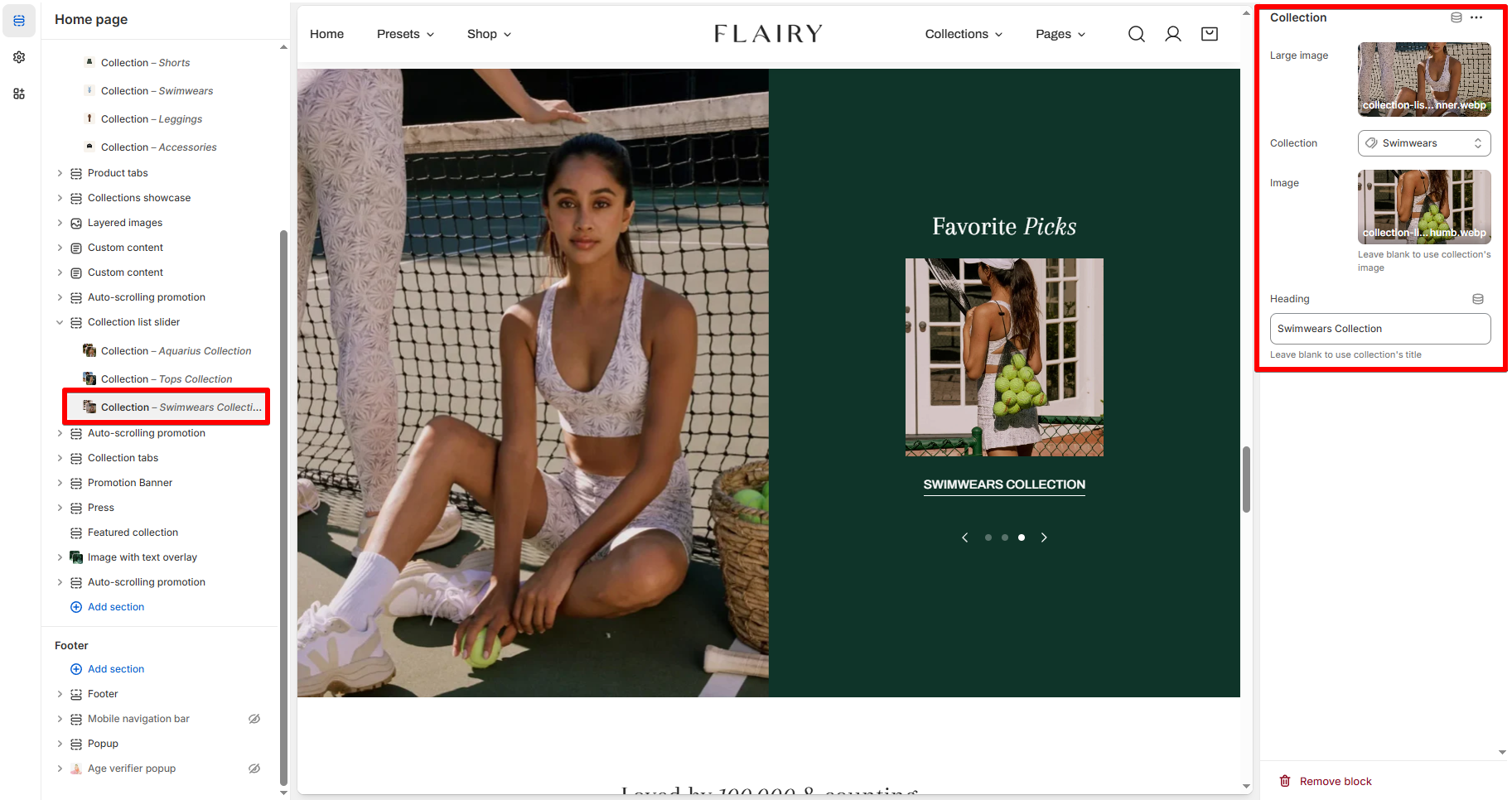
- Choose an Image for the Collection card. Leave the Image field blank if you want to use the collection's image.
- Use the provided text field to add a different Heading for the Collection. Leave the field blank to use the collection's title.
Last updated