
Pages Global Sections
Mobile navigation bar
1 min read
_389UlefU.jpg)
What is the mobile navigation bar?
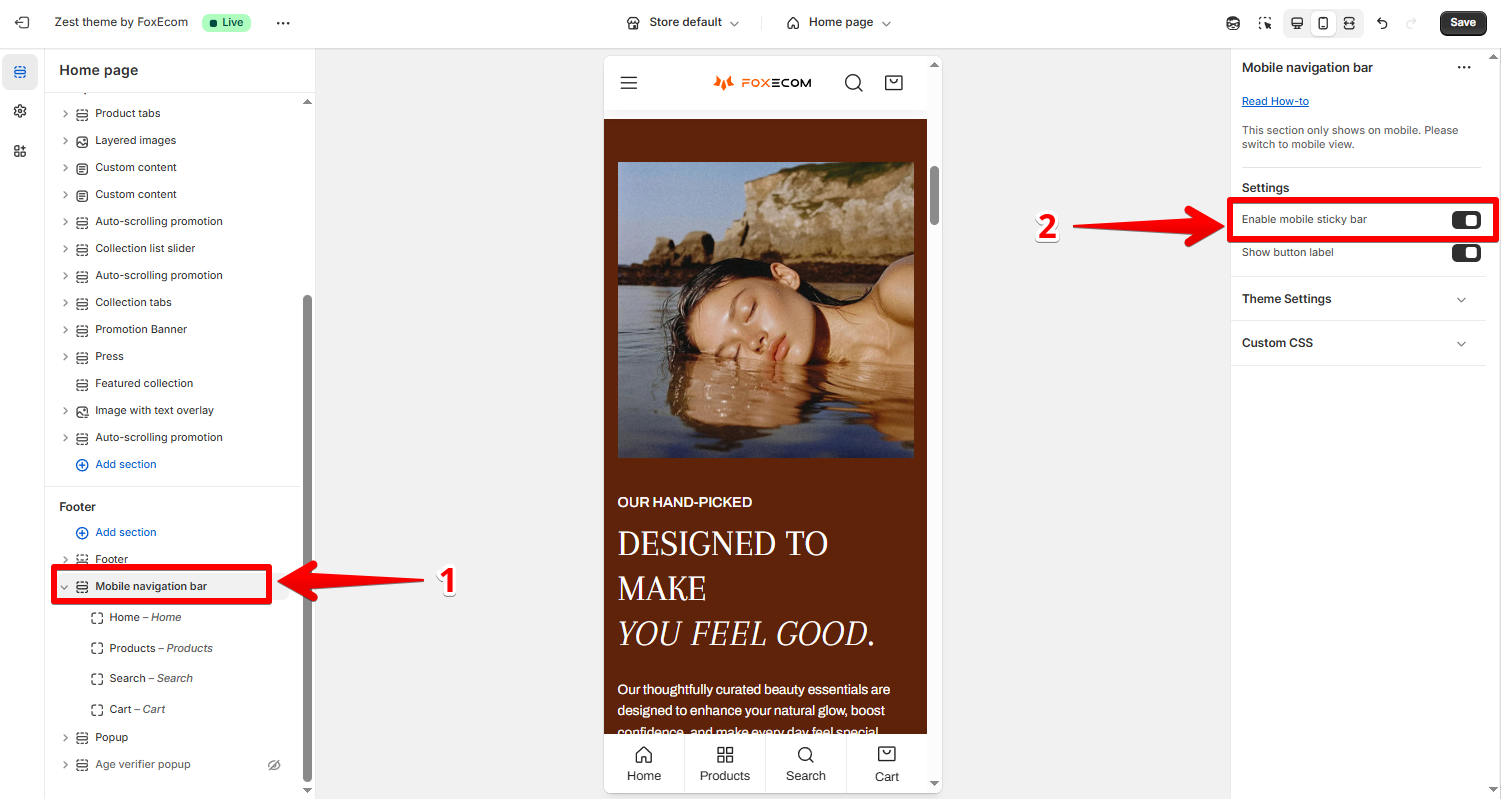
How to enable the mobile navigation bar?
- In the theme editor (Customize), click Mobile navigation bar
- Select Enable mobile sticky bar
- Save.
How to customize the mobile navigation bar
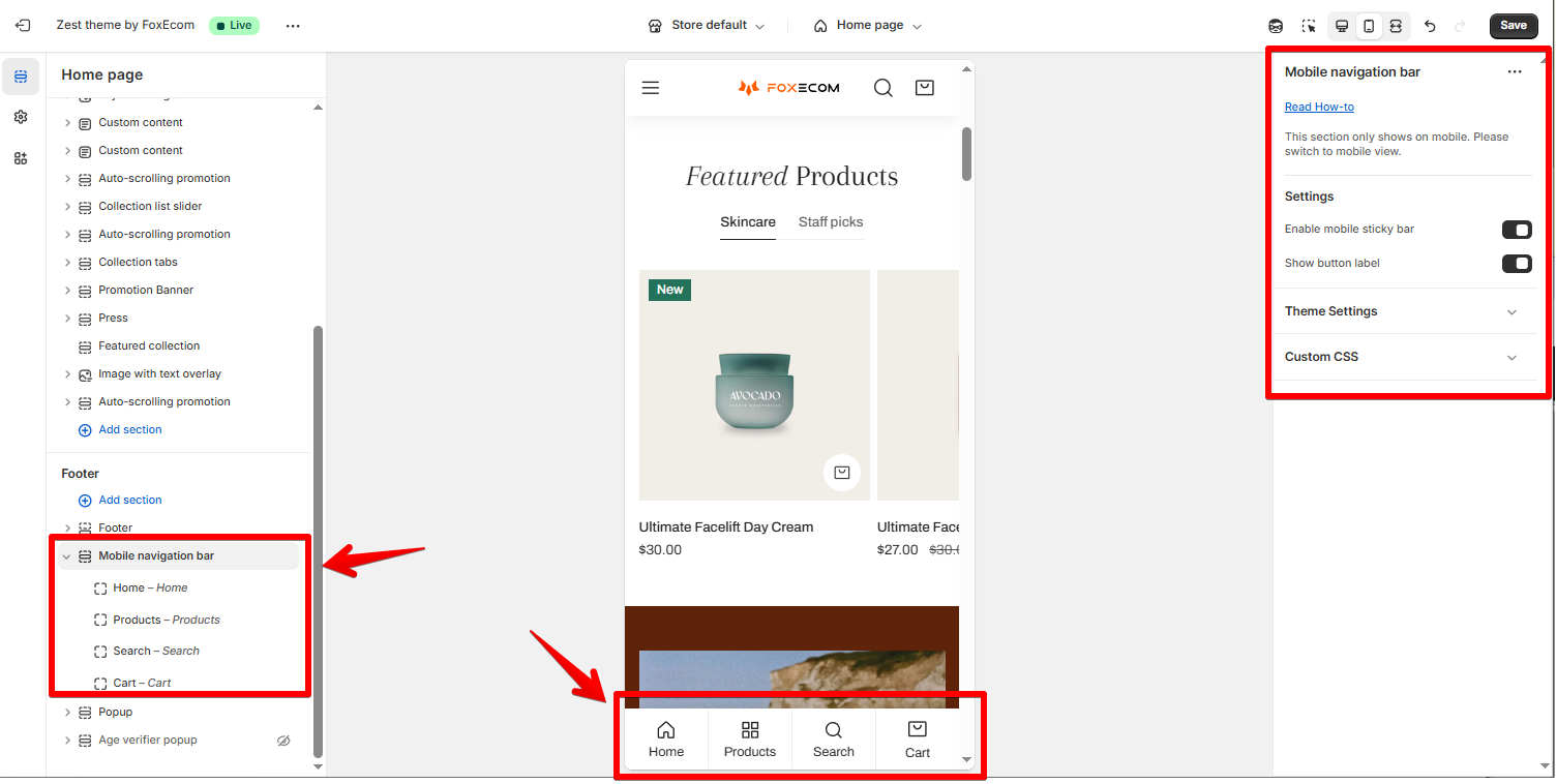
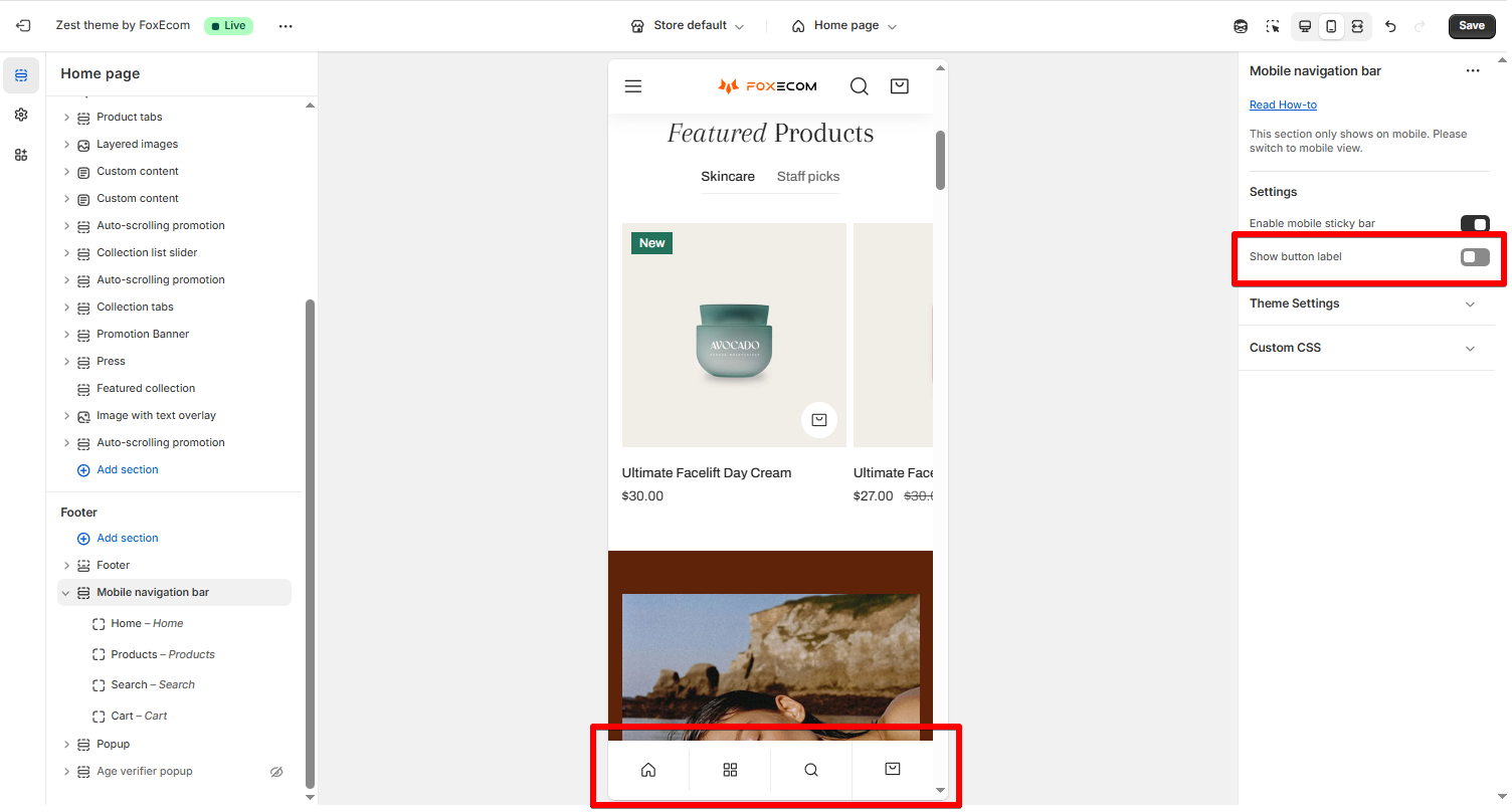
Section settings
- Show button label: You can show/hide the button labels by checking/unchecking the box.
Blocks settings
- Home: Get back to the home page.
- All products: Redirect customers to the all product page.
- Search: Let customers search for products.
- Cart: Let customers check the items they have added or check out.
- Custom link: Redirect customers to an attached link page as desired, see more here.
Last updated