
Theme Sections
Collection list
2 min read
_Cy83fdGZ.jpg)
How to add a Collection list section to your Shopify store
- In the theme editor (Customize), click Add section.
- Locate Collection list.
- Make necessary changes.
- Save.
✍ To know more about creating and editing collections, refer to this tutorial.
How to edit a Collection list
Section settings
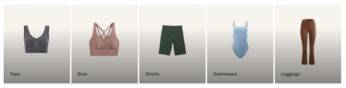
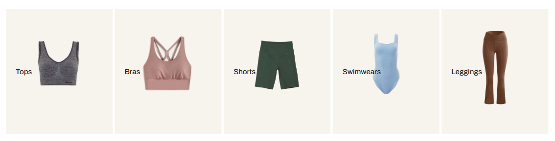
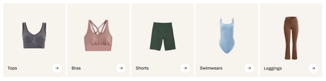
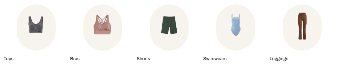
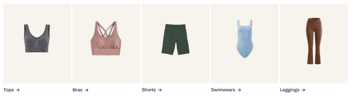
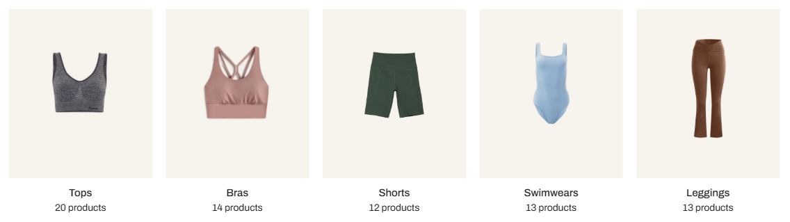
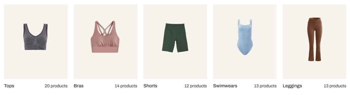
Collection card
- Style: Control how the collection cards display.
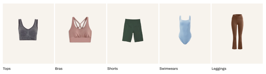
- Show product count: Show the number of products included in the collection.
Grid settings
- Number of columns on desktop: Display from 2 to 12 collection cards per row.
- Column gap / Row gap: Adjust spacing between cards.
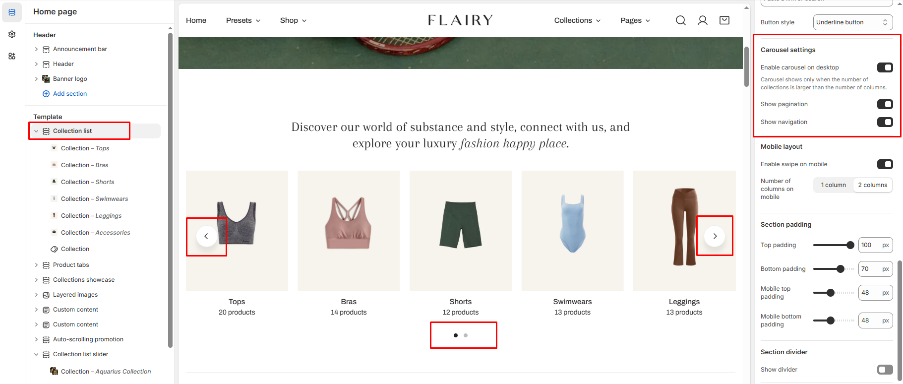
Carousel
- Enable carousel on desktop: When enabled, the section turns into a horizontal scroll if your collections exceed the number of columns.
- Show pagination: Displays dots below the carousel.
- Show navigation: Displays arrows to navigate between slides.
Mobile layout
- Enable swipe on mobile: Allows horizontal scrolling.
- Number of columns on mobile: Choose between 1 or 2 columns for mobile view.
Block settings
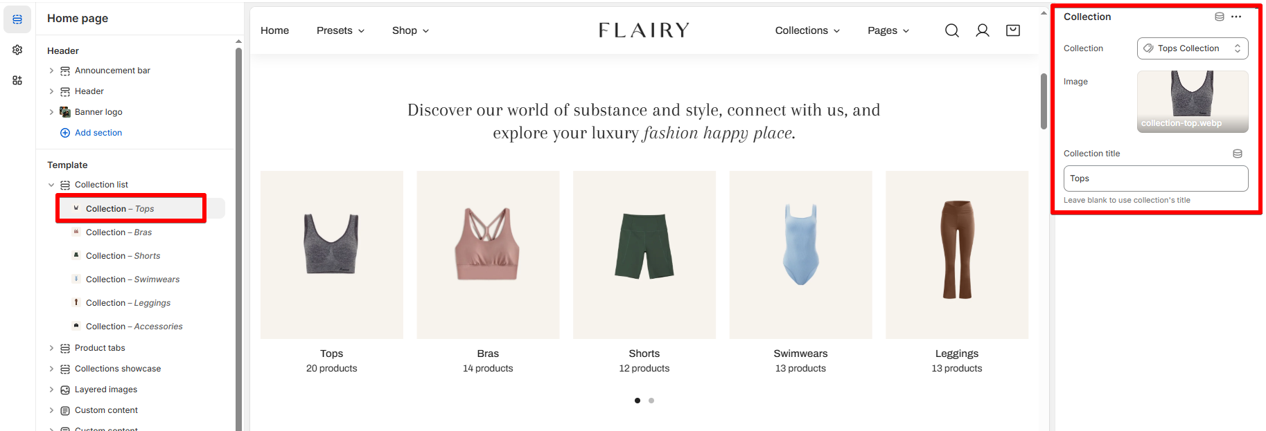
- Collection: Select which Shopify collection to display.
- Image: Optional custom image override for the collection card.
- Collection title: Add a custom name (or leave blank to use the collection’s default title).
Last updated