# Collage tab

<figure><img src="https://1836495117-files.gitbook.io/~/files/v0/b/gitbook-x-prod.appspot.com/o/spaces%2FOdebKCa6IK9qfbdvSKj0%2Fuploads%2FL5Xq94hngKaNNqDCpfGu%2FFox-BG%20Light%20(20).jpg?alt=media&#x26;token=6d0042e2-7d95-45cc-aef8-62be768fa538" alt=""><figcaption></figcaption></figure>

Use the **Collage tabs** section to organize content into horizontal tabs, each with its own image and message. Perfect for highlighting multiple promotions, collections, or brand categories without overwhelming your homepage.

{% hint style="info" %}
This section is available on ✨ **Zest version 7.0.0 onwards**. See our [changelog](https://docs.foxecom.com/zest-theme/changelog "mention")
{% endhint %}

## How to add a Collage tab section to your Shopify store

{% hint style="success" %}
**Steps:**

1. In the theme editor **(Customize)**, click **Add section**
2. Select **Collage tabs**
3. Make necessary changes
4. **Save.**
   {% endhint %}

## How to edit a Collage tab section
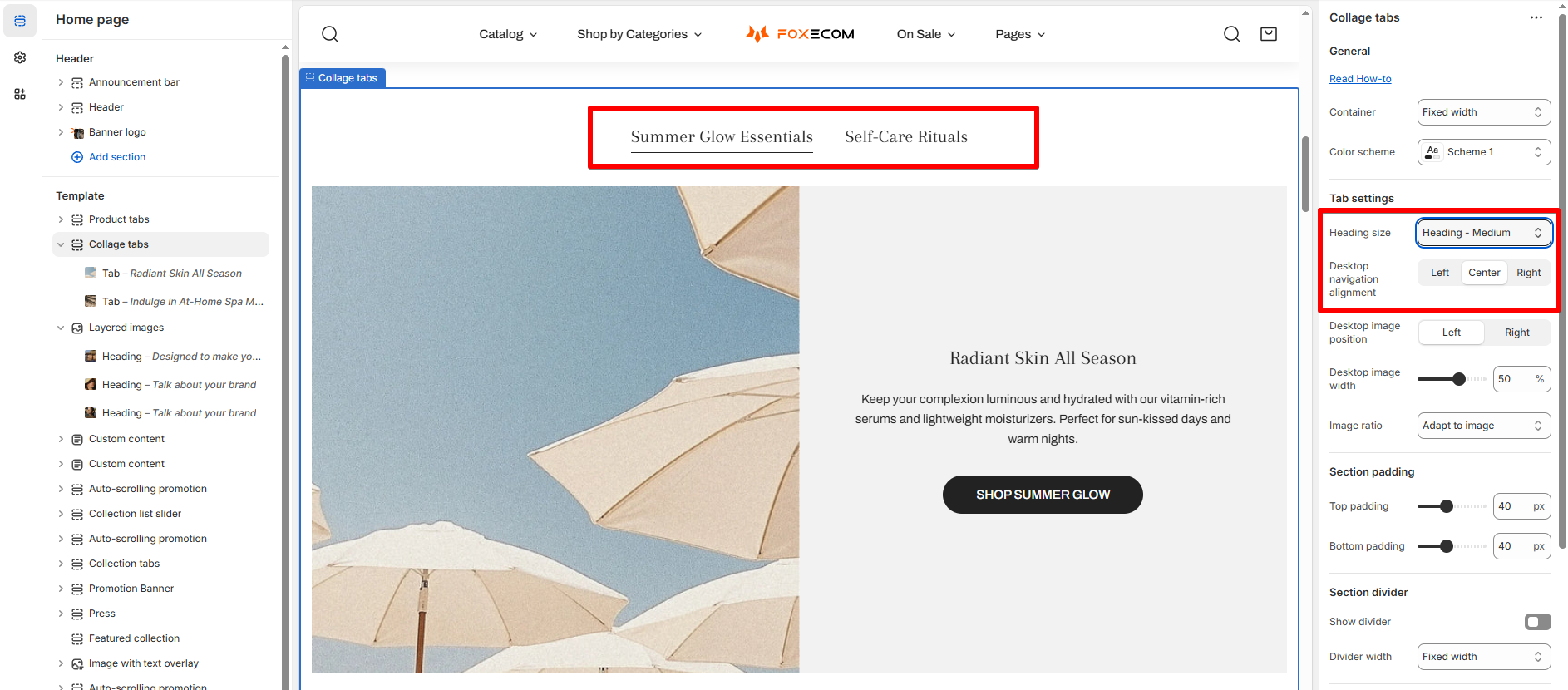
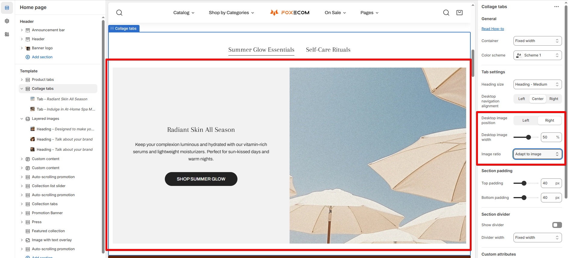
### Section settings

<table><thead><tr><th width="270">Setting</th><th>Description</th></tr></thead><tbody><tr><td><strong>Heading size</strong></td><td>Controls the tab title text size.</td></tr><tr><td><strong>Desktop navigation alignment</strong></td><td>Position of the tab navigation bar (Left / Center / Right).<br></td></tr><tr><td><strong>Desktop image position</strong></td><td>Left or Right alignment of the image relative to text.</td></tr><tr><td><strong>Desktop image width</strong></td><td>Adjust how much space the image takes (in %).</td></tr><tr><td><strong>Image ratio</strong></td><td>Maintain consistent height with Fixed ratio or match original image with Adapt to image.
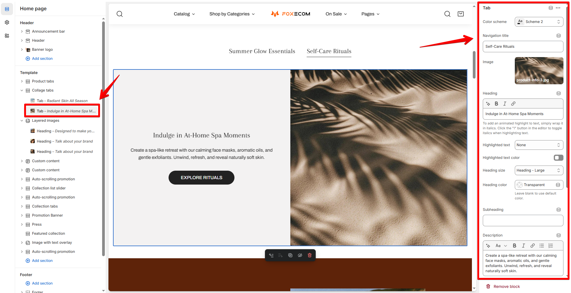
<br></td></tr></tbody></table>

<figure><img src="https://1836495117-files.gitbook.io/~/files/v0/b/gitbook-x-prod.appspot.com/o/spaces%2FOdebKCa6IK9qfbdvSKj0%2Fuploads%2F3dmkkLPg4OhpuZOfhHVq%2Fimage.png?alt=media&#x26;token=100aef46-55f6-41fa-95f8-fa4b67cd4428" alt=""><figcaption></figcaption></figure>

<figure><img src="https://1836495117-files.gitbook.io/~/files/v0/b/gitbook-x-prod.appspot.com/o/spaces%2FOdebKCa6IK9qfbdvSKj0%2Fuploads%2FXElEmJ0ci3hjqg7w7If4%2Fimage.png?alt=media&#x26;token=54be7ab4-3d82-47a0-94bf-b088086187a5" alt=""><figcaption></figcaption></figure>

### Block settings

Each tab is a block inside the section. You can add multiple.

| Setting                   | Description                                                                                                                                                                                                     |
| ------------------------- | --------------------------------------------------------------------------------------------------------------------------------------------------------------------------------------------------------------- |
| **Color scheme**          | <p>Choose from your theme’s predefined color schemes for background/text.<br>Learn how to add color schemes: <a data-mention href="../theme-settings/colors-and-color-schemes">colors-and-color-schemes</a></p> |
| **Navigation title**      | The name that appears in the tab navigation bar. Keep it short.                                                                                                                                                 |
| **Image**                 | Upload a high-quality image to visually represent the content.                                                                                                                                                  |
| **Heading / Subheading**  | Main messaging. You can bold, italicize, or highlight text.                                                                                                                                                     |
| **Description**           | Add supporting text, product info, or promotional messages.                                                                                                                                                     |
| **Text alignment**        | Aligns heading, subheading, and description (Left / Center / Right).                                                                                                                                            |
| **Button label**          | Add a call-to-action (e.g. “Shop Now”). Leave blank to hide.                                                                                                                                                    |
| **Button link**           | Paste the URL or use Shopify’s link selector.                                                                                                                                                                   |
| **Button style**          | Choose between primary, secondary, white or underline button.                                                                                                                                                   |
| **Mobile text alignment** | Option to override desktop text alignment on mobile.                                                                                                                                                            |

<figure><img src="https://1836495117-files.gitbook.io/~/files/v0/b/gitbook-x-prod.appspot.com/o/spaces%2FOdebKCa6IK9qfbdvSKj0%2Fuploads%2FHlbFQ8H3JxmEknwsDM7F%2Fimage.png?alt=media&#x26;token=145df9a9-a2de-46e3-bd4a-79178d1c481a" alt=""><figcaption></figcaption></figure>

## Best practices

* **Stick to 2–3 tabs** to avoid overwhelming shoppers.
* Use **cohesive visuals** across tabs to maintain brand consistency.


---

# Agent Instructions: Querying This Documentation

If you need additional information that is not directly available in this page, you can query the documentation dynamically by asking a question.

Perform an HTTP GET request on the current page URL with the `ask` query parameter:

```
GET https://docs.foxecom.com/zest-theme/theme-sections/collage-tab.md?ask=<question>
```

The question should be specific, self-contained, and written in natural language.
The response will contain a direct answer to the question and relevant excerpts and sources from the documentation.

Use this mechanism when the answer is not explicitly present in the current page, you need clarification or additional context, or you want to retrieve related documentation sections.
