
Theme Sections
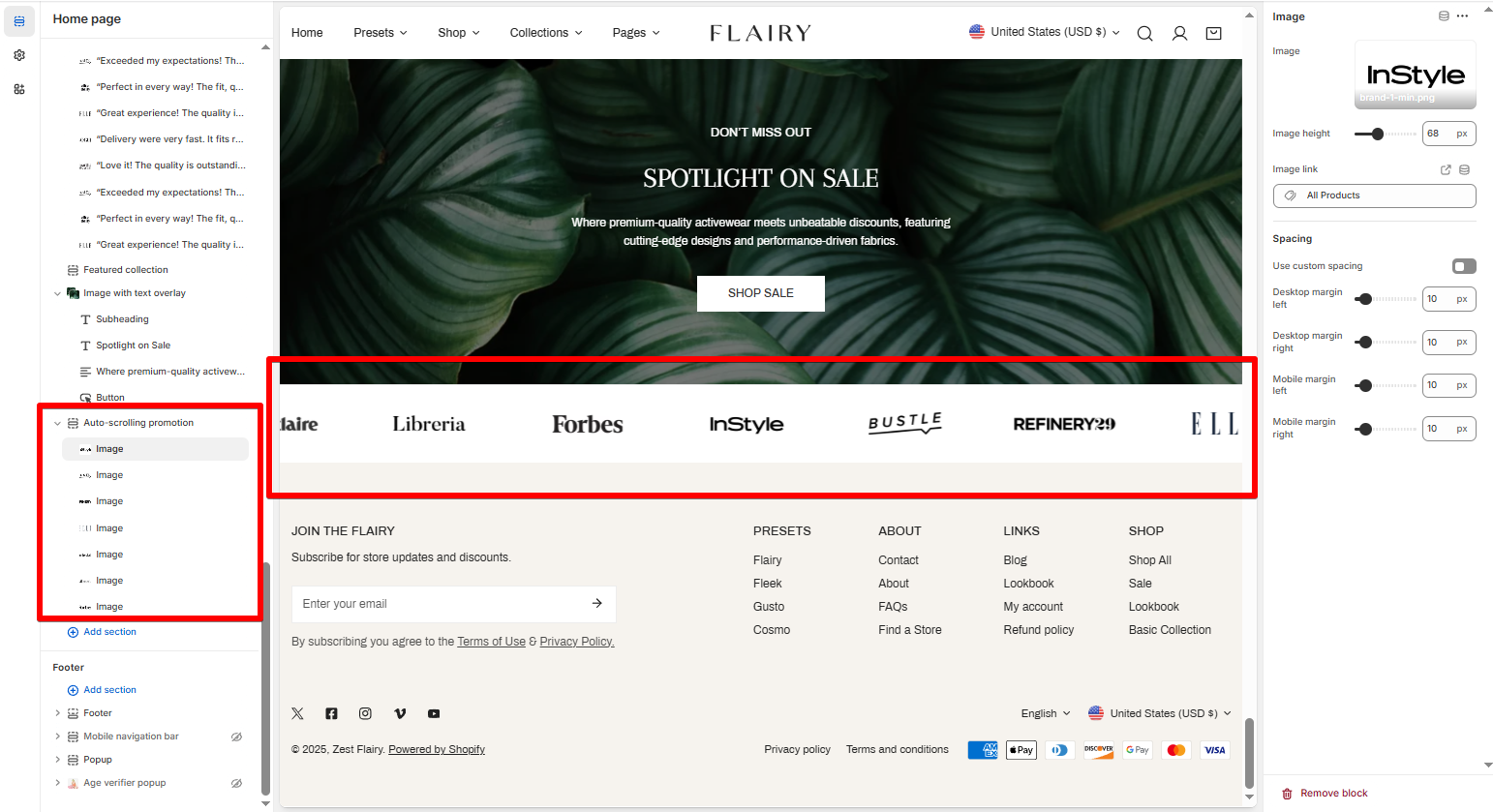
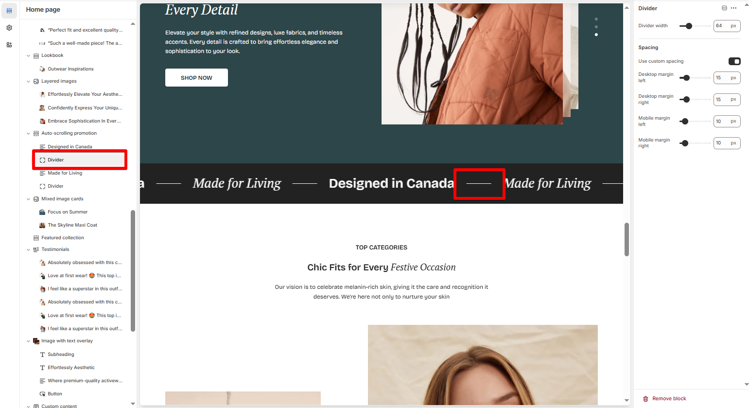
Auto-scrolling promotion
2 min read
_5cRmsZBr.jpg)
How to add an Auto-scrolling promotion section to your Shopify store
- In the theme editor (Customize), click Add section.
- In the left sidebar, click Add section > Auto-scrolling promotion.
- Make necessary changes.
- Save.
How to edit an Auto-scrolling promotion section
Section settings
| Setting | Description |
|---|---|
| Section header | Add a heading, subheading, and description. You can use italic text to create animated highlights. |
| Vertical alignment | Align content to Top, Middle, or Bottom. |
| Direction | Scroll Left or Right. |
| Pause scroll on hover | Stop scrolling when a visitor hovers over the section. |
| Speed | Control scrolling speed (e.g., 0.1x for slow). |
| Item gap / Item gap mobile | Set space between items for desktop and mobile. |
Block settings
Last updated