
Theme Sections
Image with text
2 min read
_BmVhzWvl.jpg)
How to add an Image with text section to your Shopify store
- In the theme editor (Customize), click Add section.
- Locate Image with text.
- Make necessary changes.
- Save.
How to edit an Image with text section
Section settings
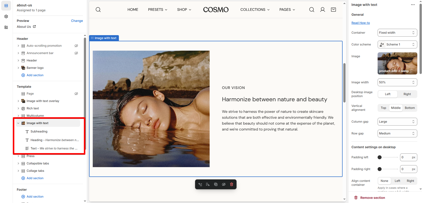
| Setting | Description |
|---|---|
| Image | Upload or select your image. |
| Image width | Set how much horizontal space the image takes up. |
| Desktop image position | Choose whether the image shows on the left or right side of the text. |
| Vertical alignment | Align content to the top, middle, or bottom of the section. |
| Column gap | Adjust horizontal spacing between the image and text. |
| Row gap | Adjust vertical spacing on mobile layout. |
| Padding left/right | Add extra spacing inside the content container. |
| Align content container | If the section is full-width, use this to align the inner content left, center, or right. |
Block settings
| Block | Description |
|---|---|
| Subheading | Optional text—good for labels or context. |
| Heading | Main title of your section. Accepts rich text formatting. |
| Text | Body copy for your message. |
| Button | Add a clickable call-to-action to guide users. |
Pro tip 💡
Last updated