
Theme Sections
Press
1 min read
_xIjP3TKB.jpg)
How to add a Press section to your Shopify store
- In the theme editor (Customize) > click Add section.
- Locate Press.
- Make necessary changes.
- Save.
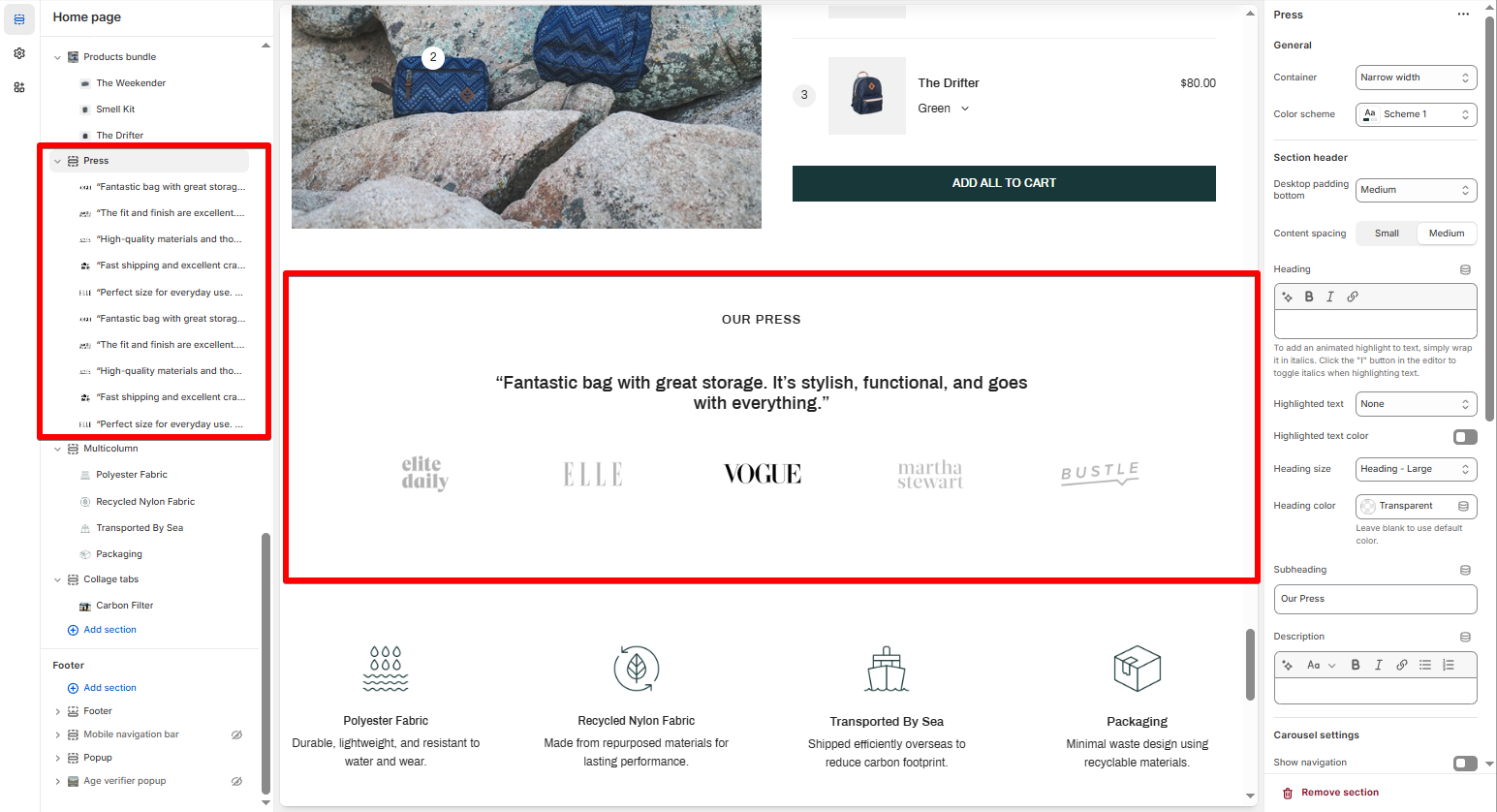
How to edit a Press section
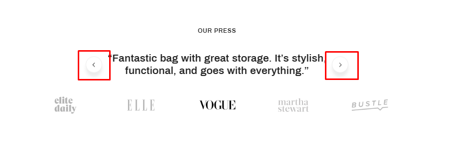
Section settings
- Carousel settings: Enable or disable navigation arrows and auto-rotate.
- Change slides every: Set the rotation speed (in seconds).
Block settings
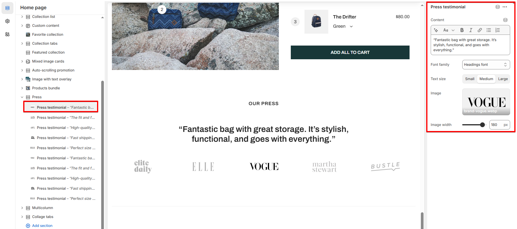
| Setting | Description |
|---|---|
| Content | Add your quote or testimonial text. |
| Font family | Choose font style (Headings, Body) |
| Text size | Small / Medium / Large |
| Image | Upload the logo of the publication or brand |
| Image width | Adjust size of the logo in pixels |
💡 Pro tips
- Keep quotes short and impactful.
- Use greyscale or subtle logos to maintain visual consistency.
- Upload logos in .webp or .svg format for best performance.
- To boost credibility, prioritize well-known media mentions near the front of the carousel.
Last updated