
Theme Sections
Product tabs
2 min read
_GIfTqjqI.jpg)
How to add a Product tabs section to your Shopify store
- In the theme editor (Customize), click Add section.
- Locate Product tabs.
- Make necessary changes.
- Save.
How to edit a Product tabs section
Section settings
✍ Section header
⚙️ Grid settings
| Setting | Description |
|---|---|
| Layout | Choose to display the section header with the View all button in horizontal or vertical layout. |
| Products to show | Limit the number of products displayed. |
| Number of columns on desktop | Set how many products display per row (2–12 columns). |
| Column / Row gap | Control spacing between items in the grid. |
🎠 Carousel settings
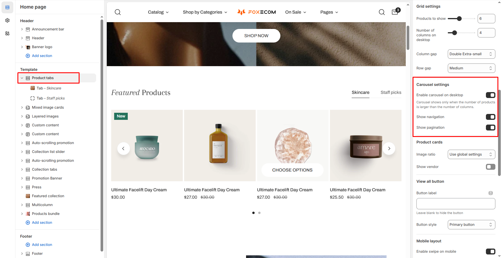
| Setting | Description |
|---|---|
| Enable carousel on desktop | Turns the static grid into a scrollable carousel (only if items > columns). |
| Show navigation / pagination | Adds arrows or page dots to the carousel. |
🛍️ Product card settings
| Setting | Description |
|---|---|
| Image ratio | Inherit global settings or choose a fixed ratio for product cards' image. |
| Show vendor | Toggle whether to display the product’s vendor name. |
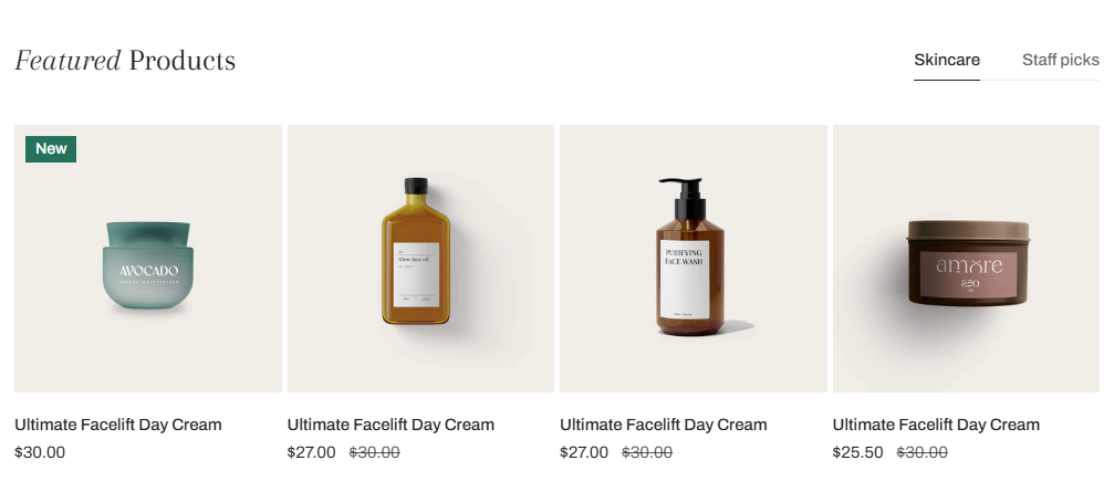
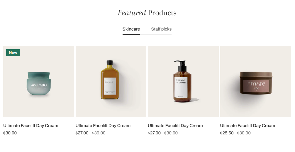
Product card
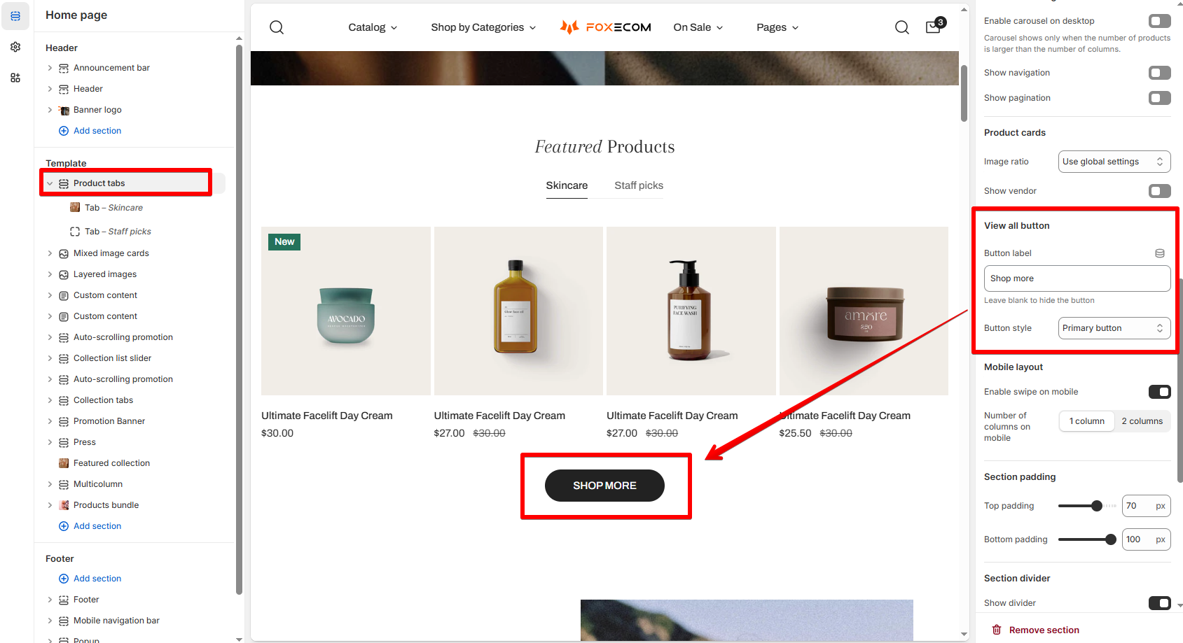
🔘 View all button
| Setting | Description |
|---|---|
| Show on heading section | Enables the “View all” link next to your heading. |
| Button label | Customize the CTA. |
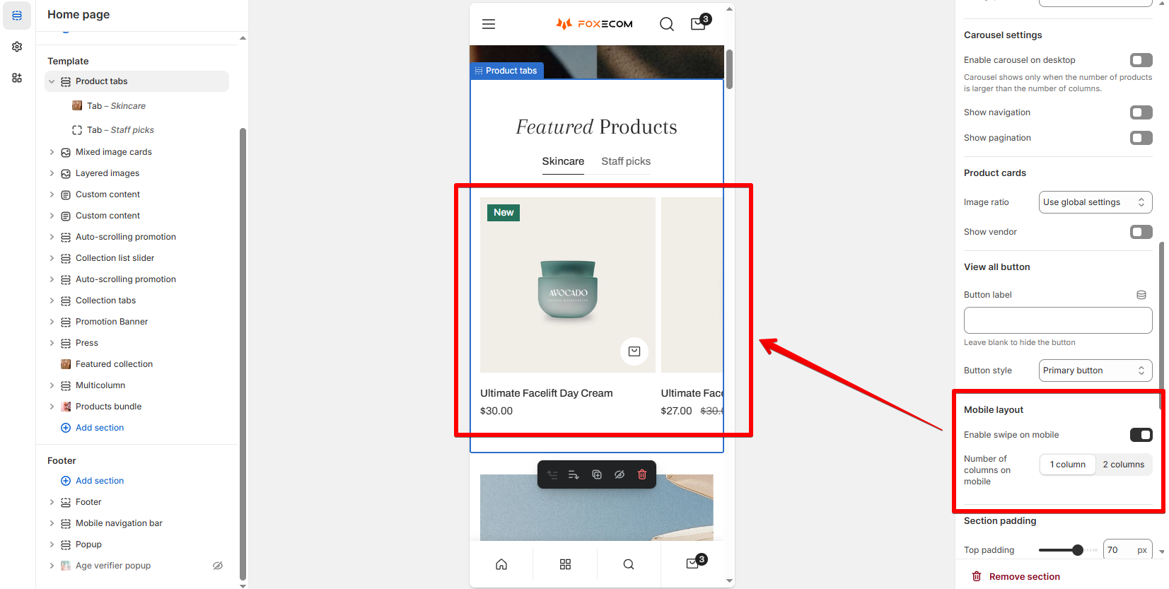
📱 Mobile layout
| Setting | Description |
|---|---|
| Enable swipe on mobile | Allow horizontal swipe navigation. |
| Number of columns | Choose 1 or 2 columns on mobile. |
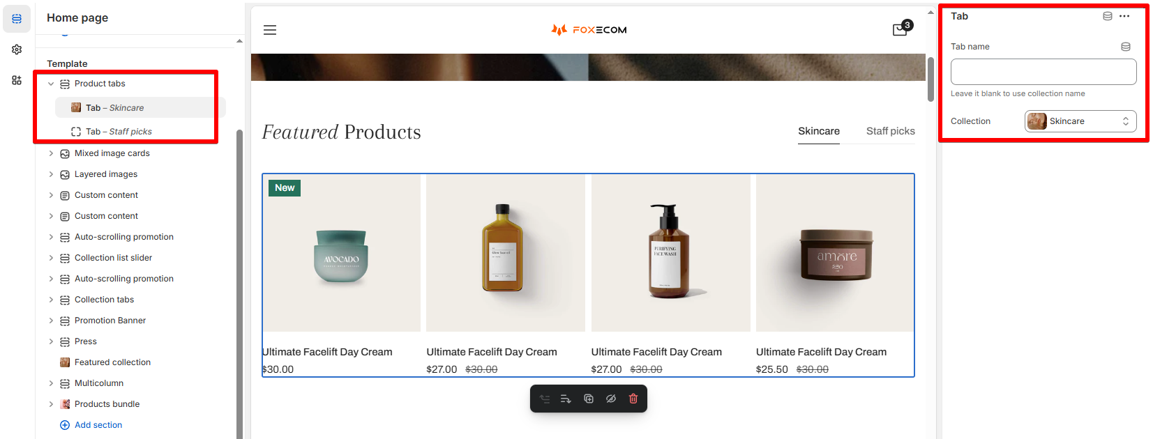
Block settings
- Give the tab name. Leave it blank to use the collection name.
- Select a Collection.
Best practices
You might be interested: My store has a low speed score - How can I improve it?
Last updated