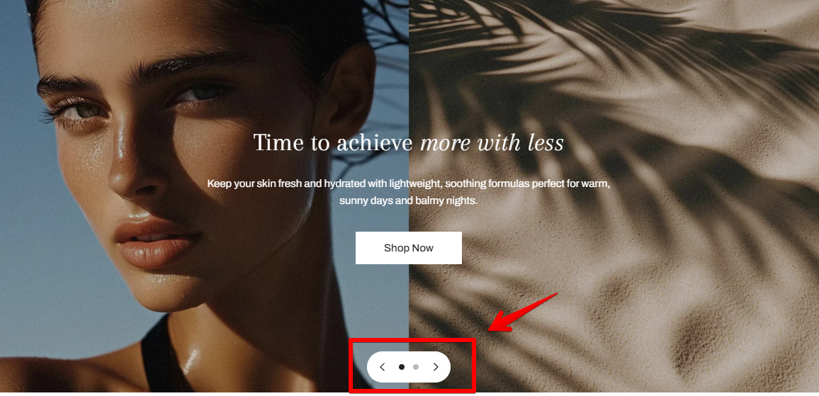
 |
| **Auto-rotate slides** | Automatically advance slides after a set time |
| **Change slides every** | Set how many seconds before slides rotate (if auto-rotate is enabled) |
| **Controls background** | Choose the color style for nav arrows:
|
| **Auto-rotate slides** | Automatically advance slides after a set time |
| **Change slides every** | Set how many seconds before slides rotate (if auto-rotate is enabled) |
| **Controls background** | Choose the color style for nav arrows:• `Dark`
• `Light`
• `None`


 |
| **Desktop controls position** | Position nav arrows: `Left`, `Center`, or `Right` |
| **Pagination type** | Choose between:
|
| **Desktop controls position** | Position nav arrows: `Left`, `Center`, or `Right` |
| **Pagination type** | Choose between:• `Dots` – simple visual dots
• `Counter` – e.g., “1 / 2”
 |
| **Show content below images on mobile** | If enabled, moves all text/buttons below the image on mobile
|
| **Show content below images on mobile** | If enabled, moves all text/buttons below the image on mobile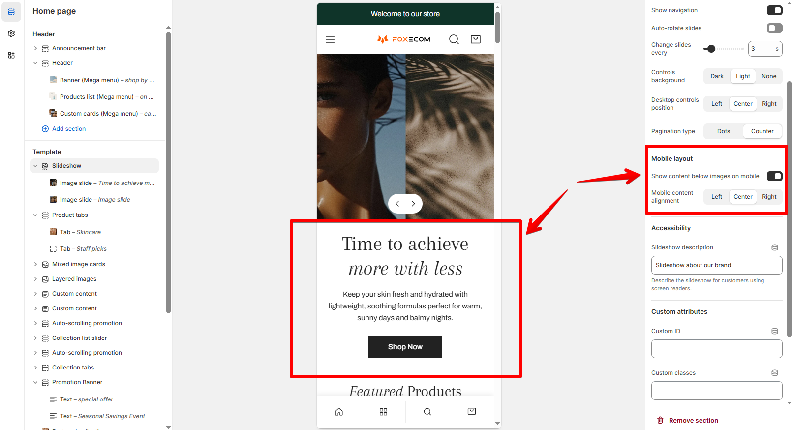 |
| **Mobile content alignment** | Align text on mobile: `Left`, `Center`, or `Right` |
| **Slideshow description** | Add alt text for screen readers (accessibility best practice) |
|
| **Mobile content alignment** | Align text on mobile: `Left`, `Center`, or `Right` |
| **Slideshow description** | Add alt text for screen readers (accessibility best practice) |