# Handpicked products

<figure><img src="https://1836495117-files.gitbook.io/~/files/v0/b/gitbook-x-prod.appspot.com/o/spaces%2FOdebKCa6IK9qfbdvSKj0%2Fuploads%2FtQWFqopjxdq857jQ0nRi%2FFox-BG%20Light%20(38).jpg?alt=media&#x26;token=e3effb9b-ba17-4851-b1a0-595e1b2dfaea" alt=""><figcaption></figcaption></figure>

The handpicked products section lets you display a product grid with handpicked items from your store inventory. Thanks to the handpicked products section, you can point visitors to the exact products that you want to highlight.&#x20;

## How to add a Handpicked products section to your Shopify store

{% hint style="success" %}
Steps:

1. In the theme editor **(Customize)**, click **Add section.**
2. Select **Handpicked products.**
3. Make necessary changes.
4. **Save.**
   {% endhint %}

## How to customize a Handpicked products section

### Text & Styling

* **Heading**: Title of the section.
* **Subheading**: Optional text shown above the heading.
* **Description**: Add supporting copy to explain the selection or context.

### Products

* **Products**: Select up to **50 individual products** from your store.
* To reorder them, simply drag and drop in the theme editor.
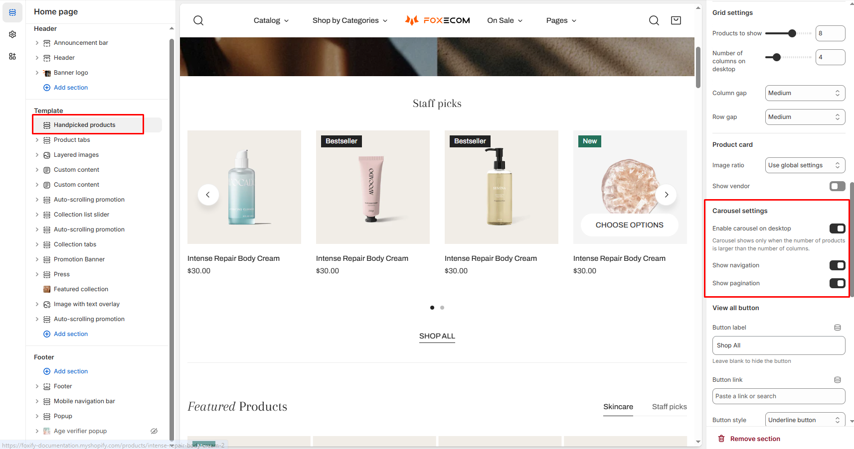
{% hint style="info" %}
💡 **Pro tip**: You can combine products from different collections in one list. Great for gift guides or curated bundles.
{% endhint %}

### Grid settings

* **Products to show**: Choose how many products appear in total. If you enable a carousel, more can be shown via scroll.
* **Number of columns on desktop**: Control how many products display per row.
* **Column gap / Row gap**: Adjust the spacing between product cards.

### Carousel settings

* **Enable carousel on desktop**: When enabled, products can be scrolled horizontally.
* **Show navigation/pagination**: Optional arrows or dots for easier browsing.

<figure><img src="https://1836495117-files.gitbook.io/~/files/v0/b/gitbook-x-prod.appspot.com/o/spaces%2FOdebKCa6IK9qfbdvSKj0%2Fuploads%2Fs02wVWzr8QrcOTqJyaNN%2Fimage.png?alt=media&#x26;token=070e88ac-a0b5-4788-abb1-2cf23d1607bb" alt=""><figcaption></figcaption></figure>

{% hint style="warning" %}
Carousel will only appear if the number of products exceeds the number of columns. For example, if you show 4 products per row, the carousel needs 5+ products.
{% endhint %}

### Product card settings

* **Image ratio**: Choose how product images display (square, portrait, adapt to image, etc.)
* **Show vendor**: Toggle the brand/vendor name below the product title.
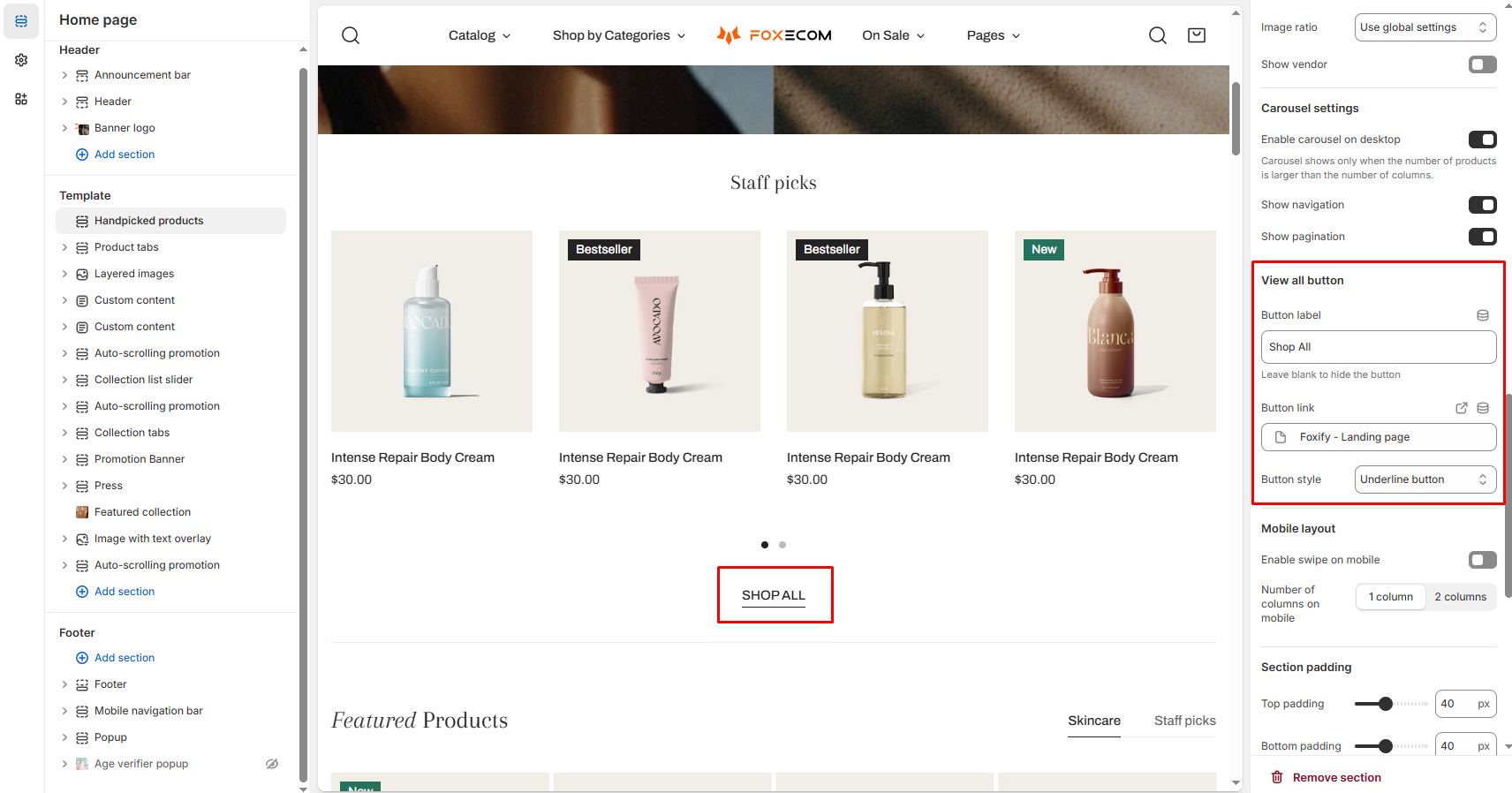
{% hint style="info" %}
📝 Tip: Use “Use global settings” to keep image sizes consistent across all product sections.
{% endhint %}

### View all button

* **Button label**: Customize the text.
* **Button link**: Paste the link to a collection, page, or product.
* **Button style**: Choose from solid, outline, or underline styles.
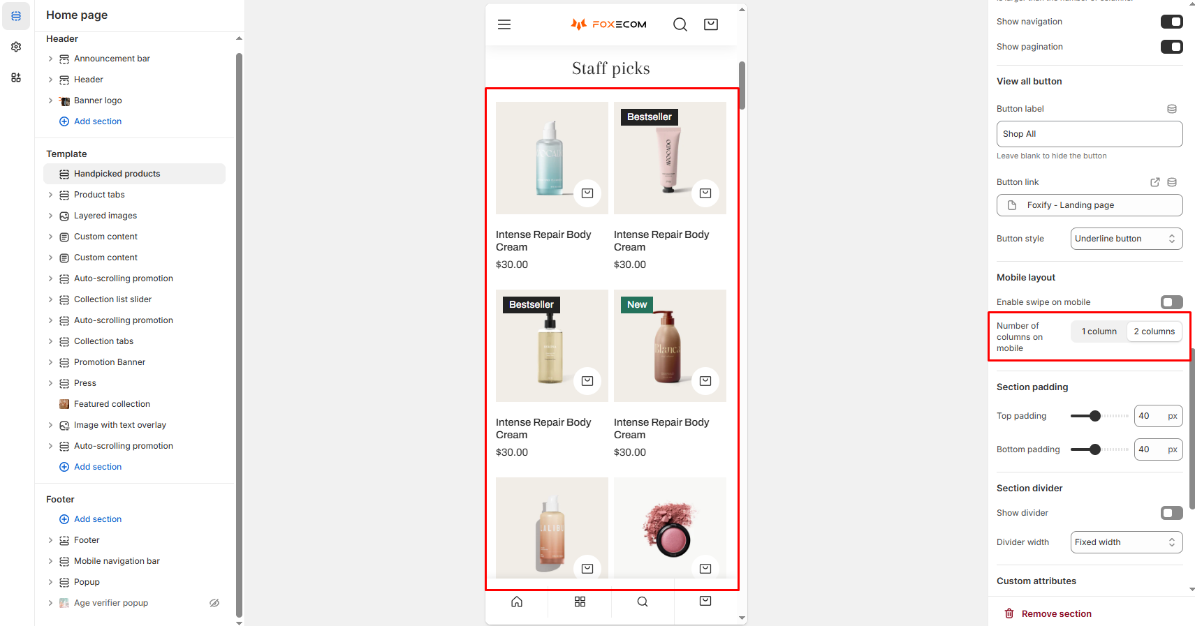
Optional: Leave the link field empty if you don’t want to show this button.

<figure><img src="https://1836495117-files.gitbook.io/~/files/v0/b/gitbook-x-prod.appspot.com/o/spaces%2FOdebKCa6IK9qfbdvSKj0%2Fuploads%2F2NOdEdVx6dBeMdKZm8VA%2Fimage.png?alt=media&#x26;token=9be898f9-c895-4d16-ad31-544a127e7043" alt=""><figcaption></figcaption></figure>

### Mobile layout

* **Enable swipe on mobile**: Let mobile users swipe horizontally through the products.
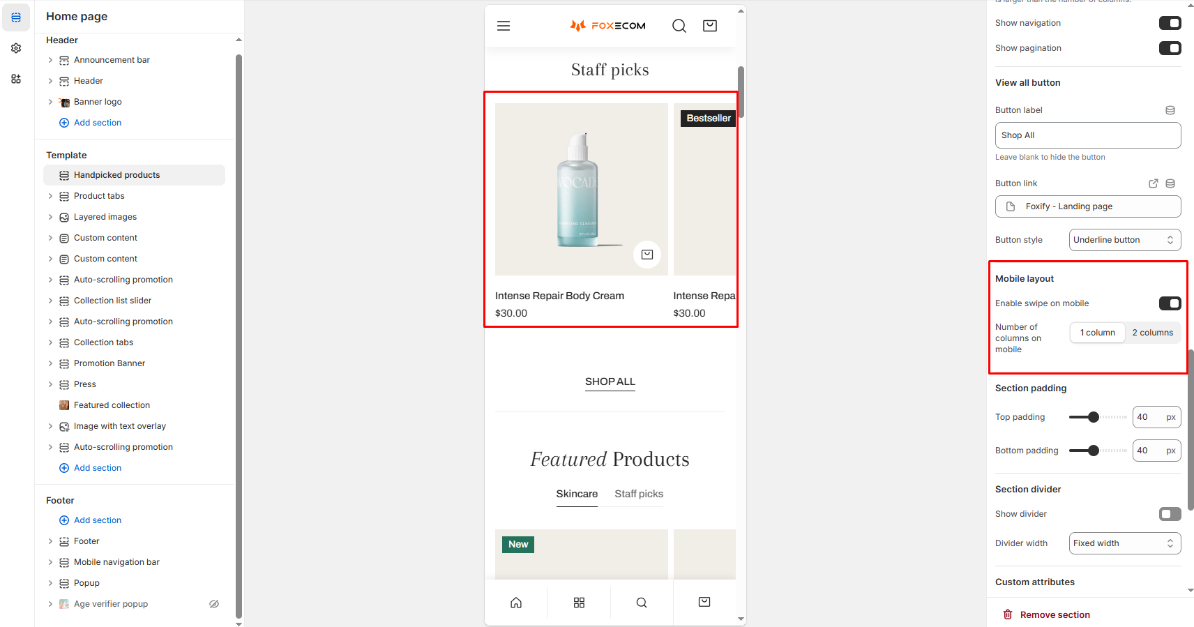
<figure><img src="https://1836495117-files.gitbook.io/~/files/v0/b/gitbook-x-prod.appspot.com/o/spaces%2FOdebKCa6IK9qfbdvSKj0%2Fuploads%2FZv005O92XBea30wy23LV%2Fimage.png?alt=media&#x26;token=9a2920fa-feae-4371-85ff-e301baf43567" alt=""><figcaption></figcaption></figure>

* **Number of columns on mobile**: Choose between 1 or 2 columns.

<figure><img src="https://1836495117-files.gitbook.io/~/files/v0/b/gitbook-x-prod.appspot.com/o/spaces%2FOdebKCa6IK9qfbdvSKj0%2Fuploads%2FtCXCC1xxnZLn45SCtoWw%2Fimage.png?alt=media&#x26;token=688bf8b4-1c17-4c2f-bb47-cbf525148ac3" alt=""><figcaption></figcaption></figure>
