# Color swatches
✨ This tutorial is applied for Zest version 8.3.0 and older ✨
By displaying color swatches on your variant picker, you allow customers to quickly view and select the available color options. This creates a more intuitive and engaging shopping experience, as customers can immediately see how each color looks and feels in context with the product.
## How to enable Color swatches
Steps
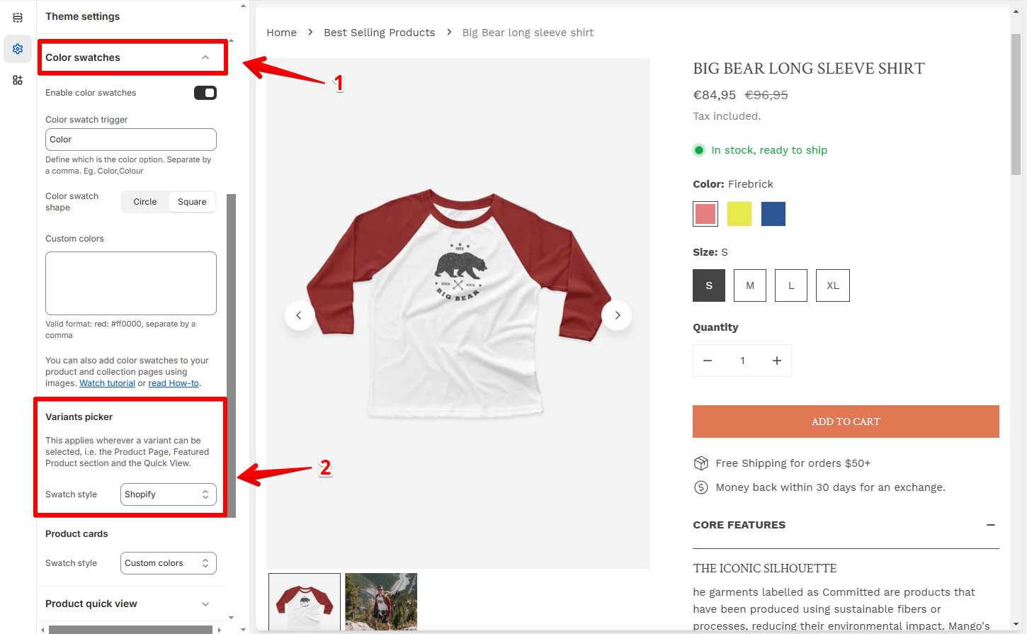
1. In the theme editor (**Customize**), click **Theme settings**
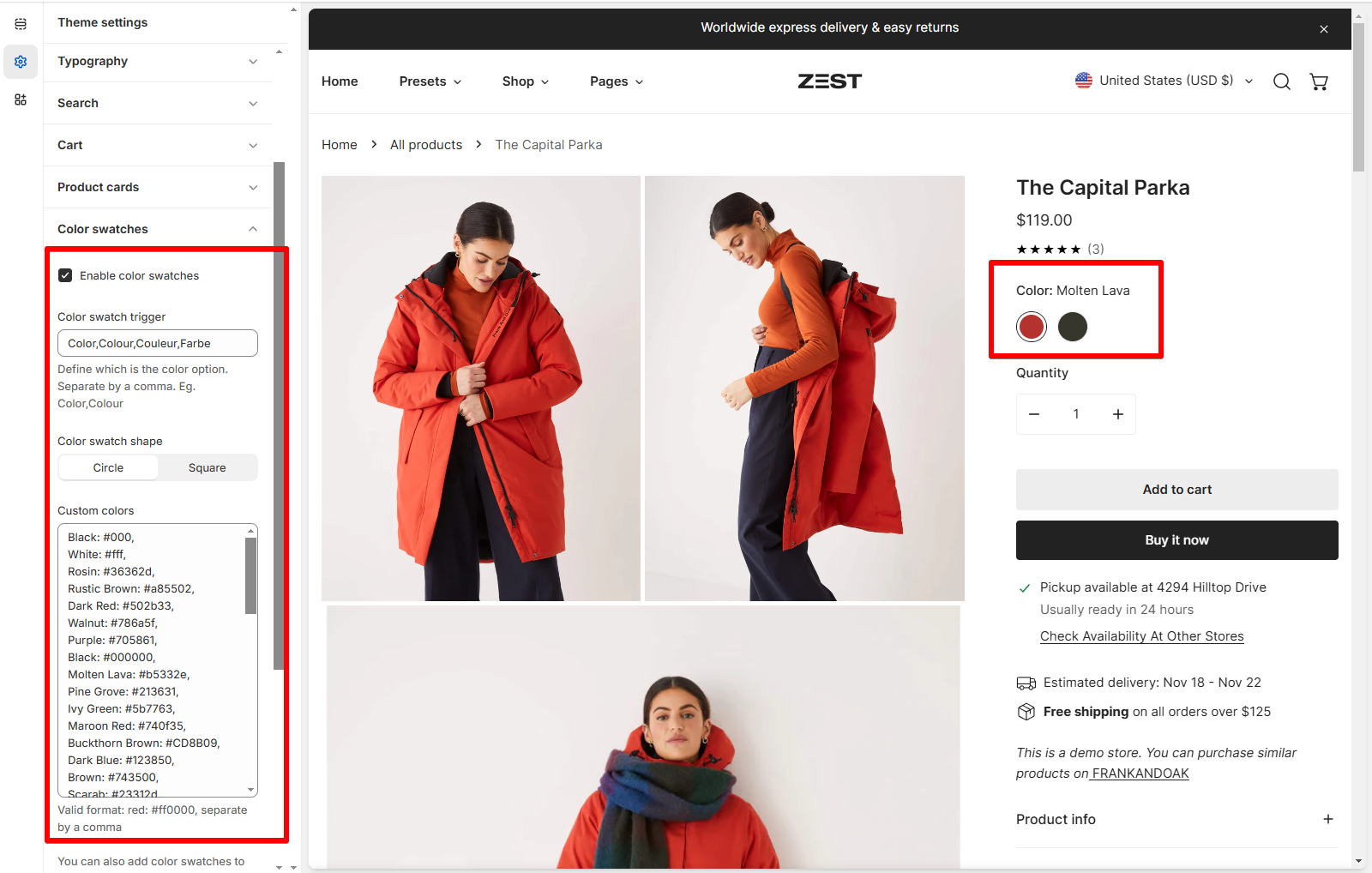
2. Locate **Color swatches**
3. Make necessary changes
4. **Save**
You can enable/disable color swatches by ticking/unticking the checkbox:
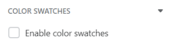
To enable swatches, your **Picker type** must be **Buttons**.
👉 The picker type of each feature can be set in the feature settings.
* [Product information](https://docs.foxecom.com/zest-theme/collections-and-products/product-page/product-information)
* [Featured product](https://docs.foxecom.com/zest-theme/theme-sections/featured-product)
* [Product quick view](https://docs.foxecom.com/zest-theme/theme-settings/product-quick-view)
### Color swatch trigger
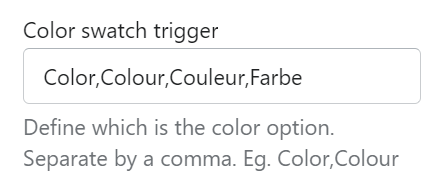
Define which is the color option by inserting your relevant product **Option names.** Separate them by a comma.
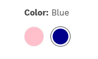
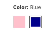
You can select the **Color swatch shape** as **Circle**/**Square**.
### Variant picker
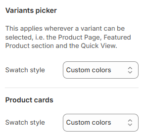
Select the **Swatch style** you want for your Variant pickers:
* [**Custom colors**](#custom-colors)
* [**Shopify swatches**](#shopify-swatches)
* [**Variant image**](#variant-image).
This applies wherever a variant can be selected.
You can choose the swatch styles for the product form (in the [Product page](https://docs.foxecom.com/zest-theme/collections-and-products/product-page/product-information#variant-picker), [Featured product](https://docs.foxecom.com/zest-theme/theme-sections/featured-product#variant-picker) section, and the [Quickview](https://docs.foxecom.com/zest-theme/theme-settings/product-quick-view)) and the [Product cards](https://docs.foxecom.com/zest-theme/theme-settings/product-card) separately.
#### Custom colors
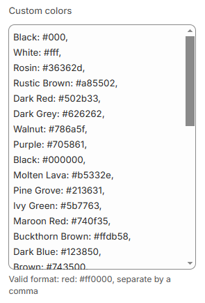
If you want to use Custom colors as your Swatch style, choose the suitable [HEX color](https://g.co/kgs/X6rdiB) codes and add them to the provided box.
Note:
* Separate items with a comma.
* Write the color name from the product option and separate options with the color HEX value.
* All texts are in lowercase.
Besides custom colors, you can also add color swatches to your product and collection pages using images:
1. Go to **Shopify admin** > **Content** > **Files.**
2. Click **Upload files.**
3. Naming your swatch files:
* **Orange** swatches would need to be named **orange.png** (capitals become lowercase).
* **Light blue** swatches would need to be named **light-blue.png** (capitals become lowercase, spaces and other special characters become hyphens).
Here are some sample images for color swatches: [light blue](https://cdn.shopify.com/s/files/1/0594/4190/5837/files/light-blue.png?v=1657771752),[ ](https://cdn.shopify.com/s/files/1/0594/4190/5837/files/orange.png?v=1657766980)[cyan](https://cdn.shopify.com/s/files/1/0594/4190/5837/files/cyan.png?v=1657766980).
🚨 **Note**: .jpg files will not be shown, you must use .png
\
👉 Watch [our tutorial](https://youtu.be/AHbJJbYlfkk?si=TXghR92CaG2g97fp\&t=82).
#### Shopify swatches
Shopify swatches for your color swatches is available from ⭐ **Zest version 8.4.0 and above** ⭐
See [Changelog](/zest-theme/changelog)
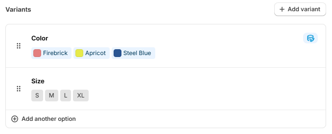
Native Shopify swatches allow you to manage your swatches directly from Shopify admin.
Native color swatches leverage Shopify categories to work.
For more information on setting up native color swatches, please check the [Shopify documentation](https://help.shopify.com/en/manual/custom-data/metafields/category-metafields/using-category-metafields).
#### Variant image
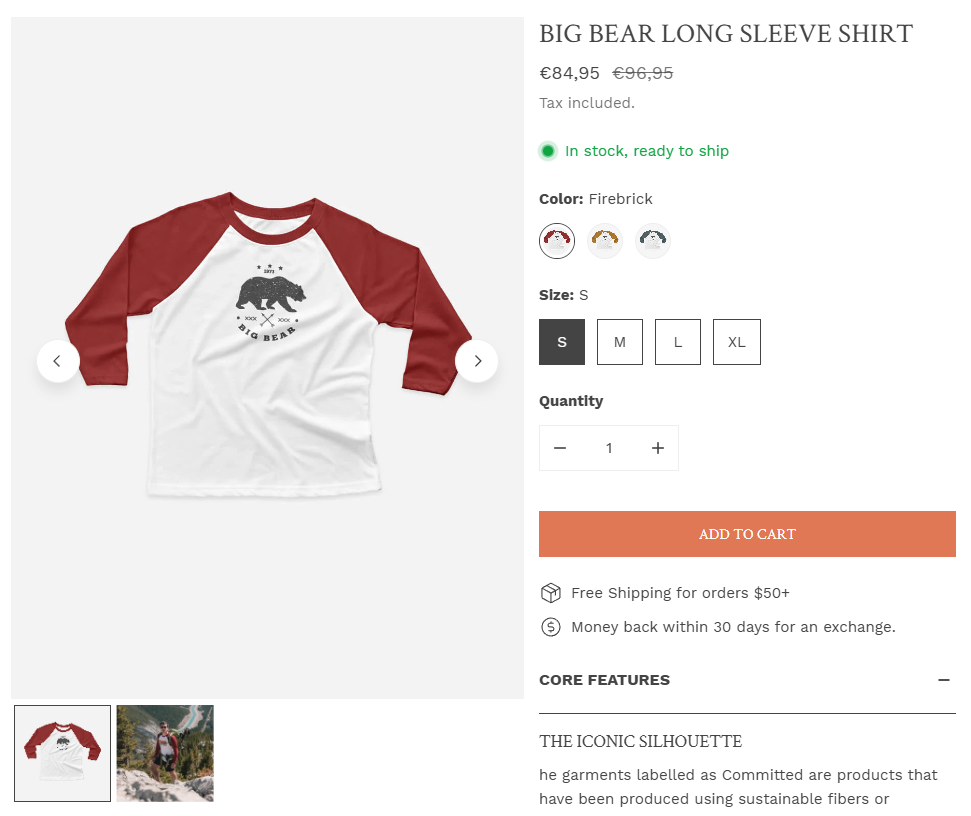
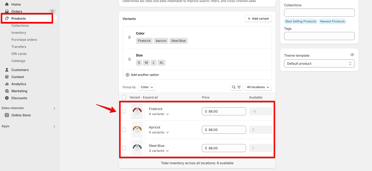
If you select the Variant image as your Swatch style, make sure you have [associated your product variants with their images](https://help.shopify.com/manual/products/product-media/add-images-variants) in Shopify **Products** > **Variants**.