Colors & Color schemes

How to change the color scheme to match the website's look and feel

One of the most important components of designing a visually appealing, functional, and accessible theme is color.

Not only does a well-designed color system reinforce a merchant’s branding, but it also has the power to enhance and improve user experiences.

Steps:

  1. In the theme editor (Customize), click Theme settings.

  2. Select Colors

  3. Manage your Schemes and other element colors.

  4. Save the changes.

Color schemes

What is a color scheme?

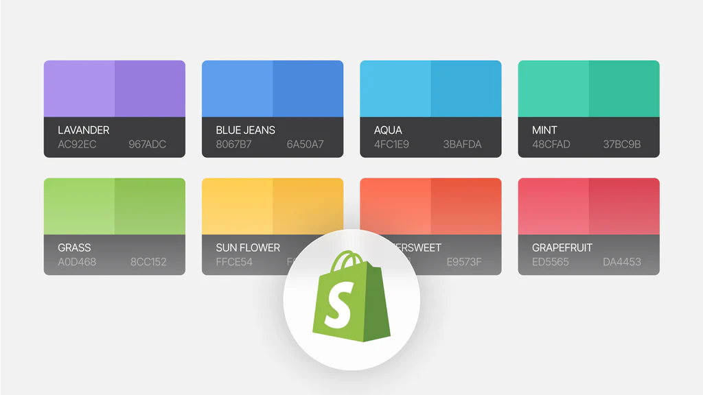
A color scheme is a set of visually compatible colors that applies to the following elements:

  • Accent

  • Border

  • Text (Heading and Body text)

  • Background

  • Primary button

  • Secondary button

  • Form field

  • Product sale price

  • Tooltip

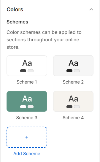
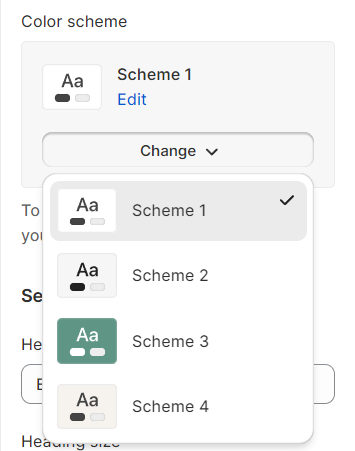
You can define different color schemes in your theme settings and apply the color schemes to different sections throughout your online store, using a color scheme picker.

You can create up to 21 color schemes in Zest.

Apply your color scheme

After defining your color scheme in the theme settings, you can assign a color scheme using the color scheme picker in the section settings.

The color scheme picker is available only in certain sections and general theme settings.

Element colors

To change the color of the text and icon on the header.

Badges

To change the background color of the badges.

See how to add custom badges here: Add custom badges to the product card

Other colors

To change the background color of the cart bubble and its overlay opacity.

You can also adjust the Overlay opacity by tweaking the toggle.

Last updated