
Theme Sections
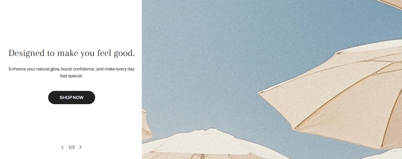
Image with text slider
2 min read
_sTrA9wG8.jpg)
How to add an Image with text slider section to your Shopify store
- In the theme editor (Customize) > click Add section
- Select Image with text slider.
- Make necessary changes.
- Save.
How to edit an Image with text slider section
Section settings
| Setting | Description |
|---|---|
| Image height | Choose from Adapt to image, Small, Medium, or Large. |
| Image width | Adjust width of image in slide. |
| Image position | Position image on left or right.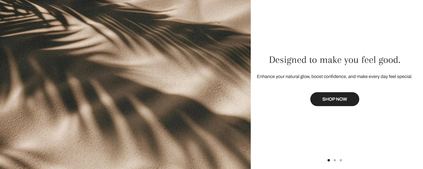 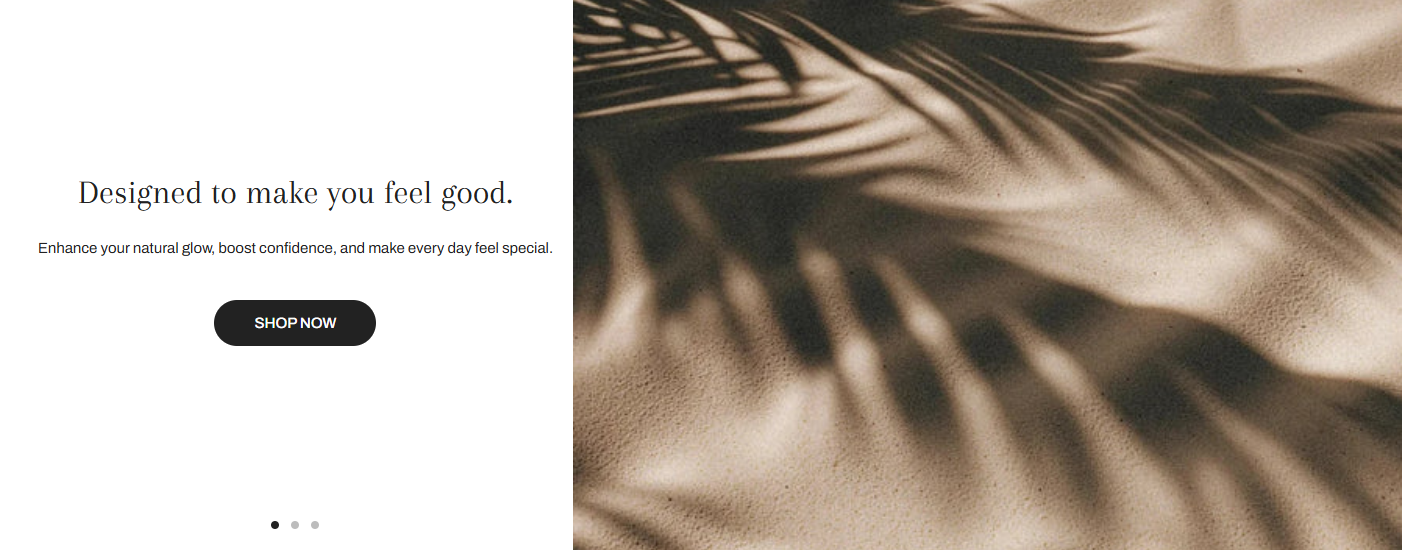 |
| Show pagination | Enable dots or counter for slider control. |
| Show navigation | Show arrows for manual slide navigation.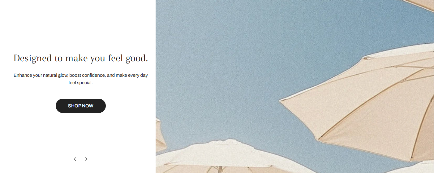 |
| Auto-rotate slides | Automatically switch slides every few seconds. |
| Desktop controls position | Position nav controls (Left, Center, Right). |
| Pagination type | Choose Dots or Counter. |

Block settings
| Block | Setting | Description |
|---|---|---|
| Video/Image | Upload content | Use high-res images or Shopify-hosted video |
| Text | Heading, subheading, description | Communicate your message clearly |
| Content layout | Position/alignment | Adjust placement on desktop & mobile |
| Button | Label, link, style, size | Add a call-to-action |
Last updated