
Pages Global Sections
General settings
2 min read
Color scheme
To define a set of default color schemes for your store, go to Theme settings > Colors & Color schemes
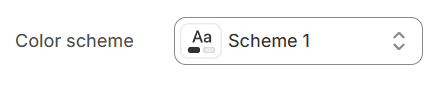
In Shopify, the Color scheme (a set of colors) of your store can be set within the Theme settings. It helps group elements and their respective colors, making your store visually appealing and cohesive. You can apply the color schemes to different sections throughout your online store with a color scheme picker.
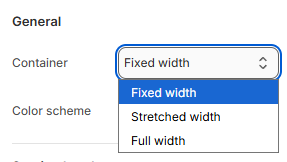
Container
- Stretched width: span the section width regardless of screen size.
- Fixed width: depends on your page content width in Theme settings > Layout
- Full width: takes up the entire space on the page and it usually resizes itself to fit the size of the screen.
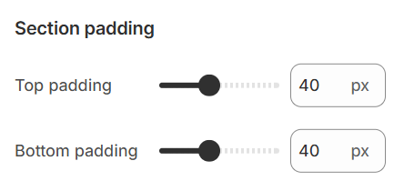
Section padding
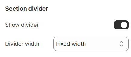
Section divider
Custom attributes
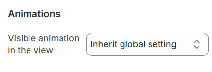
Animations
You can either set the section loading effect to each of the sections (if present) particularly or make them inherit the global settings that you set in your Theme settings > Animations.
View Changelog here.
Highlight text
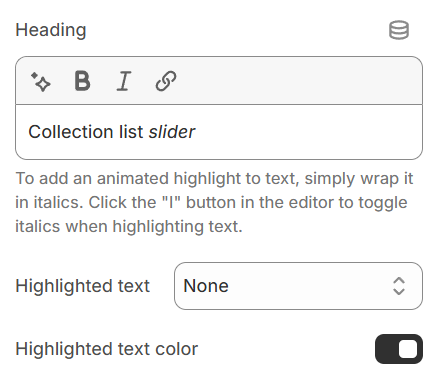


To use the Highlight text color defined in the Color scheme, enable the Highlighted text color toggle.

Last updated