
Theme Settings
Product card
2 min read
- In the theme editor (Customize), click Theme settings.
- Locate Product cards.
- Make necessary changes.
- Save.
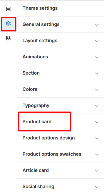
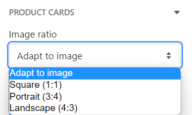
Image settings
- Adapt to image
- Square (1:1)
- Portrait (3:4)
- Landscape (4:3)
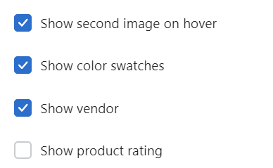
Content
- Show video as featured image (when the video is set first in the Shopify Products > Media list);
- Show second image on hover;
- Show color swatches (See Color swatches);
- Show vendor;
- Show product rating.
Button and Badges
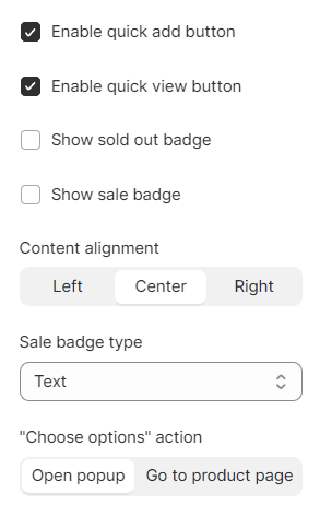
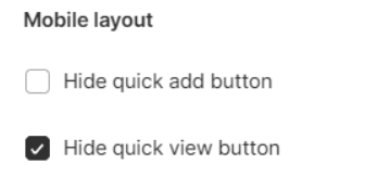
- Quick add button: to let customers add items to their cart without actually completing the payment (for products that don't have any variants).
- Quick view button: to let customers preview the detailed product information without actually going to the product page.
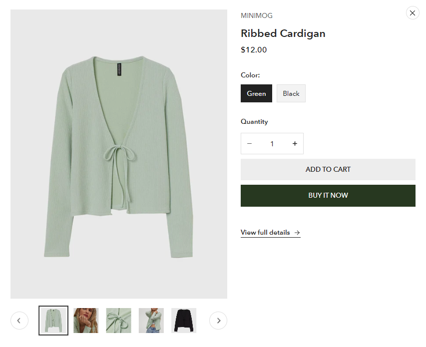
- "Choose options" action: to set the action for the Quick add button on products with variants either as opening a simplified popup modal or going to the product page.
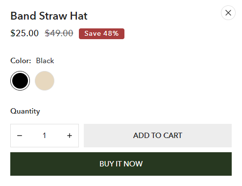
- product title;
- product price;
- variants;
- quantity selector;
- buy buttons.
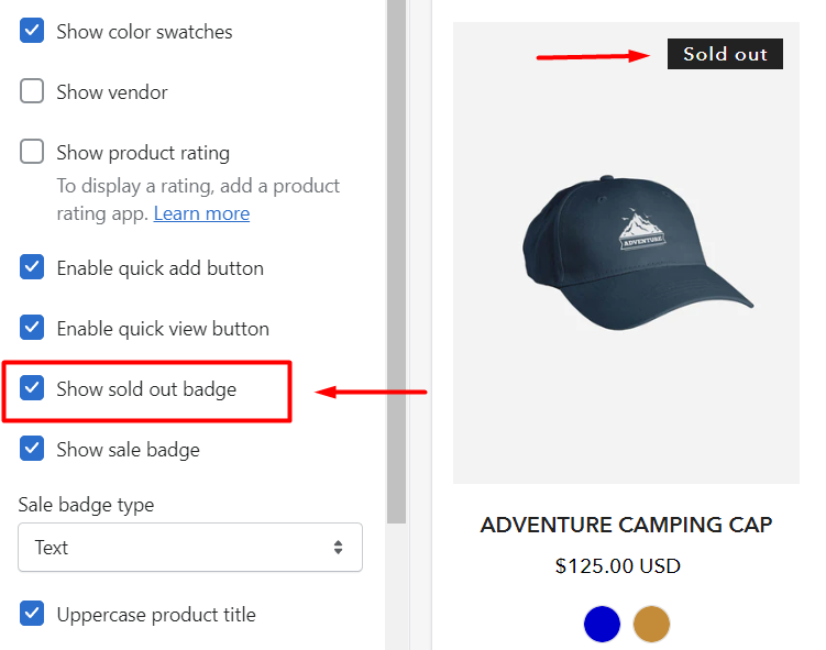
- Sold out badge:
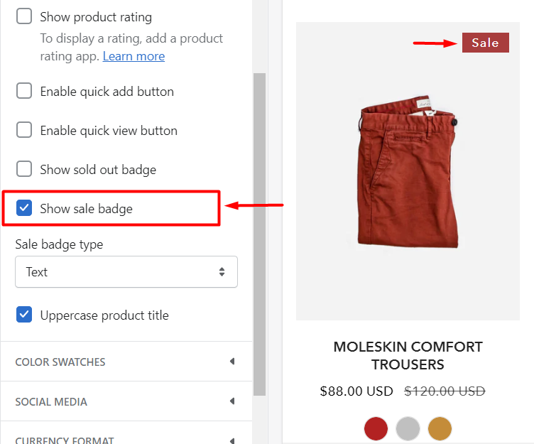
- Sale badge:
Mobile layout
Last updated