
Theme Sections
Gallery images
2 min read
_GO9iEIzs.jpg)
This section is available on ✨ Zest version 7.0.0 onwards. See our Changelog
How to add a Gallery images section to your Shopify store
- In the theme editor (Customize), click Add section.
- Locate Gallery images.
- Make necessary changes.
- Save.
How to edit the Gallery images section
Section settings
| Setting | Description |
|---|---|
| Heading | Add a title for the section. Highlight text |
| Subheading | Optional short text shown above the heading — ideal for labels like “Tag us” or “As seen on” |
| Description | Add a short message. |
| Button label & link | Add a CTA button (e.g., “Follow us”) and link it to your social page or campaign. Leave blank to hide the button. |
| Button style | Choose the button style to match your brand look. |
| Image ratio | Controls how images are cropped: choose Adapt to image (keep original ratio) or a fixed shape. |
| Images per row | Set how many images show per row on desktop (2 to 12). |
| Column gap | Adjust spacing between the images (when the Layout is Grid). |
| Layout | Choose between: • Grid layout: 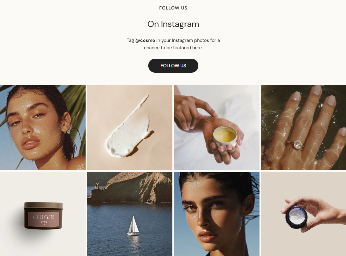 • Metro layout: 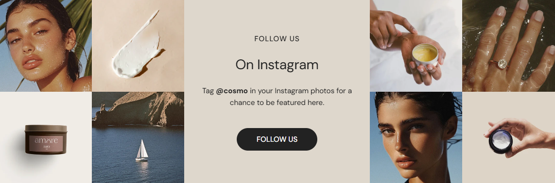 |
| Color scheme | Pick a background/text color preset that matches your theme. |
| Enable carousel on desktop | Optional — turns the grid into a swipeable carousel if there are more images than columns.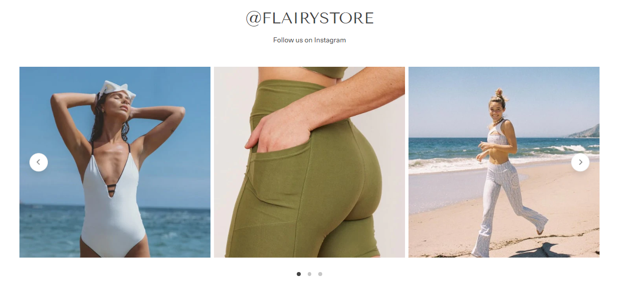 |
| Show navigation / pagination | Toggle arrows or page dots for the carousel view. |
| Enable swipe on mobile | Allow users to swipe through images horizontally on mobile.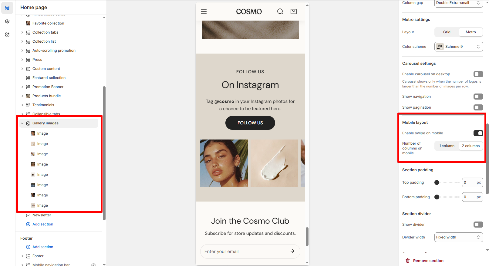 |
| Number of columns on mobile | Choose 1 or 2 columns layout for smaller screens. |
Block settings
| Setting | Description |
|---|---|
| Image | Upload your image. JPG or WEBP formats work best. |
| Text (optional) | Add short label text on the image when hovering. |
| Text size | Choose between Small, Medium, or Large to adjust text visibility. |
| Link | Link the image to a product, collection, or social post. Leave blank if you don’t want it clickable. |
Last updated