
Theme Sections
Collections showcase
2 min read
_A9aCak0G.jpg)
This section is available on ✨ Zest version 9.0.0 onwards. See our Changelog
How to add a Collections showcase section to your Shopify store
- In the theme editor (Customize) > click Add section.
- Select Collections showcase.
- Make necessary changes.
- Save the settings.
How to edit a Collections showcase section
Section settings
| Setting | Description |
|---|---|
| Color scheme | Pick a color scheme that matches your brand style. Learn more: Colors & Color schemes |
| Heading | Add a section title. Wrap text in italics to highlight it with animation. Learn more: Highlight text |
| Heading size / color | Adjust heading font size and color. Leave color blank to use assigned color scheme. |
| Subheading | Optional small label above the main heading. |
| Description | Add a paragraph below the heading to describe or give context to the collections. |
| Image ratio | Choose image aspect ratio: Square, Portrait, Landscape, or Adapt to first image. |
Block settings
- You can add up to 4 collection blocks in this section.
- If you don’t enter custom text, the theme will pull the collection’s description — helping you save time and stay consistent.
| Setting | Description |
|---|---|
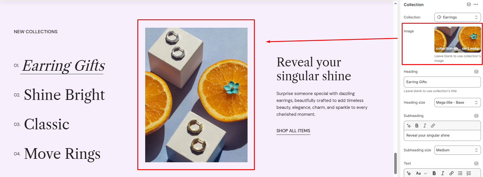
| Collection | Choose the Shopify collection to feature. |
| Image | Upload a custom image. Leave blank to use the collection’s featured image. |
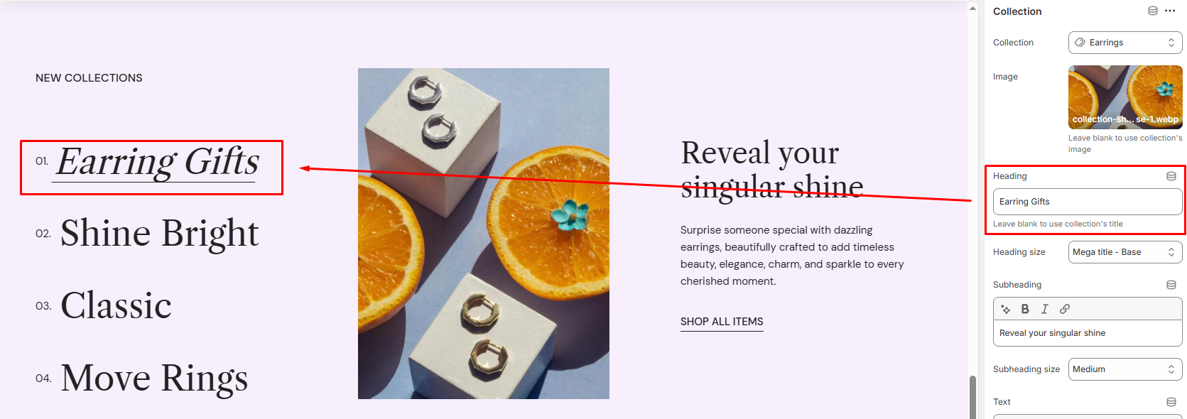
| Heading | Enter a custom title for the block. Leave blank to use the collection’s title. |
| Heading size | Choose from various heading sizes. |
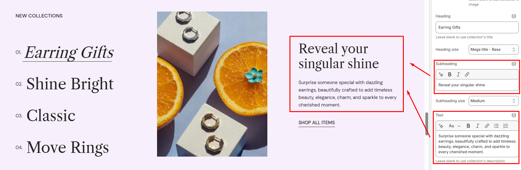
| Subheading | Add a short label above the description. |
| Subheading size | Adjust the subheading’s font size. |
| Text | Write a short description or story. If left blank, the theme will automatically use the collection’s description. |
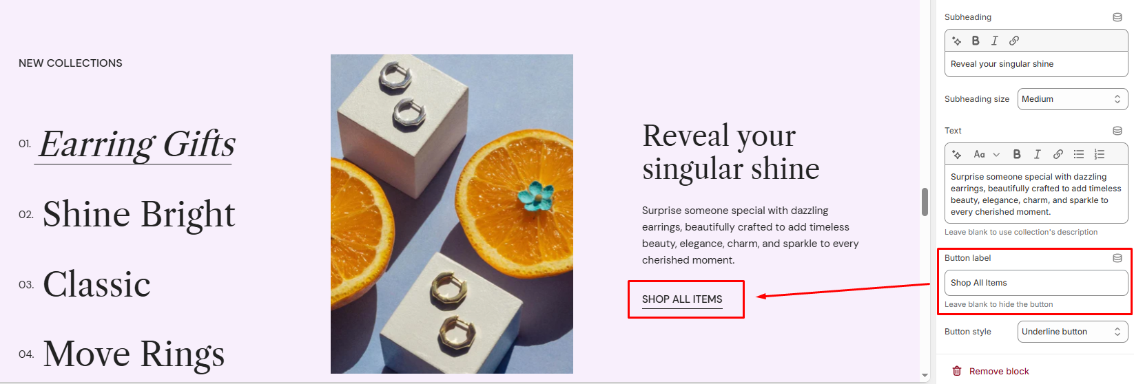
| Button label | Add a CTA button that link to the collection page. Leave blank to hide the button. |
Last updated