# Blog posts
_xYERzaS5.jpg)
Display a grid of recent articles from your Shopify blog to keep customers engaged, boost SEO, and drive traffic to product or collection pages.
## How to add Blog posts section to your Shopify store
Steps
1. In the theme editor **(Customize)**, click **Add section**
2. Select **Blog posts**
3. Make necessary changes
4. **Save.**
## How to edit Blog posts section
### Section header
Add a heading, subheading and description that appears on top of the blog posts.
💡 Add emphasis to the heading using [Highlight text](https://docs.foxecom.com/zest-theme/pages-global-sections/general-settings#highlight-text)
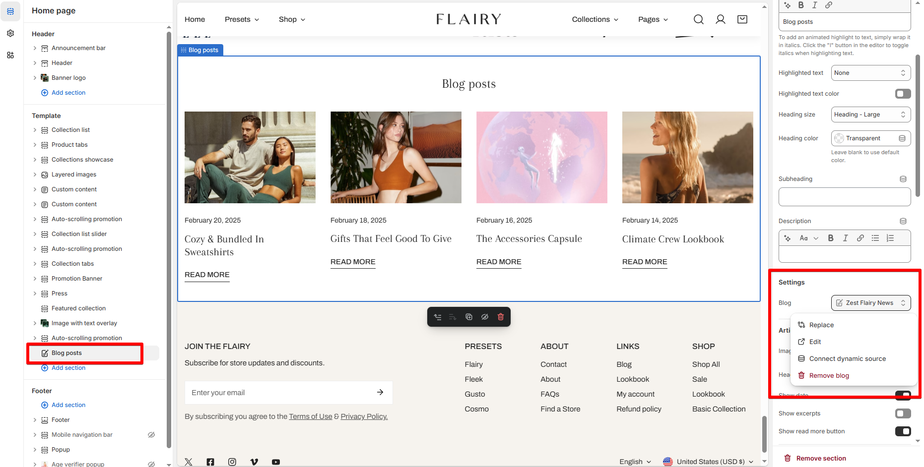
### Blog
Choose which block to pull posts from.
To know more about how to add a blog to your online store, see [Blogs](https://help.shopify.com/en/manual/online-store/blogs).
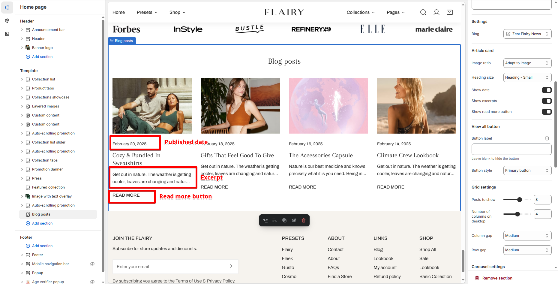
### Article card
| Setting | Description |
| --- | --- |
| **Image ratio** | Adjust image crop style: `Adapt to image`, `Square`, etc. |
| **Heading size** | Adjust font size for article titles. |
| **Show date** | Toggle display of published date. |
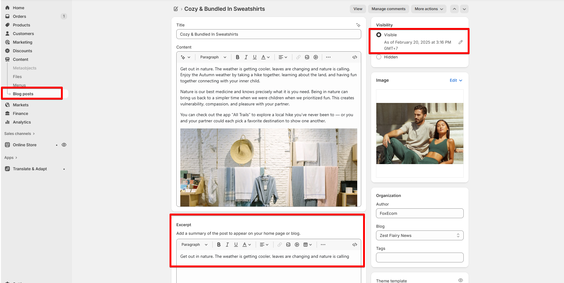
| **Show excerpts** | Show a short summary (from the blog’s excerpt field). |
| **Show "Read more" button** | Toggle visibility of read more link. |
### View all button
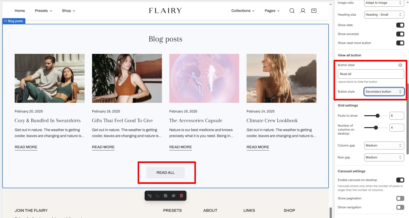
Use this to link users to your full blog archive.
| Setting | Description |
| --- | --- |
| **Button label** | Optional text. Leave blank to hide the button. |
| **Button style** | Choose from primary/secondary/white/underline button designs. |
### Grid settings
| Setting | Description |
| --- | --- |
| **Post to show** | Set the number of articles to display (up to 12). |
| **Number of columns on desktop** | Choose how many columns to display (2-6). |
| **Column gap / Row gap** | Adjust spacing between posts. |
### Carousel settings
| Setting | Description |
| --- | --- |
| **Enable carousel on desktop** | Turn your blog posts into a sliding carousel (The number of posts must larger than the number of columns). |
| **Show pagination** | Display dots indicating slide progress. |
| **Show navigation** | Show arrows for manual navigation. |
### Mobile layout
| Setting | Description |
| --- | --- |
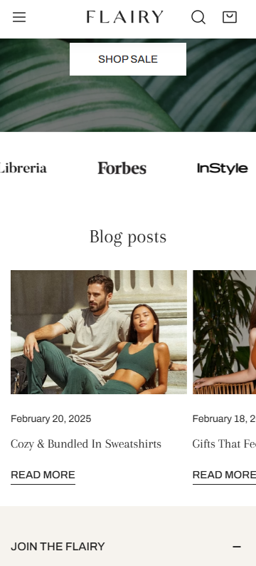
| **Enable swipe on mobile** | Enable horizontal swipe on phones.
 |
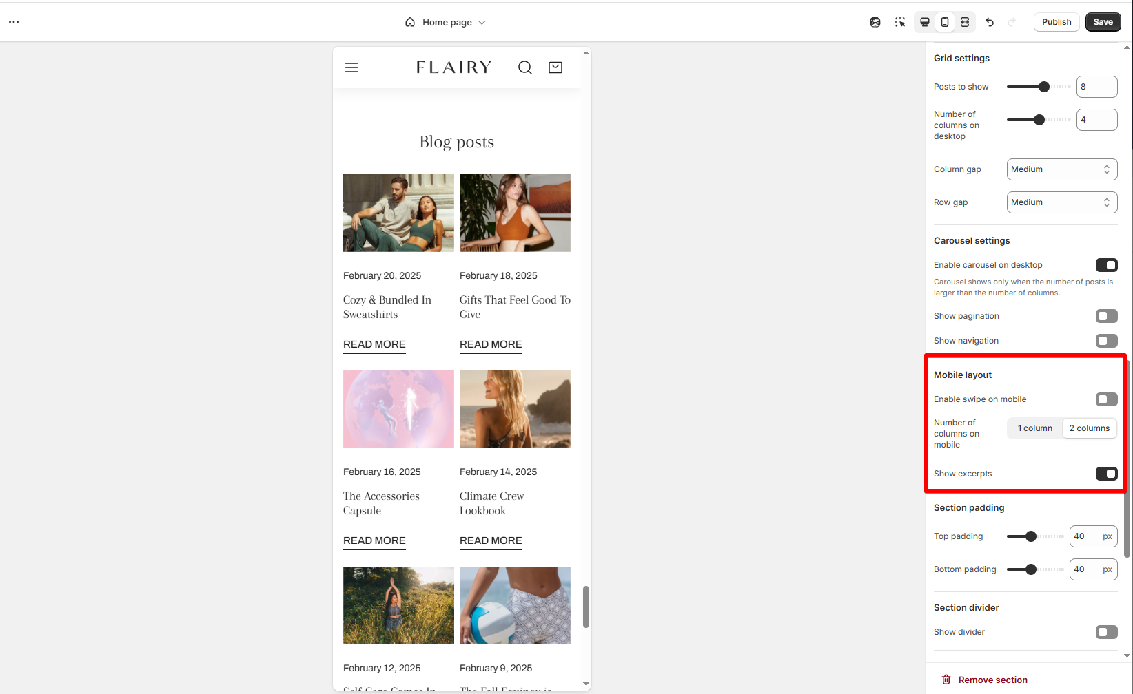
| **Number of columns on mobile** | Choose between 1 or 2 columns.
 |
| **Show excerpts** | Toggle excerpt display on smaller screens. |