Layered images

Create a stunning Layered images section for a dynamic scrolling effect

This section is available on ✨ Zest version 9.0.0 onwards. See our Changelog

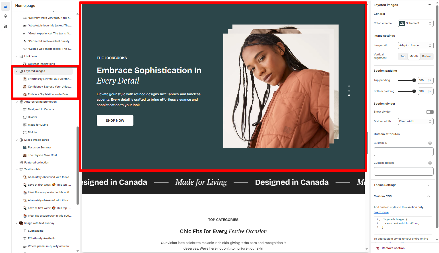
Enhance your website with the Layered Images section, a visually engaging feature that creates a smooth, overlapping transition as users scroll. This effect adds movement, depth, and storytelling power to your brand’s imagery, making your website feel more immersive and high-end.

In this article, we will show you how to add a Layered images section.

How it works

Instead of images staying fixed in their place, this section allows them to collapse into each other, creating a seamless transition. As the user scrolls, one image subtly layers over the previous one, maintaining a smooth and immersive browsing experience. This effect is perfect for:

  • Telling a brand story through images

  • Showcasing multiple product shots in an elegant way

  • Creating a visually engaging landing page

How to add a Layered images section to your Shopify store

How to edit a Layered images section

Section settings

Image settings

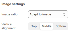
Select the Image ratio for the layered images:

  • Adapt to image

  • Square (1:1)

  • Portrait (3:4)

  • Landscape (4:3)

The Vertical alignment setting allows you to choose how your text and other design elements are arranged around the images:

  • Top

  • Middle

  • Bottom

Block settings

In the Layered images section, you can add up to 5 Heading blocks.

You can choose a featured Image for the layered image.

Use the provided text fields to add a suitable Heading, Subheading, and Description.

  • Leave them blank if you do not want to display them

Change the Heading size to the desired size:

  • Heading - Medium

  • Heading - Large

  • Heading - Extra large

  • Heading - Extra extra large

  • Mega title - Base

You can also change the Heading color:

  • Leave it blank if you do not want to use the default color setting in the Color scheme.

You can also display a call-to-action button to redirect customers to your desired pages.

The Button label field sets the text displayed on the button

  • Leave this blank if you do not want to display the button.

Enter the URL where users will be directed when they click the button to the Button link field.

Choose a desired Button style to match your design:

  • Primary button

  • Secondary button

  • White button

  • Underline button

Choose the Button size:

  • Default

  • Small

  • Medium

Last updated

Was this helpful?