
Theme Sections
Mixed image cards
2 min read
_5B6PfwTN.jpg)
This section is available on Zest version 9.0.0 and later. See our Changelog
- Create side-by-side content blocks
- Highlight seasonal campaigns, product lines, or brand messages
- Add flexible content with buttons, headings, and descriptions
How to add a Mixed image cards section to your Shopify store
- In the theme editor (Customize) > click Add section
- Select Mixed image cards.
- Make necessary changes.
- Save the settings.
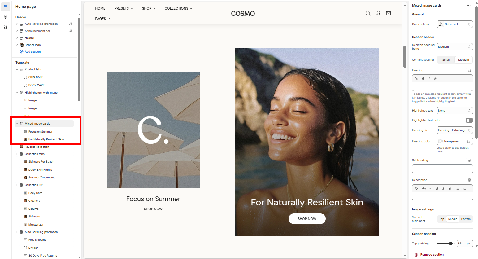
How to edit a Mixed image cards section
Section settings
- Image settings: The Vertical alignment setting allows you to choose how an image is positioned within its container:
Block settings
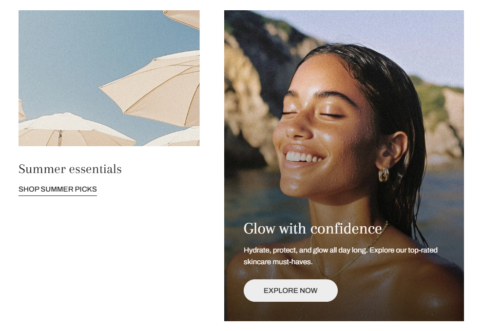
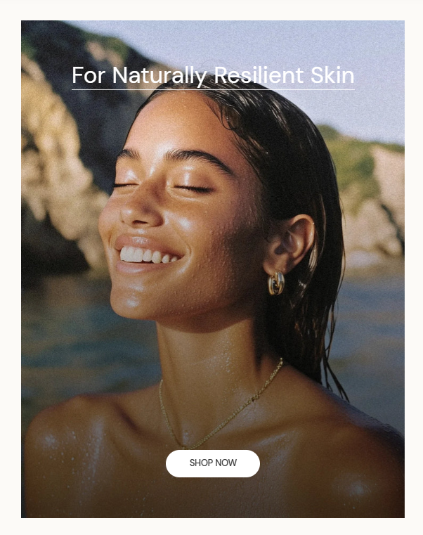
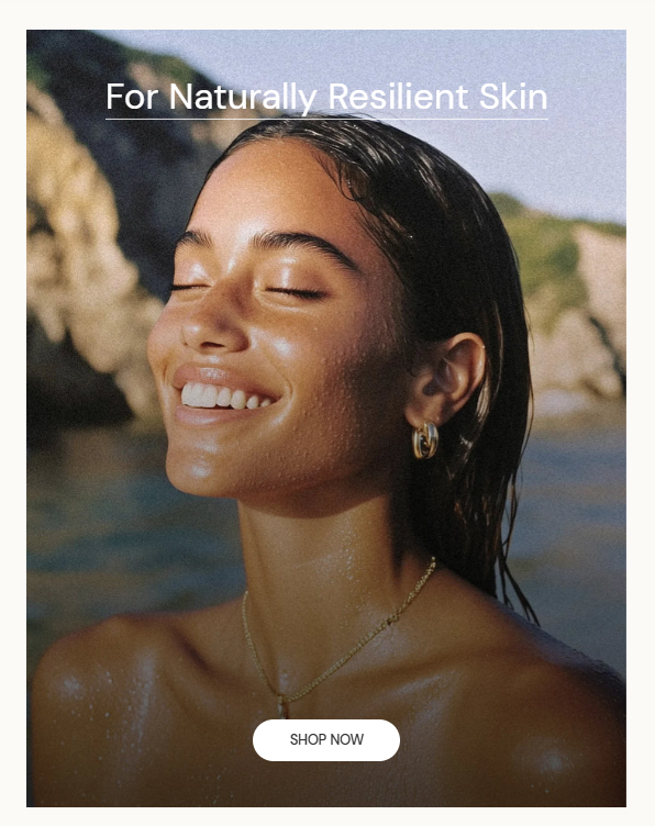
- Image with text: Displays an image with a heading, description, and button below the image.
- Image card: Shows text directly on top of the image with overlay options
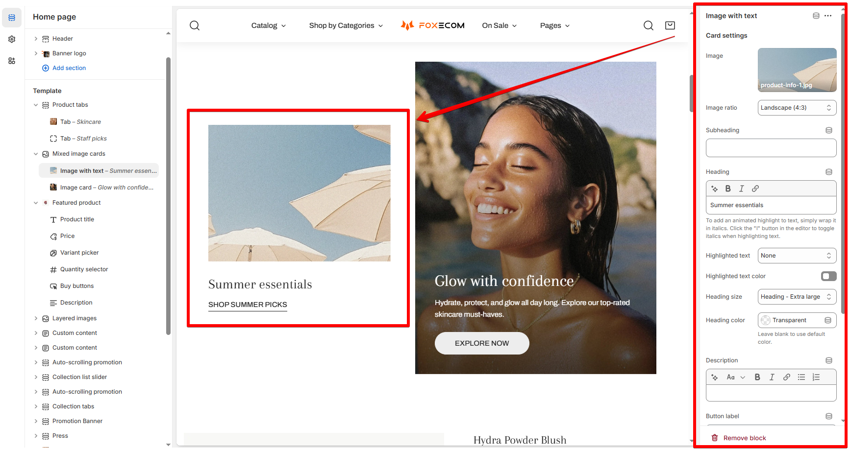
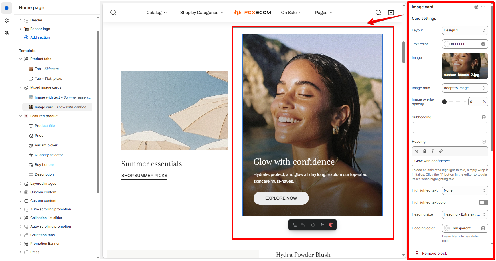
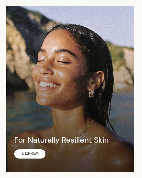
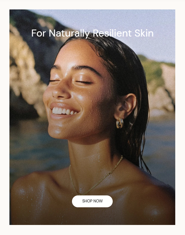
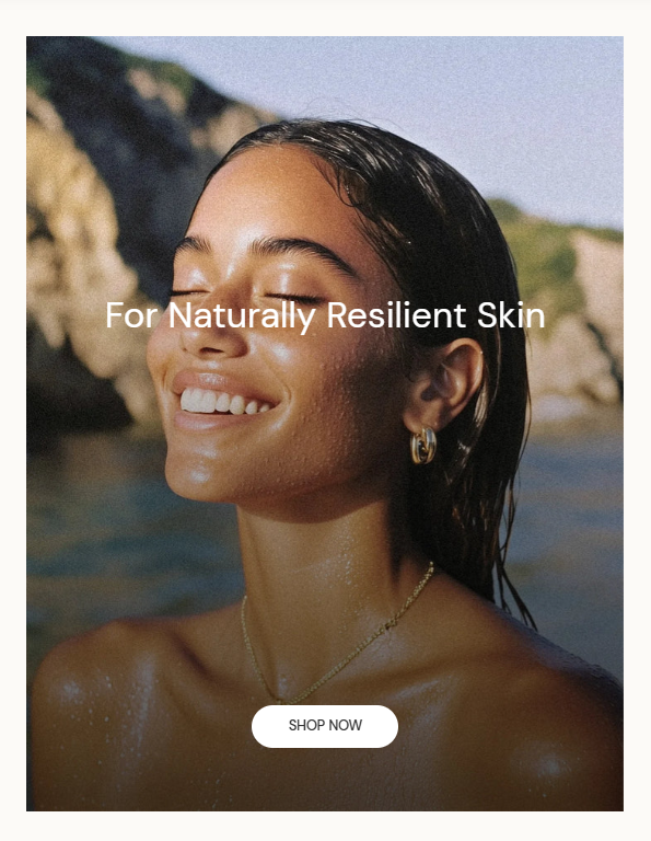
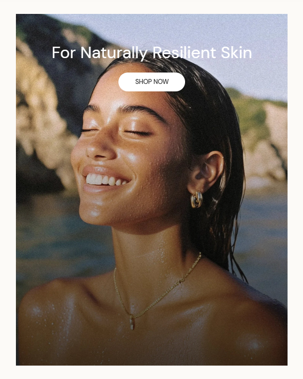
- Select your desired card layout and text color. Examples of Image card's layouts:
- Upload/ select an image
- Set the Image ratio and Image overlay opacity
- Add the content that will display over the image.
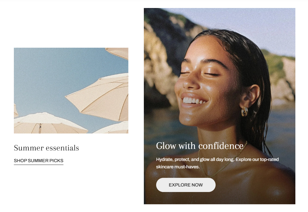
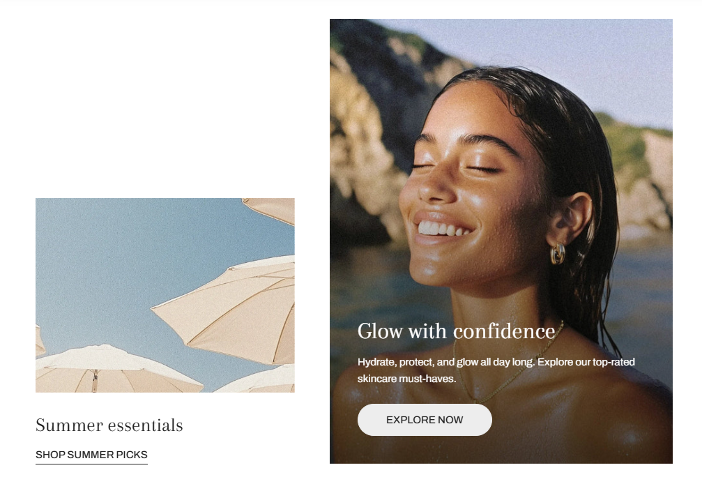
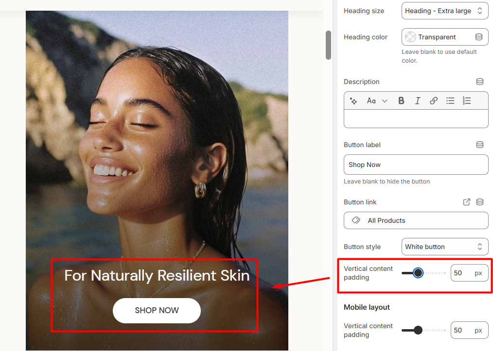
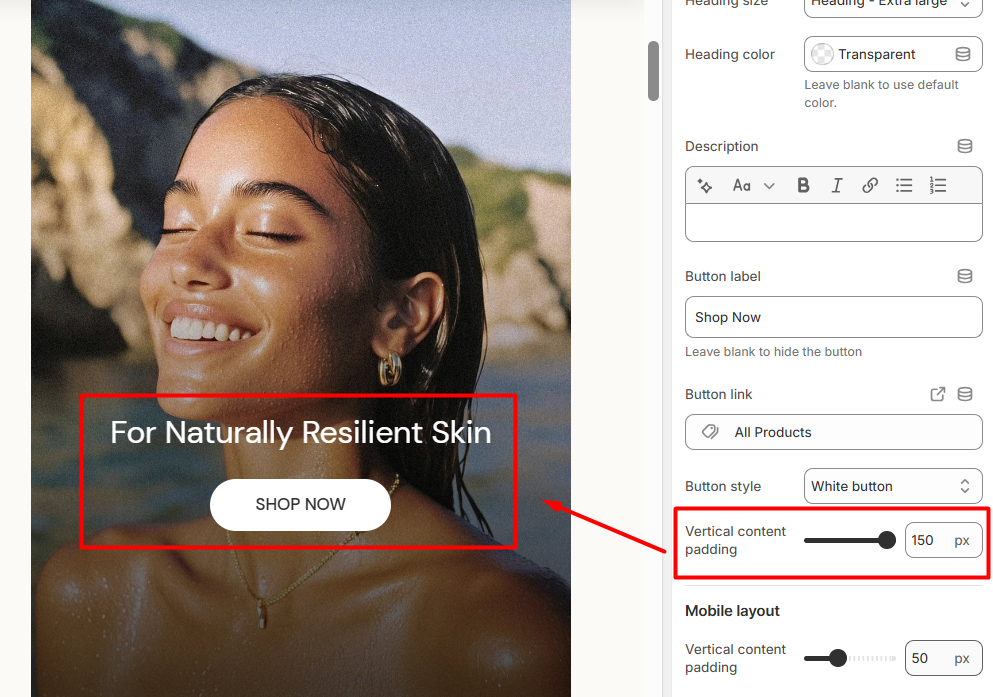
- Adjust how much space the text takes on the image using the Vertical content padding settings.
Examples of Vertical content padding setting:
Examples of Image card's layouts:
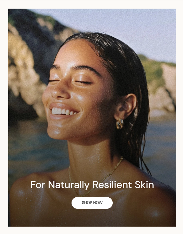
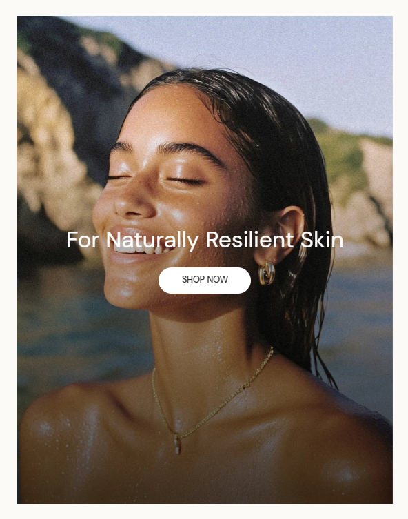
Examples of Vertical content padding setting:
Last updated