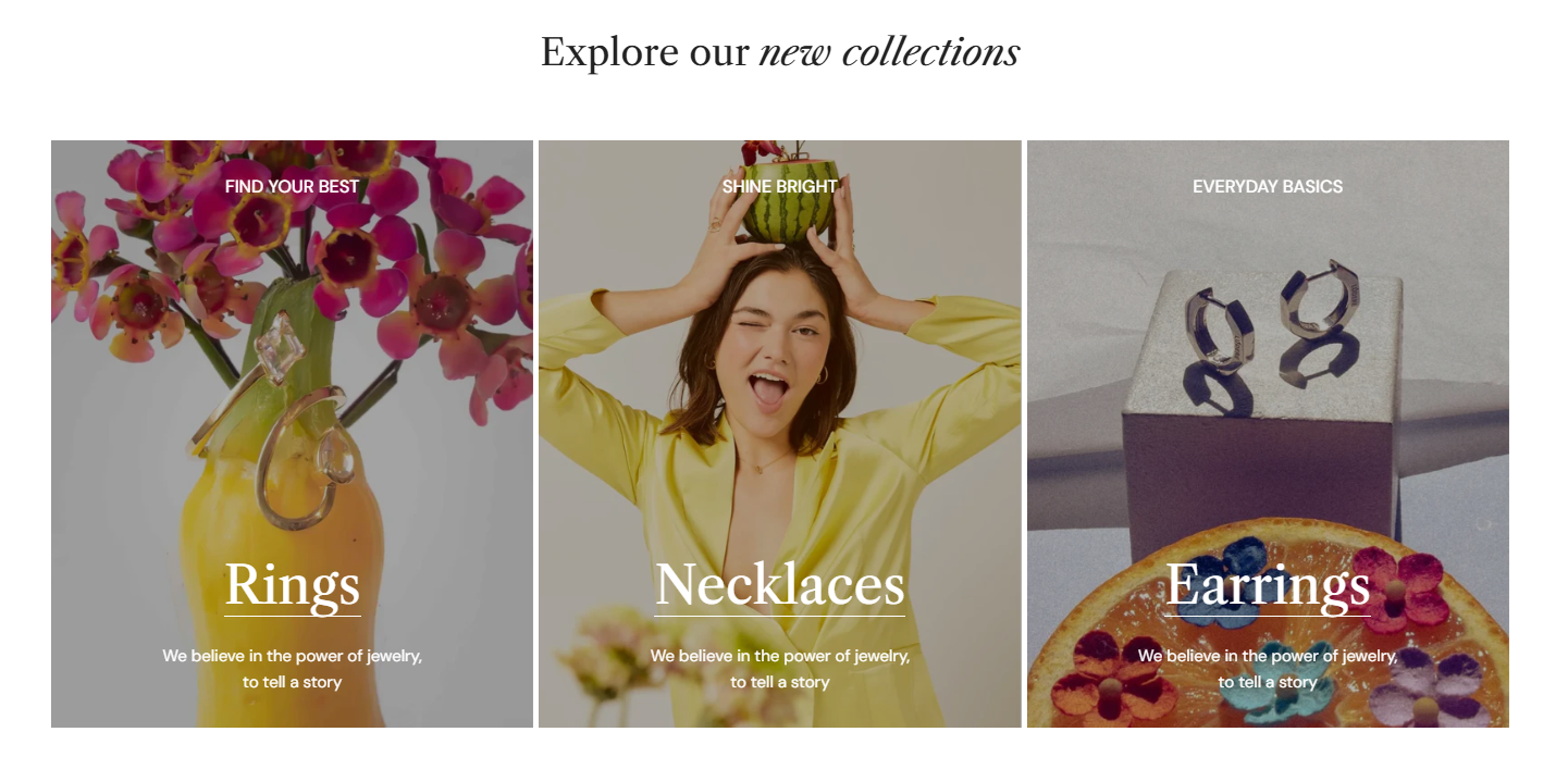
Custom content
Utilize the Custom content section to display more information, showcase products, or flaunt customer testimonials.
#How to add a Custom content section to your Shopify store
Steps
- In the theme editor (Customize), click Add section.
- Locate Custom content.
- Make necessary changes.
- Save.
#How to edit a Custom content section
#Section settings
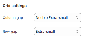
#Grid settings
Modify the Column gap and Row gap between blocks in the section.
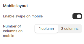
#Mobile layout
Display the section in grid layout or enable swipe on mobile.
#Block settings
Combine different block types to create your desired layout.
Preset preferences:
Last updated

_fOqhS2vX.jpg)