Typography
Steps
In the theme editor (Customize ), click Theme settings
Locate Typography
Make necessary changes
Save Typography is considered one of the essential components that impact the website's look and feel. It contains the following elements.
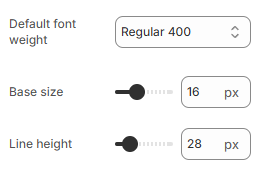
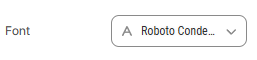
# Body text and Headings You can either choose the existing fonts from the library or custom fonts.
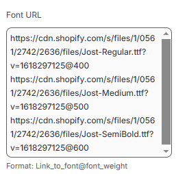
For the custom front, ollow the steps below:
Steps
Allow multiple links, each link in a new line.
Upload the font to Shopify files and paste the link into the blank field.
Recommended formats: TTF, OTF, WOFF, and WOFF2.
When pasting in the field, follow this format: Link_to_font@font_weight
For ex:
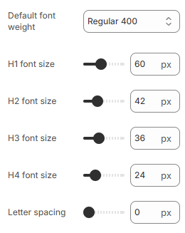
Elements related to the font such as spacing, height, weight, etc. are adjustable.
In Minimog v3.0.0 onwards, some text settings are removed to maintain the consistency of the theme design.
If you want to adjust anything related but can't find it in Theme settings, let us know via
live chat and we will be happy to assist 😄
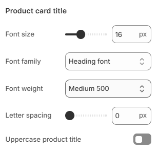
# Product card titleThe Product card title settings control how product names appear in product grids and collection pages.
Available settings include:
Font size
Font family
Font weight
Letter spacing
Uppercase product title toggle
This allows better control over how product titles appear throughout your store.
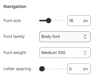
# NavigationThe Navigation settings control the appearance of menu and navigation text throughout the store.
Available settings include:
Font size
Font family
Font weight
Letter spacing
These settings help you fine-tune the appearance of menu and navigation items.
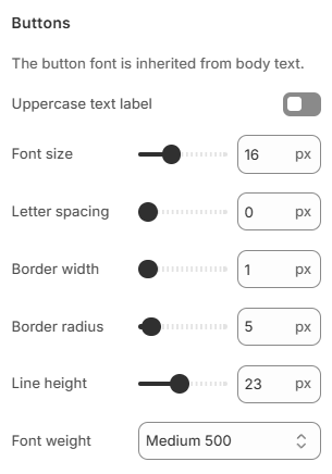
The button font is inherited from the Body text settings.
You can customize the following button styles:
Uppercase Text Label
Font Size
Letter Spacing
Border Width
Border Radius
Line Height
Font Weight
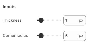
The Inputs settings let you customize the appearance of input fields (such as search bars, contact forms, newsletter fields,...) on your site
Thickness : Adjusts the border thickness of input fields. Use the slider or enter a value in pixels (e.g., 1 px) to control how bold the border appears.Corner Radius : Controls the roundness of input field corners. Higher values (e.g., 5 px) make the corners more rounded, while lower values keep them more square.
Last updated about 1 month ago