# Image cards
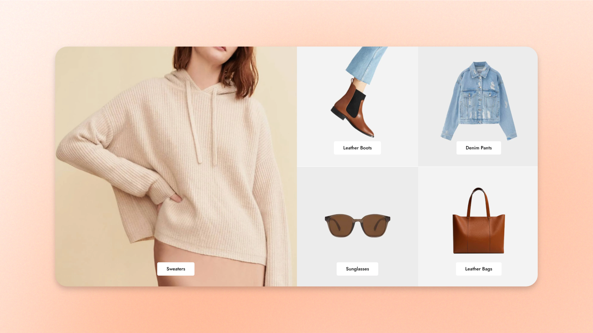
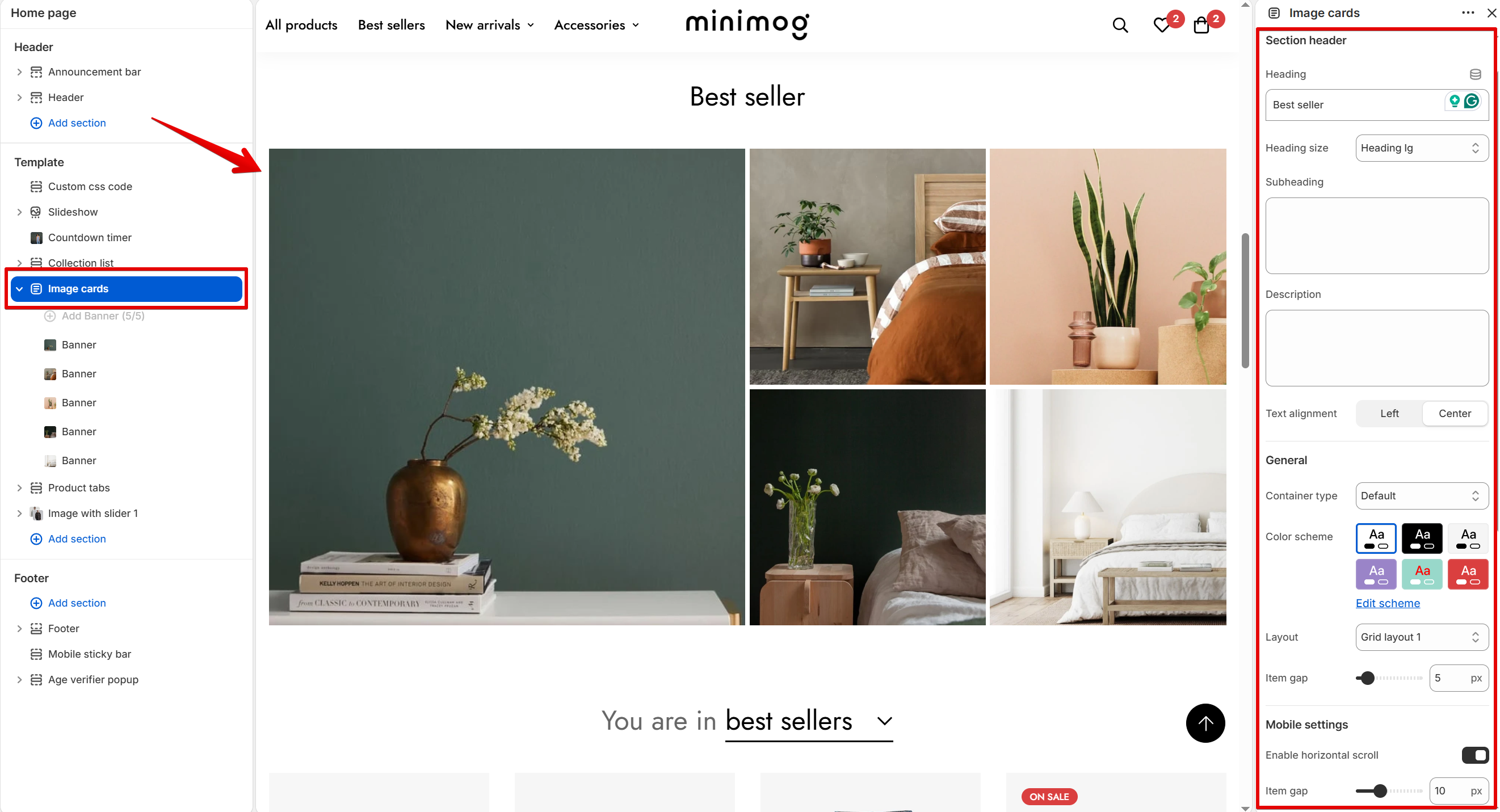
The Image cards section shows banner-style images in a grid. Use it to feature bestselling products or collections.
## How to add Image cards
1. Open the theme editor (**Edit theme**).
2. Click **Add section** under **Template** in the sidebar.
3. Select **Image cards**.
4. Click the first **Banner** under **Image cards**.
5. Click **Select** next to **Image**.
6. Choose an image.
7. Repeat steps 4 to 6 for each **Banner**.
8. Click **Save**.
If **Image cards** is already on the page, click it to edit it instead.
## Section settings
**Section header**, **Section Padding**, **Custom Attributes**, and **Animations** work the same as in every section. See [Common section settings](https://docs.foxecom.com/minimog-theme/theme-sections/common-section-settings).
### General
**Container type** and **Color scheme** work the same as in every section. See [Common section settings](https://docs.foxecom.com/minimog-theme/theme-sections/common-section-settings).
| Setting | Description | Options |
| ------------ | ----------------------------------- | ------------------------------------------------------------------------------------------------- |
| **Layout** | How the cards are arranged. | **Grid layout 1**, **Grid layout 2**, **Grid layout 3**, **Grid layout 4**, or **Grid layout 5**. |
| **Item gap** | The space between cards on desktop. | **0 to 50 px.** |


### Mobile settings
| Setting | Description | Options |
| ---------------------------- | ---------------------------------------------------------- | ----------------------------------------------------------------------- |
| **Enable horizontal scroll** | Lets customers swipe through the cards sideways on mobile. | **On** or **Off**.
*Turn off to stack the cards vertically.* |
| **Item gap** | The space between cards on mobile. | **0 to 30 px.** |
## Blocks
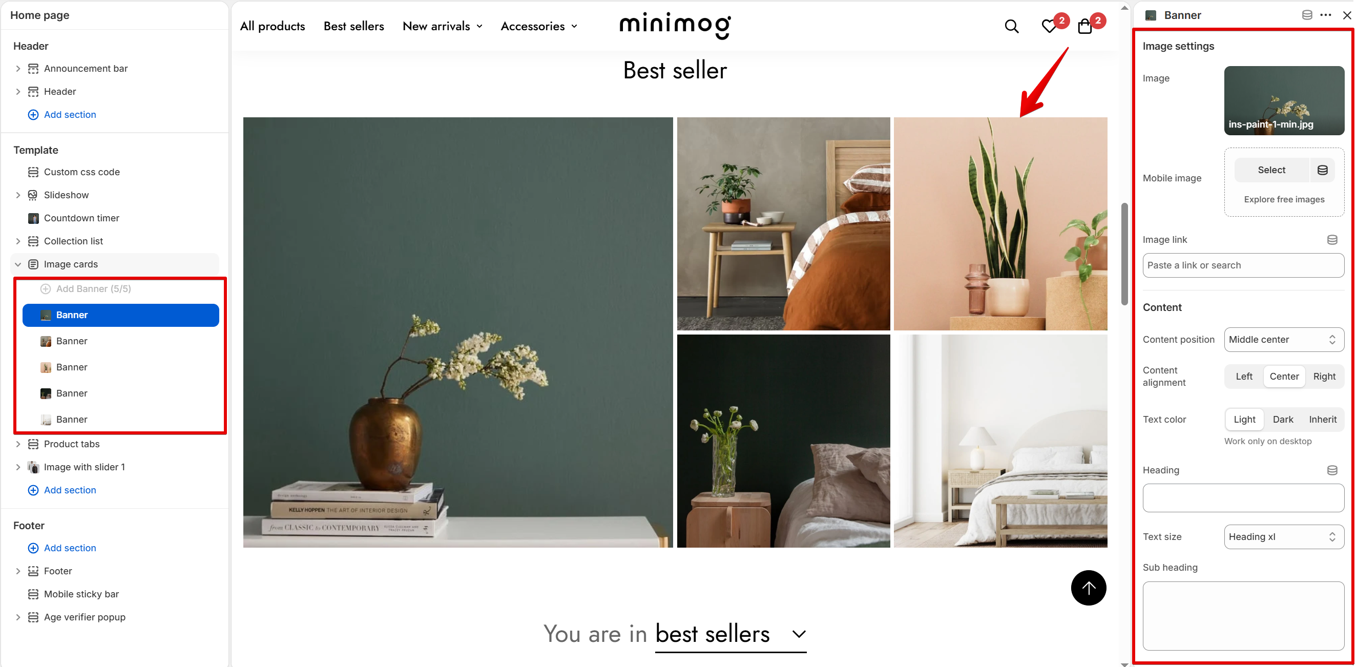
Each **Banner** block is one card in the grid. The section holds up to 5 banners. To add one, click **Add Banner** under **Image cards** in the sidebar.
### Banner
**General**
| Setting | Description | Options |
| ---------------- | -------------------------------------------- | ------------------------------------------------------------ |
| **Color scheme** | The background and text colors of this card. | Select a scheme. Click **Edit scheme** to change its colors. |
**Image settings**
| Setting | Description | Options |
| ---------------- | -------------------------------------------------- | --------------------------------------------------------------------------------------- |
| **Image** | The image shown on the card on desktop. | Click **Select** to choose an image. |
| **Mobile image** | The image shown on the card on mobile. | Click **Select** to choose an image.
*Leave blank to use the desktop image.* |
| **Image link** | The page customers go to when they click the card. | Paste a link or search for a page. |
**Content**
| Setting | Description | Options |
| --------------------- | ------------------------------------------ | ----------------------------------------------------------------------------------------------------------------------------------------------------------- |
| **Content position** | Where the text and button sit on the card. | **Top left**, **Top center**, **Top right**, **Middle left**, **Middle center**, **Middle right**, **Bottom left**, **Bottom center**, or **Bottom right**. |
| **Content alignment** | How the text and button line up. | **Left**, **Center**, or **Right**. |
| **Text color** | The color of the card's text. | **Light**, **Dark**, or **Inherit**.
*Works on desktop only.* |
| **Heading** | The main text on the card. | Enter text, such as `Image card`.
*Leave blank to hide it.* |
| **Text size** | The size of the heading. | **Heading xs**, **Heading sm**, **Heading md**, **Heading lg**, **Heading xl**, or **Heading 2xl**. |
| **Sub heading** | A short line shown with the heading. | Enter text.
*Leave blank to hide it.* |
**Button settings**
| Setting | Description | Options |
| ------------------- | ---------------------------------------------------------------------------------------------------------- | ------------------------------------------------------------------------------------ |
| **Button label** | The text on the button. | Enter text, such as `Shop now`.
*Leave blank to hide the button.* |
| **Button style** | How the button looks. | **Primary button**, **Secondary button**, **White button**, or **Underline button**. |
| **Button size** | The size of the button. | **Button small**, **Button medium**, or **Button large**. |
| **Fixed on bottom** | Pins the button to the bottom of the card, as a line with an arrow. Its text color follows **Text color**. | **On** or **Off**. |

Your cards show in the theme editor preview, in the grid layout you chose.
## Related articles
Common section settings
Collection list
Image with slider