
Theme Sections
Featured promotion
3 min read
- In the theme editor (Customize), click Add section
- Locate Featured promotion
- Save
Section settings
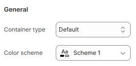
General
- Default;
- Full width;
- Use container box.
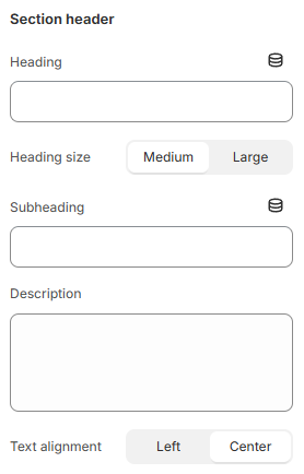
Section header
- Leave any of the fields blank if you do not want to display them.
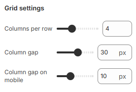
Grid settings
- Columns per row: Set the number of columns displayed per row (e.g., 4). This determines how many items appear side by side.
- Column gap: Adjust the space between columns in pixels (e.g., 30 px) for desktop or larger screens.
- Column Gap on mobile: Set a separate column gap for mobile devices (e.g., 10 px) to ensure the layout is optimized for smaller screens.
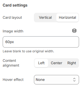
Cards settings
- Card Layout: Choose between a Vertical or Horizontal layout to control the orientation of content cards.
- Image Width: Set a specific width for images within cards (e.g., "60px"). Leave this field blank to use the image’s original width.
- Content Alignment: Align content within the card to the Left, Center, or Right.
- Hover Effect: Select an effect that activates when users hover over the card:
- None: No hover effect.
- Scaling Down: The card slightly reduces in size on hover.
- Scaling Up: The card slightly enlarges on hover.
- Zoom In: The image zooms in on hover for a closer view.
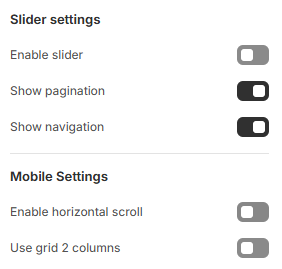
Slider and Mobile settings
- Enable slider: Toggle this to activate the slider feature, which enables content to slide horizontally.
- Show pagination: Toggle to display pagination dots, indicating the number of slides and allowing users to navigate through them.
- Show navigation: Toggle to add navigation arrows to the slider for manual control over slide movement.
- Enable horizontal scroll: Toggle to allow horizontal scrolling on mobile, which enables users to swipe through content.
- Use grid 2 columns: Toggle to display items in a 2-column grid layout on mobile devices, optimizing space for a more compact view.
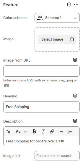
Block settings
- Color Scheme: Choose a color scheme to match the feature with your site’s overall design.
- Image: Click Select Image to upload an image or graphic to represent the feature.
- Image from URL: Alternatively, enter an image URL (supports .svg, .png, or .jpg formats) if you prefer to use an online image.
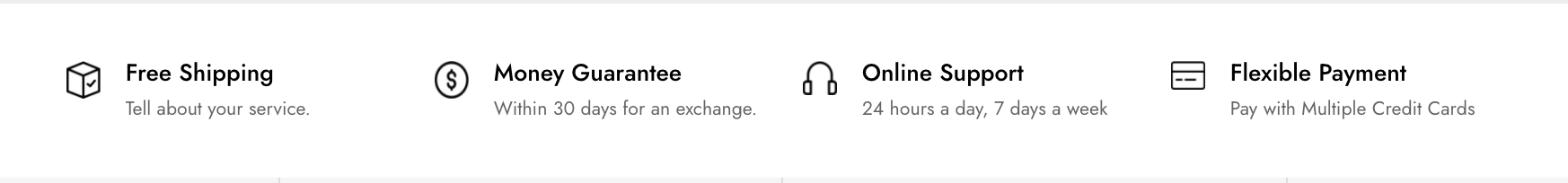
- Heading: Enter a heading that briefly describes the feature (e.g., "Free Shipping").
- Description: Add a description with more details (e.g., "Free Shipping for orders over £130"). You can format this text using bold, italics, lists, and links as needed.
- Image Link: Paste a URL to make the image clickable, directing users to a relevant page or section when they click the image.
Last updated