A Custom Content section in a theme is used to provide flexibility in design and layout, allowing you to add unique content such as text, images, videos, or custom HTML code to the pages.
This section enables customization beyond the standard templates provided by
Minimog theme , empowering you to create visually appealing and engaging web pages tailored to your specific needs and branding requirements.
# How to add Custom ContentSteps
In the theme editor (Customize ) > click Add section
Select Custom content
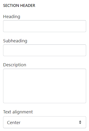
Save # Section settings# Section header and GeneralUse the provided fields to add a suitable heading/ subheading/ description.
Leave them blank if you do not want to display them.
You can also adjust the text alignment here as Left/Center.
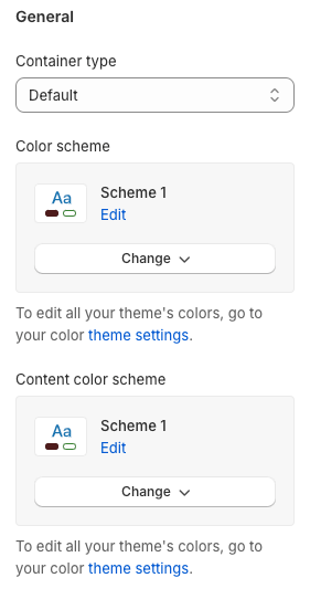
Select the container type, the background color scheme, and the content color scheme for this section.
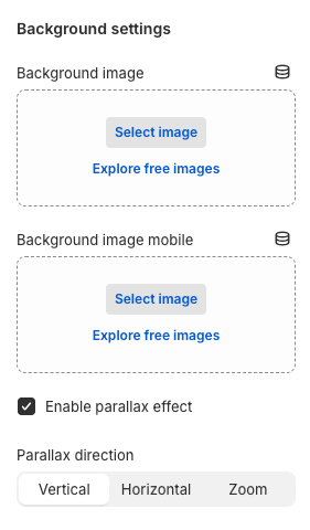
# Background settingsYou can add a separate background image for the desktop/ laptop/ tablet view, and a separate one for the mobile view.
Here, you can also Enable parallax effect with different Parallax direction s:
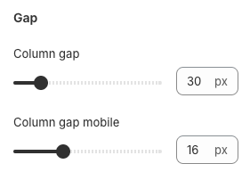
# GapYou can adjust the column gap between each block on desktop and mobile views.
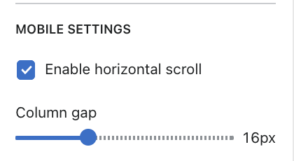
# Mobile settingsYou can enable/ disable horizontal scroll for mobile users, and the gap between each column in mobile view.
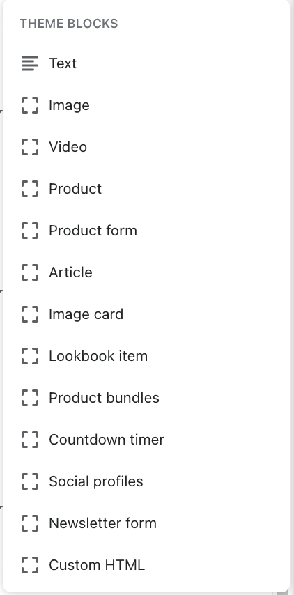
# Block settingsSeveral blocks can be added based on the requirements.
Some blocks are similar as they have appeared in theme sections such as countdown timer, product form (featured product), image cards, etc. Each of them will have its settings.
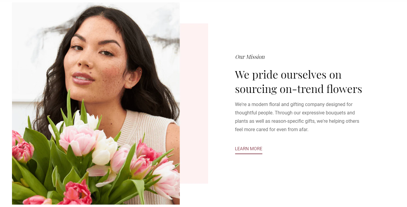
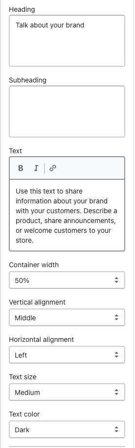
# Image and Text blocksText block Image block
Use the provided text fields to add a suitable heading/subheading/description.
Leave the fields blank if you do not want to display them.
Control container width, text color/size, and alignment.
In this block, you can:
Add images
Change the container width
Change the vertical alignment
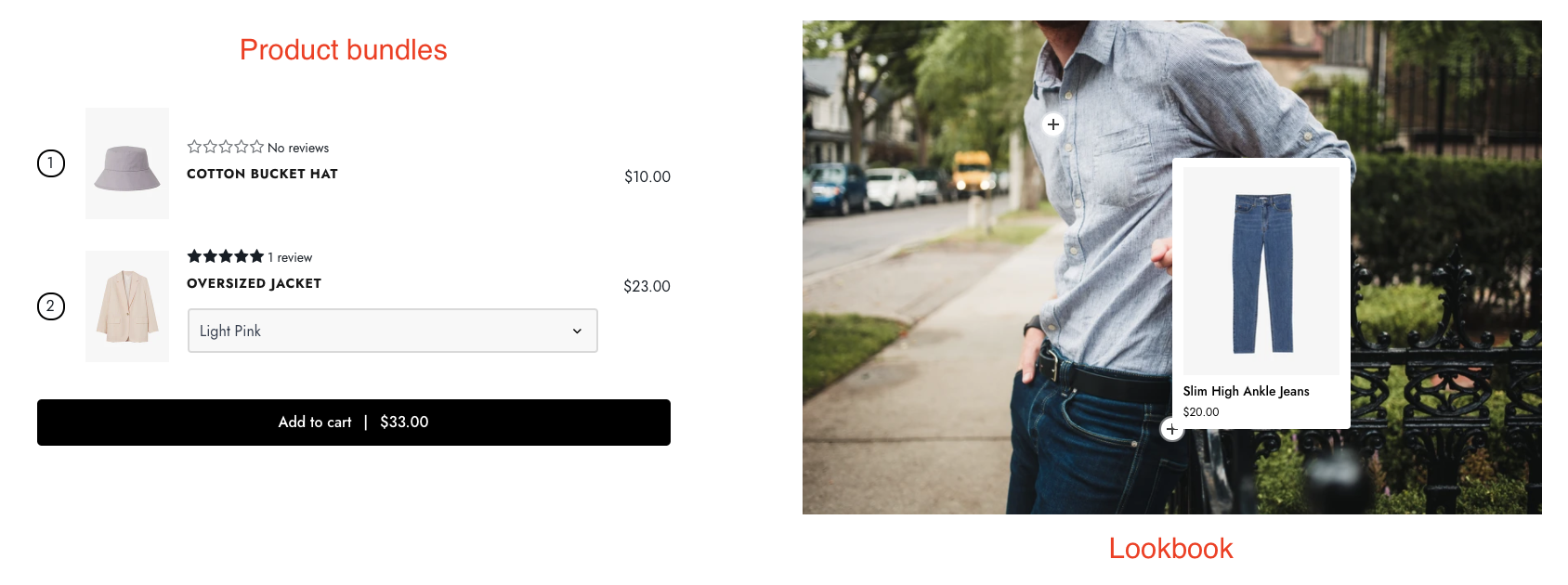
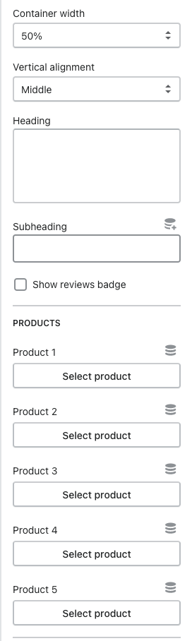
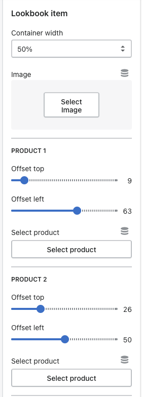
# Lookbook items and Product bundles blocksProduct bundles Lookbook items
Use the provided text fields to add a suitable heading/subheading.
Leave the fields blank if you do not want to display them.
Control container width and add the products that you want to include in the bundles.
To tag products on the item image, select them here.
They can be easily adjusted using the offset percentage.
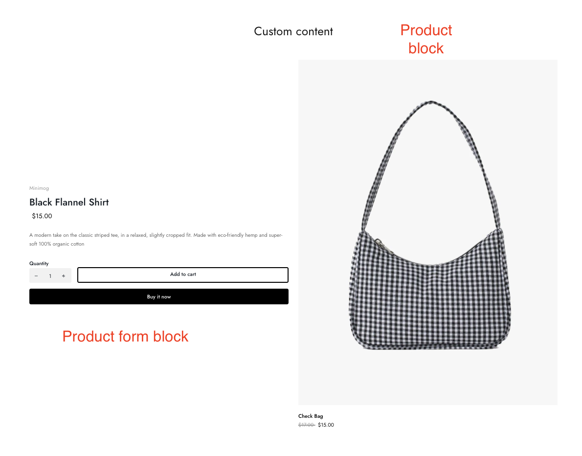
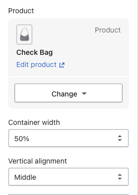
Product Product form
Add a product that merchants want to display for the block. Adjust the container width and alignment.
Steps:
Add a product that merchants want to display for the block.
Adjust the container width and alignment.
Enable/ disable elements such as product price, vendor, cart button, etc.
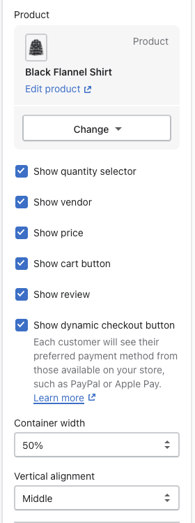
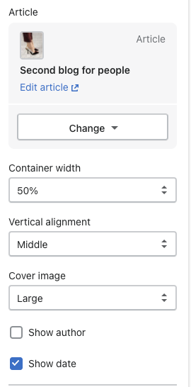
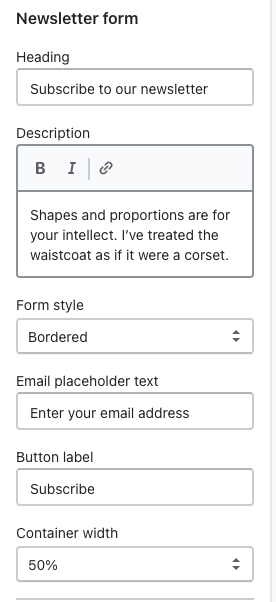
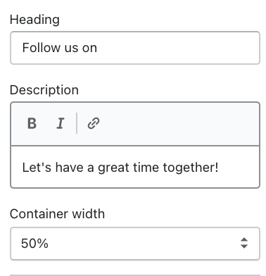
# Article and Newsletter form blocksArticle Newsletter form
Steps:
Add an article that you want to display for the block.
Adjust container width, alignment, and image size.
Enable/ disable showing published date and author.
Use the provided text fields to add a suitable heading/ description as well as the email placeholder and button label.
Leave them blank if you do not want to display them.
Control form style and container width.
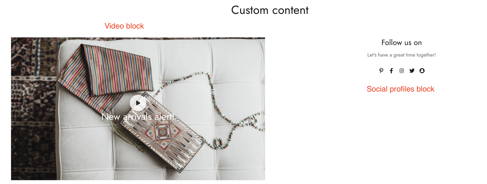
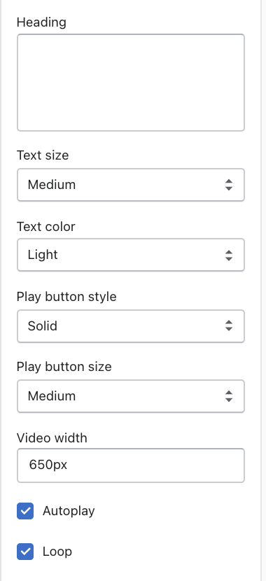
# Video and Social profiles blocksVideo block Social profiles
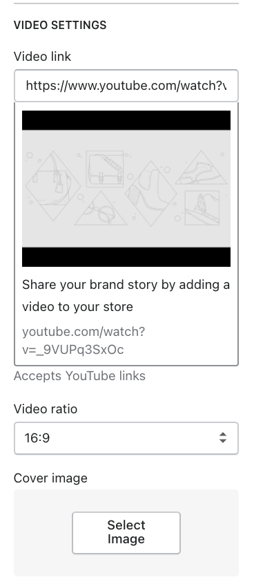
Add a YouTube video link and adjust its ratio.
If you want to use the original video thumbnail, leave the video image cover blank.
Use the provided text field to add a suitable heading and change its color and size.
If you don't want to display it, leave the field blank.
Modify the video button style, size, and video width.
Additionally, the video can be played in a loop and autoplay when customers visit the site.
Use the provided text fields to add a suitable heading/description. Leave any of the fields blank if you do not want to display them. Control the container width.
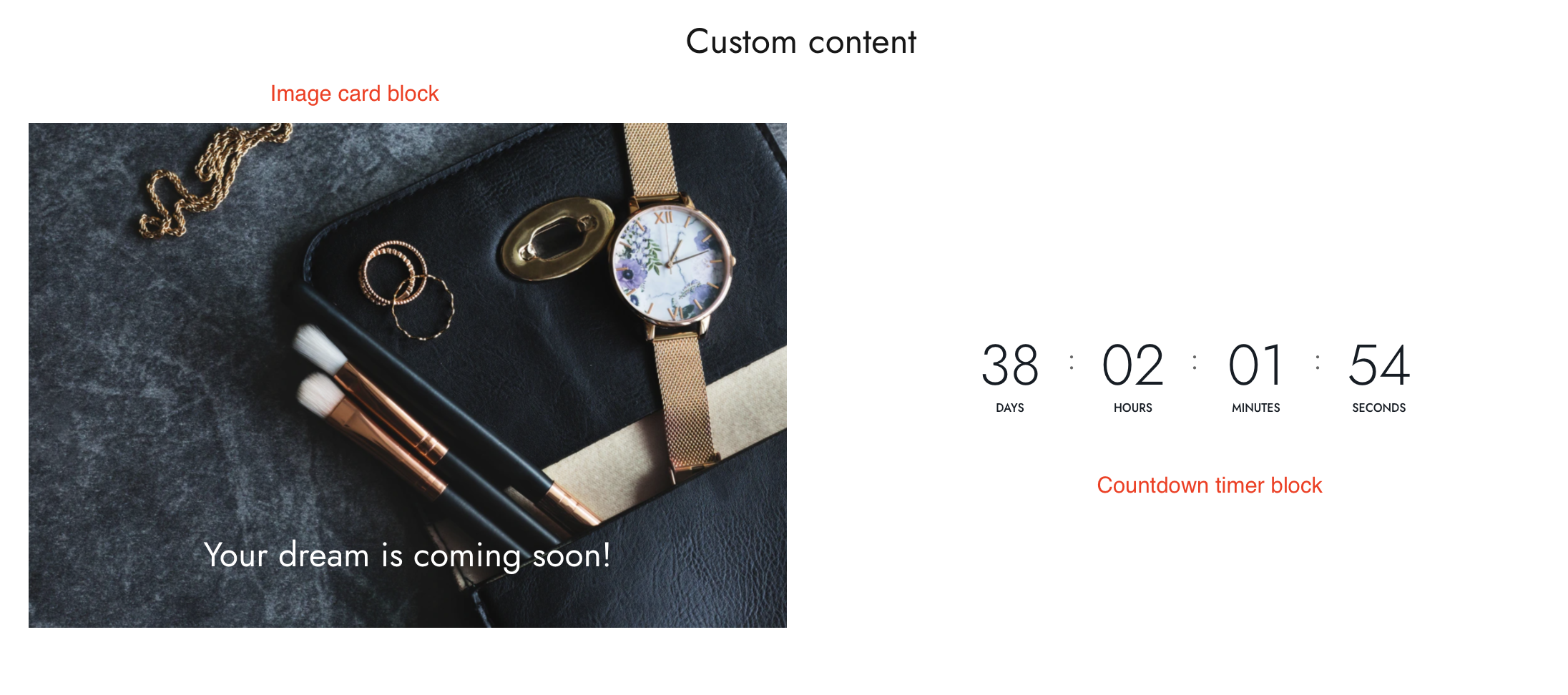
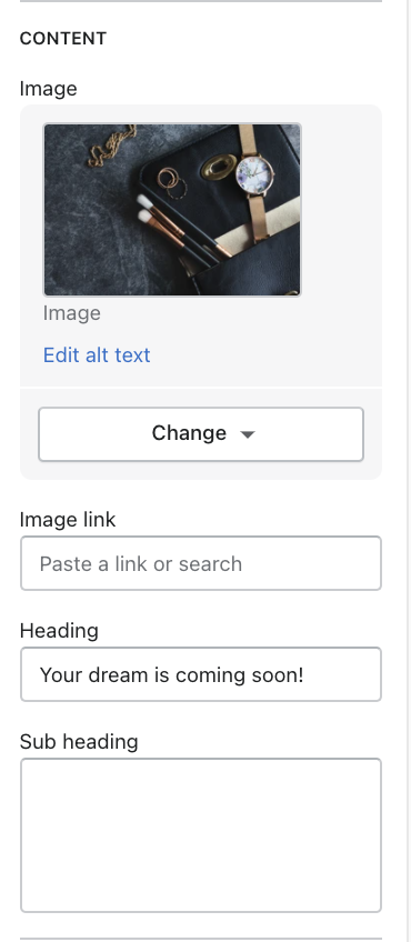
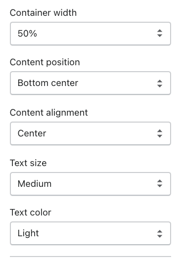
# Image card and Countdown timer blocksImage card Countdown timer
Use the provided text fields to add a suitable heading/ subheading/ description.
Leave the fields blank if you do not want to display them.
Adjust the container width, content position, etc.
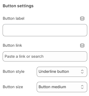
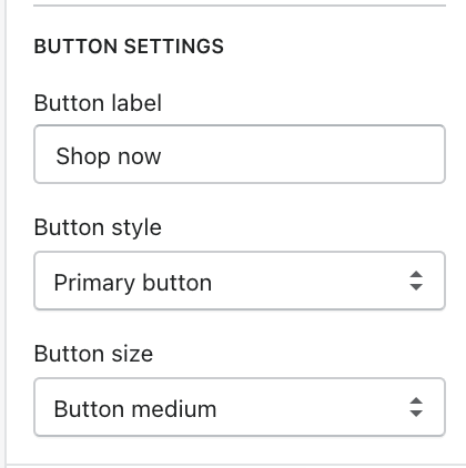
Add a call-to-action button to direct customers to the product detail page.
Add a Label then choose a Button style and adjust the Button size.
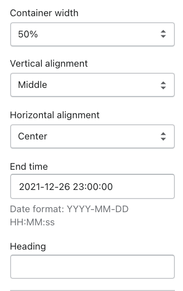
Adjust the container width, alignment, and end time of the timer.
Add a call-to-action button to direct customers to the product detail page. Add a Label then choose a Button style and adjust the Button size.
# Custom HTML blockYou can check the example below on how to display the HTML correctly.
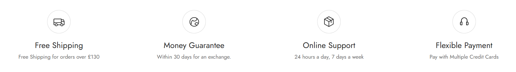
# Icon boxThe Icon box block allows you to display an image or icon with a heading, description, and optional button.
This block is commonly used for:
Store services
Feature highlights
Brand values
Promotional content
Support information
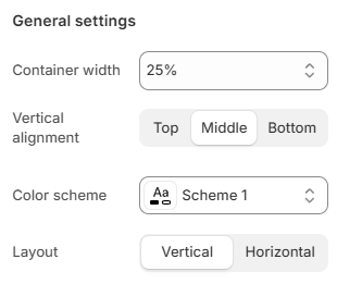
# General settingsChoose the Container width for the Icon box block.
Choose the Vertical alignment for the content:
Select the Color scheme for the block.
Set up your Color schemes anytime in the Theme settings >
Colors .
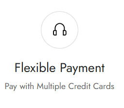
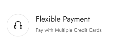
Choose the Layout for the Icon box:
# Image settings
Upload an Image for the Icon box block.
You can also use Image from URL to display an external image.
Adjust the Image width in pixels. Leave the field blank to use the original image width.
Add an Image link to make the image clickable.
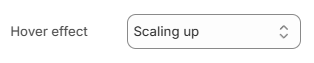
Choose the Hover effect for the image:
None
Zoom in
Scaling up
Scaling down
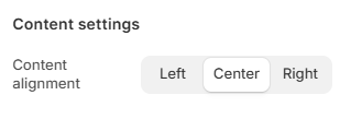
# Content settingsChoose the Content alignment for the block:
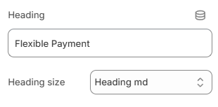
Enter the Heading text for the Icon box.
Choose the Heading size as:
Heading xs
Heading sm
Heading md
Heading lg
Heading xl
Heading 2xl
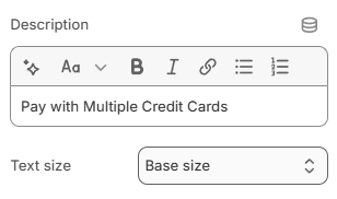
Add a Description using the rich text editor.
Select the Text size for the description:
Display a call-to-action button to redirect customers to your desired pages.
Add a Label and Link for one or both, then choose a Button style:
Primary button
Secondary button
Underline button
White button
Leave the Button label field blank to hide the button.
and adjust the Button size:
Button small
Button medium
Button large

_q5Dwgd9M.png)
_HOdn0toB.png)