Featured products slider

A guide to display product list under slider format

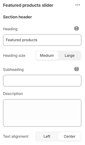
Unlike Featured product that displays only one particular product, the featured products slider section showcases a product list that you want to introduce.

Section settings

Section header

Use the provided text fields to add a suitable Heading/Subheading/Description. Leave any of the fields blank if you do not want to display them.

You can also change the Heading size to Medium/Large and adjust the Text alignment (Left/Center).

General

You can choose your Container type for the collection list as:

  • Default;

  • Full width;

  • Use container box.

Select the Color scheme for the section, and adjust the Image placement (Right/Left).

Slider settings

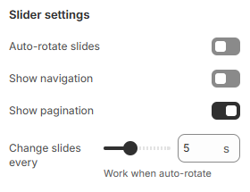
Enable/disable the slider. You can also display navigation and pagination with the slider. The duration time between each slide is between 2-10 seconds.

Mobile settings

Enable/disable the Show featured image toggle to show/hide the featured image on mobile.

Product card settings

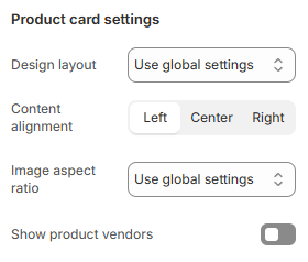
Use the dropdown boxes to select the product cards' design layout, content alignment, and image aspect ratio. You can enable/disable showing product vendors in the product cards of this section.

Block settings

For product blocks, you can add products, their headings, descriptions, and a feature image.

Last updated