
Theme Settings
Colors & Color schemes
4 min read
- In the theme editor (Customize), click Theme settings ()
- Locate Colors
- Make necessary changes
- Save
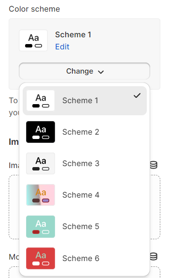
Color schemes
- Background
- Text
- Solid button background
- Sold button label
- Outline button
- Button hover
- Product price
- Form field
- Tooltip
- Border
Manage your color scheme
- From your Shopify admin, go to Online Store > Themes.
- Click Customize next to the theme that you want to customize.
- Select Theme settings () > Colors.
- In the Schemes section, click an existing scheme or click Add scheme to add a new color scheme.
- Click the color swatch for the content type color that you want to change.
- To set your color, enter a hex color code or choose the color from the color picker. To set the color to transparent, delete the hex code from the text field.
- Click Save.
Apply your color scheme
Gradients
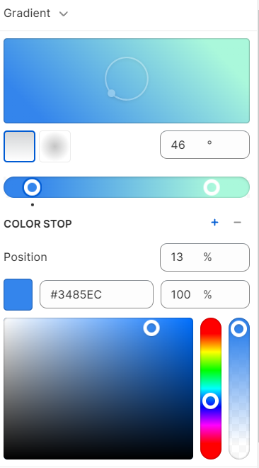
Set up gradients
- From your Shopify admin, go to Online Store > Themes.
- Click Customize next to the theme that you want to customize.
- Click Theme settings () > select Colors.
- In the Schemes section, click an existing scheme that you want to edit.
- Click the gradient color swatch option: Background gradient.
- If you haven't previously set up a gradient, then some preset options are displayed for you to choose from. Select any preset gradient to open the options panel.
- Select your gradient options:
- Choose between a linear or radial gradient. Use the buttons to select your preferred gradient style.
- Set the angle of your gradient with the up and down arrows. Clicking the up or down arrow increases or decreases the angle percentage by 5.
- Use the slider to select the position of your gradient, or enter a numeric value in the field.
- Enter a specific color hex code or use the color slider to choose a hue. Recently selected colors are displayed at the bottom of the gradient options panel.
- To make your gradient opaque, use the slider on the right to select the transparency of your gradient. You can also enter a percentage in the field next to the hex color code.
- Click Save.
Remove a gradient
- From your Shopify admin, go to Online Store > Themes.
- Click Customize next to the theme that you want to customize.
- Click the gear icon (Theme settings), and then click Colors.
- In the Schemes section, click an existing scheme that you want to edit.
- Click the gradient that you want to remove.
- Click Remove gradient.
- Click Save.
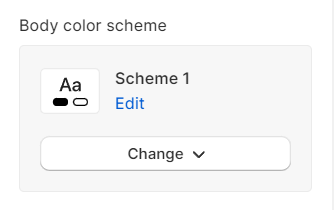
Body color scheme
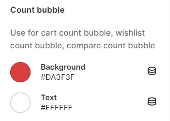
Count bubble
See how to set up the wishlist and compare page here: Additional pages
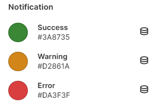
Notification
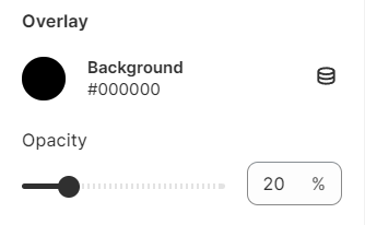
Overlay
Last updated