# Collection showcase
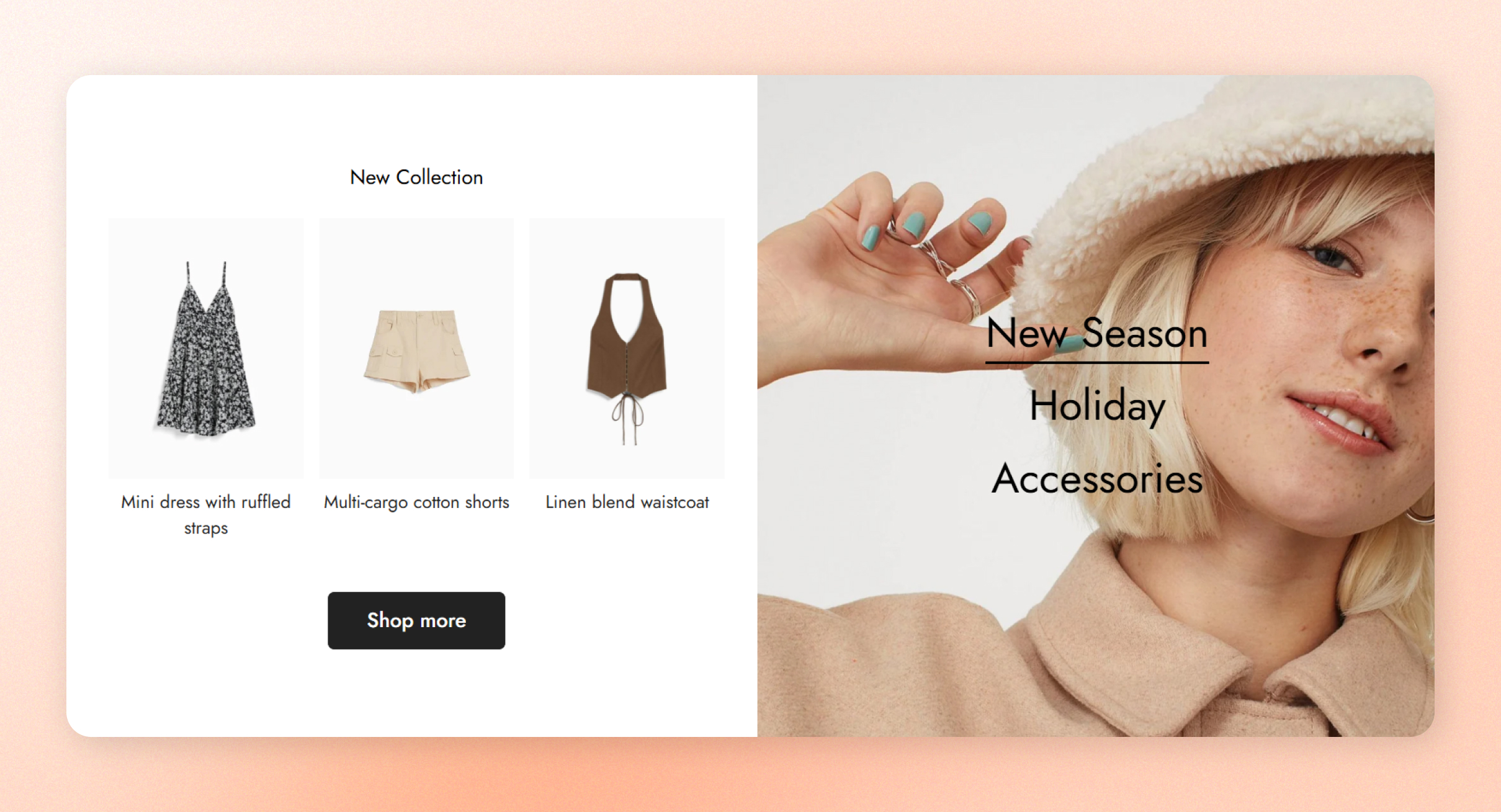
Let customers switch between collections and see their products side by side with a large image. The **Collection showcase** section shows your collections as tabs over an image, and the products of the selected collection next to it.
## How to add Collection showcase
1. Open the theme editor (**Edit theme**).
2. Click **Add section** under **Template** in the sidebar.
3. Select **Collection showcase**.
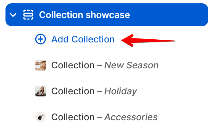
4. Click **Add Collection** under **Collection showcase**.
5. Click **Select** next to **Collection**.
6. Choose a collection.
7. Select an image in **Image**.
8. Repeat steps 4 to 7 for each collection.
9. Click **Save**.
If **Collection showcase** is already on the page, click it to edit it instead.
## Section settings
**Section Padding**, **Custom Attributes**, and **Animations** work the same as in every section. See [Common section settings](https://docs.foxecom.com/minimog-theme/theme-sections/common-section-settings).
### General
**Container type** and **Color scheme** work the same as in every section. See [Common section settings](https://docs.foxecom.com/minimog-theme/theme-sections/common-section-settings).
| Setting | Description | Options |
| --------------------- | ------------------------------------------------- | ------------------------------------------------------------ |
| **Color scheme tabs** | The colors of the collection tabs over the image. | Select a scheme. Click **Edit scheme** to change its colors. |
### Layout
| Setting | Description | Options |
| -------------------------- | --------------------------------------------------------- | --------------------------------------------------------------------------------- |
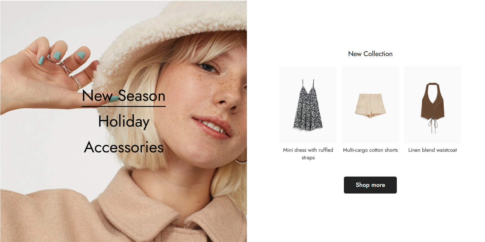
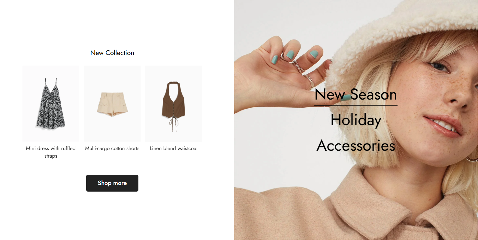
| **Desktop image position** | Which side of the products the image sits on, on desktop. | **Left** or **Right**.
*The position is set automatically on mobile.* |
| **Product to show** | How many products of the selected collection show. | **3 to 12.**
*With more than 3 products, the products show in a slider.* |
### Product card settings
| Setting | Description | Options |
| ---------------------- | -------------------------------------------- | ------------------------------------------------------------------ |
| **Image aspect ratio** | The shape of the image on each product card. | **Original aspect ratio**, **1:1**, **3:4**, **4:3**, or **16:9**. |
## Blocks
Each **Collection** block is one tab over the image. To add one, click **Add Collection** under **Collection showcase** in the sidebar.
 ### Collection
| Setting | Description | Options |
| ----------------------- | ------------------------------------------------------- | --------------------------------------------------------------------------------------------------- |
| **Alias to collection** | The tab's name, shown instead of the collection's name. | Enter text.
*Leave it blank to use the collection name.* |
| **Collection** | The collection whose products show. | Click **Select** to choose a collection. |
| **Image** | The image shown when this tab is selected. | Click **Select** to choose an image. |
| **Subheading** | A short line of text above the heading. | Enter text. |
| **Heading** | The heading above the products. | Enter text. |
| **Heading size** | The size of the heading. | **Heading xs**, **Heading sm**, **Heading md**, **Heading lg**, **Heading xl**, or **Heading 2xl**. |
| **Button label** | The text on the button below the products. | Enter text, such as `Shop more`.
*Leave it blank to hide the button.* |
| **Button style** | How the button looks. | **Primary button**, **Secondary button**, **White button**, or **Underline button**. |
| **Button size** | The size of the button. | **Button small**, **Button medium**, or **Button large**. |
Give the button a clear label, such as `Shop more`, so customers know where it leads.
Your collections show as tabs over the image in the theme editor preview, and selecting one shows its products.
## Related articles
Common section settings
Collection image showcase