# Gallery images 🔥

The **Gallery images** section visually showcases products, portfolios, or photoshoots like a gallery effectively.
This feature allows you to present multiple images in a visually appealing manner, enhancing user engagement and increasing the likelihood of conversions by providing potential customers with a clearer view of what is being offered.
In this article, we will show you how to add a **Gallery images** section.
## How to add a Gallery images section to your Shopify store
Steps
1. In the theme editor **(Customize)**, click **Add section.**
2. Select **Gallery images**.
3. Make necessary changes.
4. **Save** the settings.
## How to edit a Gallery images section
### Section settings
#### Section header
Use the provided text fields to add a suitable **Heading**/**Subheading**/**Description**.
* Leave any of the fields blank if you do not want to display them.
Change the **Heading size** to Medium/Large and adjust the **Text alignment** (Left/Center)
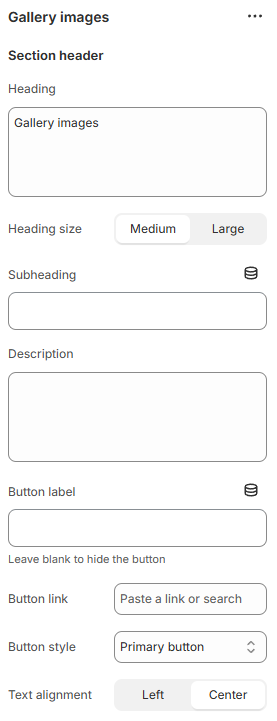
You can also display a call-to-action button to redirect customers to your desired pages.
Add a **Button label** and **Button link**, then choose a **Button style:**
* Primary button
* Secondary button
* White button
* Underline button
#### General
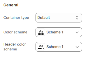
You can choose your **Container type** for the collection list as:
* Default;
* Full width;
* Use container box.
Select the **Color scheme** and **Header color scheme** for the section.
#### Social media
Choose the social media **Icon** that you want to display:
* None
* Instagram
* Facebook
* Twitter

#### Settings
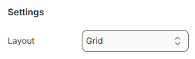
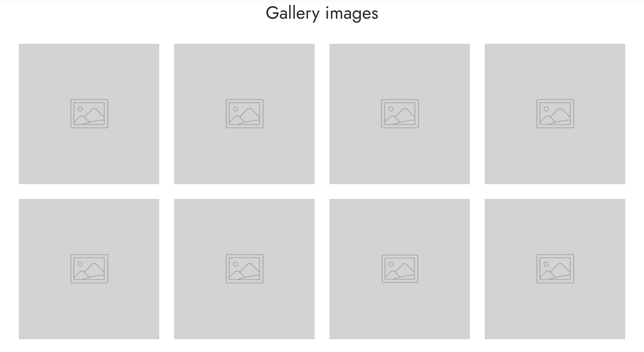
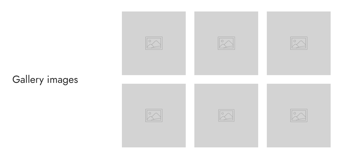
The **Layout** dropdown allows you to select the display style for your images:
* Grid
* Metro 1
* Metro 2

#### Grid settings
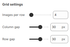
Use the slider to adjust the **Images per row** (between 4 and 12) for Image blocks.
You can also control the suitable spacing between the Image blocks by adjsuting **Column gap** and **Row gap** options. (0px - 50px)
#### Mobile settings
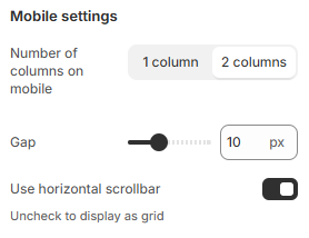
You can adjust the grid layout on mobile by changing the value of the **Number of columns on mobile** to 1 column/2 columns.
You can also control the suitable spacing between the Image blocks on mobile by adjusting the **Gap** option. (0px - 30px)
If you are not into the grid layout, you can use the carousel layout by selecting the **Use horizontal scrollbar** to make the image gallery swipeable.
### Block settings
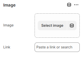
You can add multiple **Image** blocks to the **Gallery images** section.
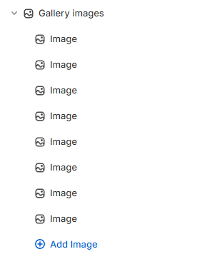
Click *Select image* to select a suitable **Image** for the block to display in the section.
Moreover, you can optionally add the specific **Link** for that image block.