
FaqsGeneric
Hide sections on mobile/ desktop view
1 min read
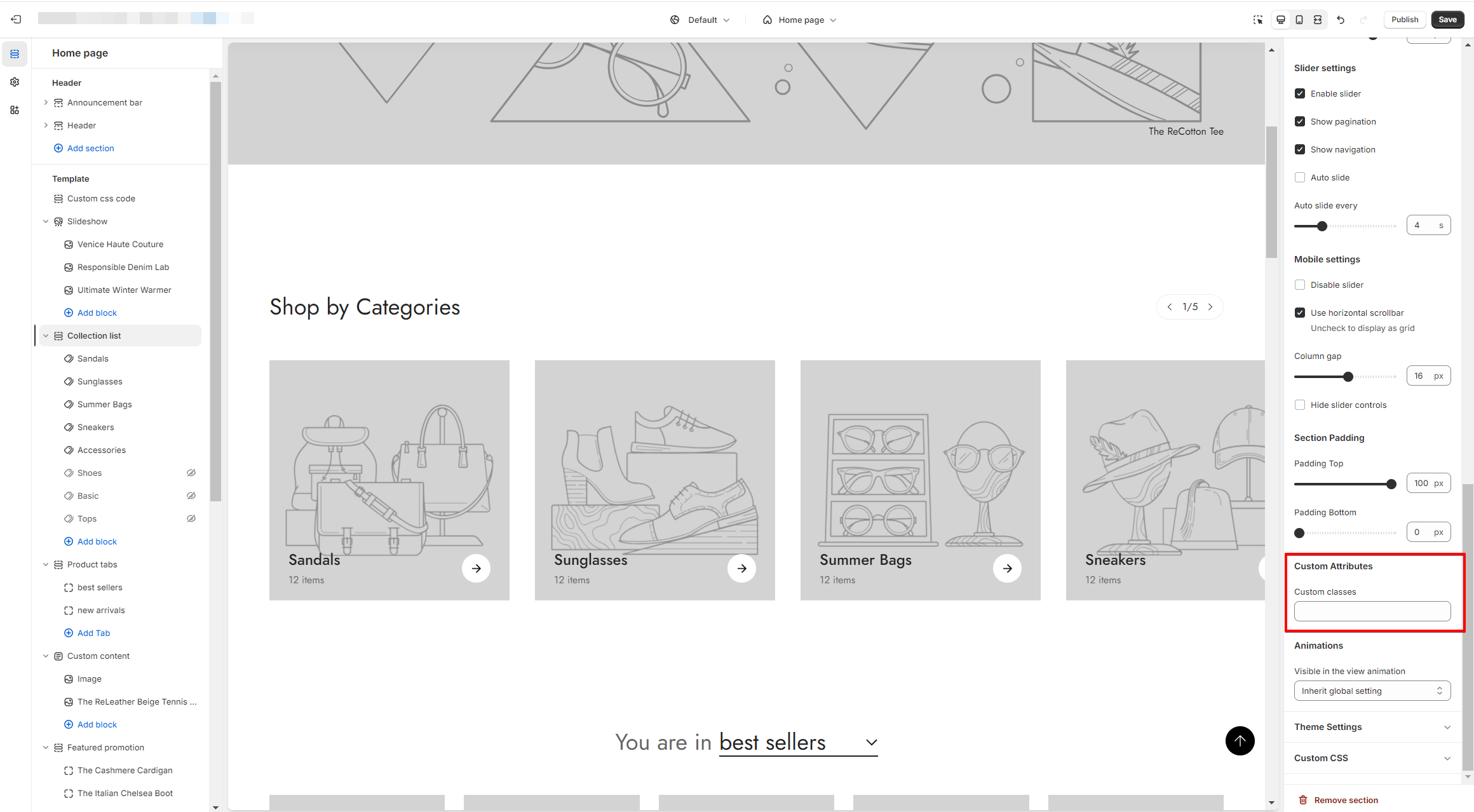
- From your Shopify admin, go to Online Store > Customize.
- In the theme editor, select the section you want to customize.
- Find Custom attributes in the section settings and add the following custom classes:
Minimog version 3.5.0 and older:
- Display that section on desktop and hide it on mobile:
hidden md:block - Display that section on mobile and hide it on desktop:
block md:hidden Minimog version 4.0.0 and above:
- Display that section on desktop and hide it on mobile:
m:hidden md:m:block- Display that section on mobile and hide it on desktop:
m:block md:m:hiddenLast updated