
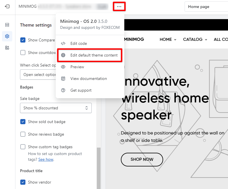
Theme Settings
Product card
3 min read
- In the theme editor (Customize), click Theme settings.
- Locate Product card.
- Make necessary changes.
- Save.
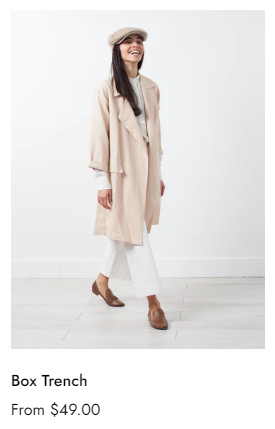
Layout and image
Card style
Content alignment
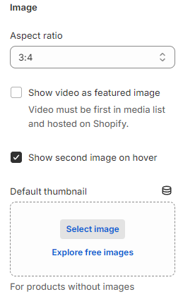
Image
- Aspect ratio: Set the suitable Aspect ratio for your image card. There are 4 options:
- Adapt to image
- 1:1 (square image)
- 3:4
- 4:3
- 16:9
- Show video as featured image: When checked, the product card shows a video (if the video is placed first in Shopify Products > Product media).
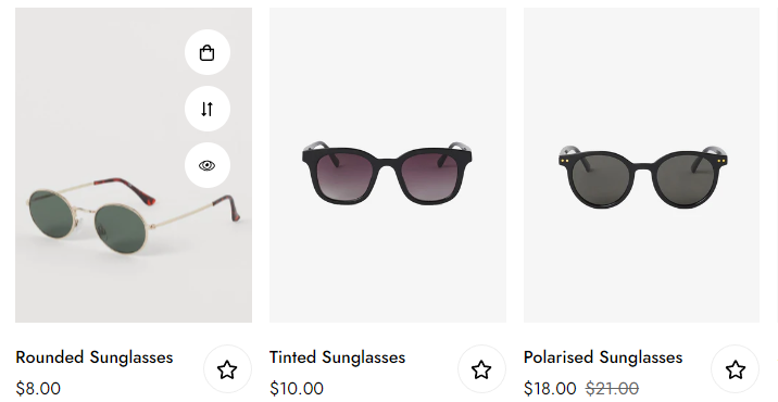
- Show second image on hover: When checked, the second image in Product media is shown when customers hover over the product card.
- Default thumbnail: For products without images, you can set a default thumbnail by uploading an image or selecting one from your Shopify Files.
Variant options
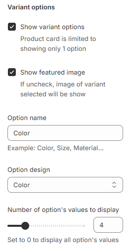
- Show variant options: Enable or disable showing variants in product items and how they display on the front store.
- Show featured image:
- When checked, the featured image shown in the product card is the first image as set in Product media.
- When unchecked, the image of the selected variant will be shown.
- Option name: Insert one product option you want to display on the product cards.
- Option design: Select how the variant options are shown:
- Custom image: as set in Theme settings > Product options swatches.
- Color: as set in Theme settings > Product options swatches.
- Variant image: as set in Shopify Products > Variants.
- Button.
- Dropdown.
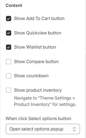
Content and Badges
Content
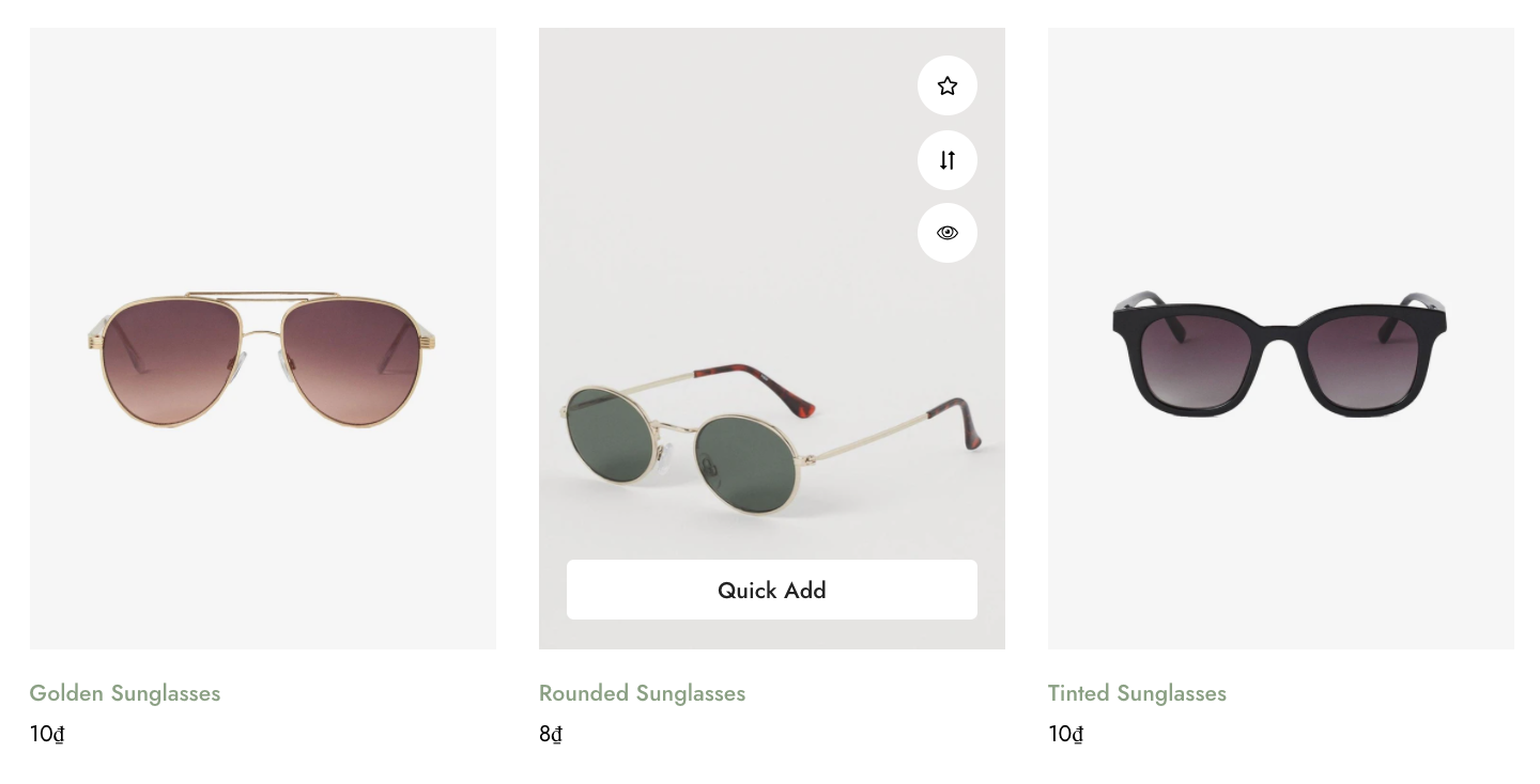
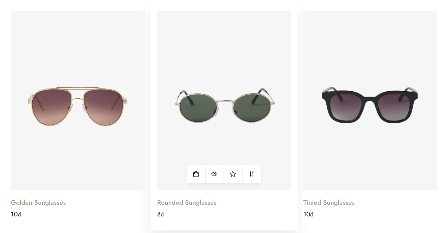
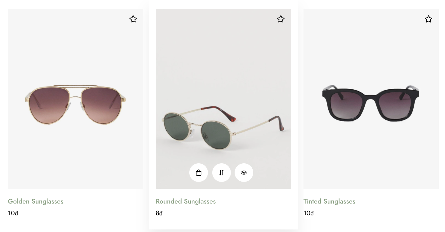
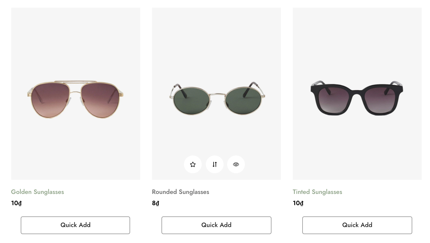
- Add to cart button: let customers add items to the cart without leaving the current page.
- Quickview button: let customers preview product information without needing to go to the product page.
- Wishlist button: let customers add their favorite products to the list.
- Compare button: let customers add products to the comparison page to check the differences and similarities among stores' products.
- Countdown: display time when there is an event for the product to release/discount.
- Show product inventory: display the product inventory as set in Theme settings > Product inventory
- Actions when clicking Select options button: It either pops up Select options dialogue or goes directly to the product page.
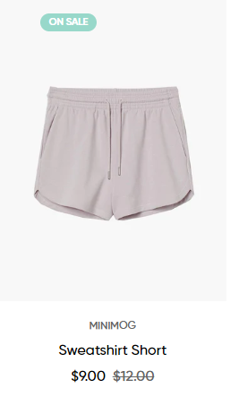
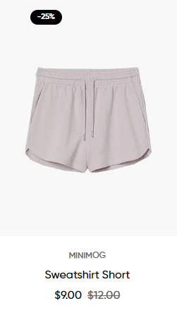
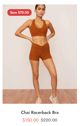
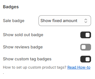
Badges
- Sale badge: hide or show the sale badge in % discount or fixed amount or text.
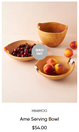
- Sold-out badge: display badge to let customers know which products are out of stock.
- Reviews badge: display ratings from the customers (A review application is required).
- Custom badges: display/hide other badges rather than sale and sold-out badges. To display custom badges, you need to add tags to your products, see Product tags.
Product titles
- Show vendor: display vendor/brand names under the product title.
- Capitalize product name.
- Product title line limit: control the maximum line of the product titles as No limit/1 lines/2 lines/3 lines.
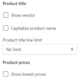
Product prices
Last updated