# Collapsible tabs
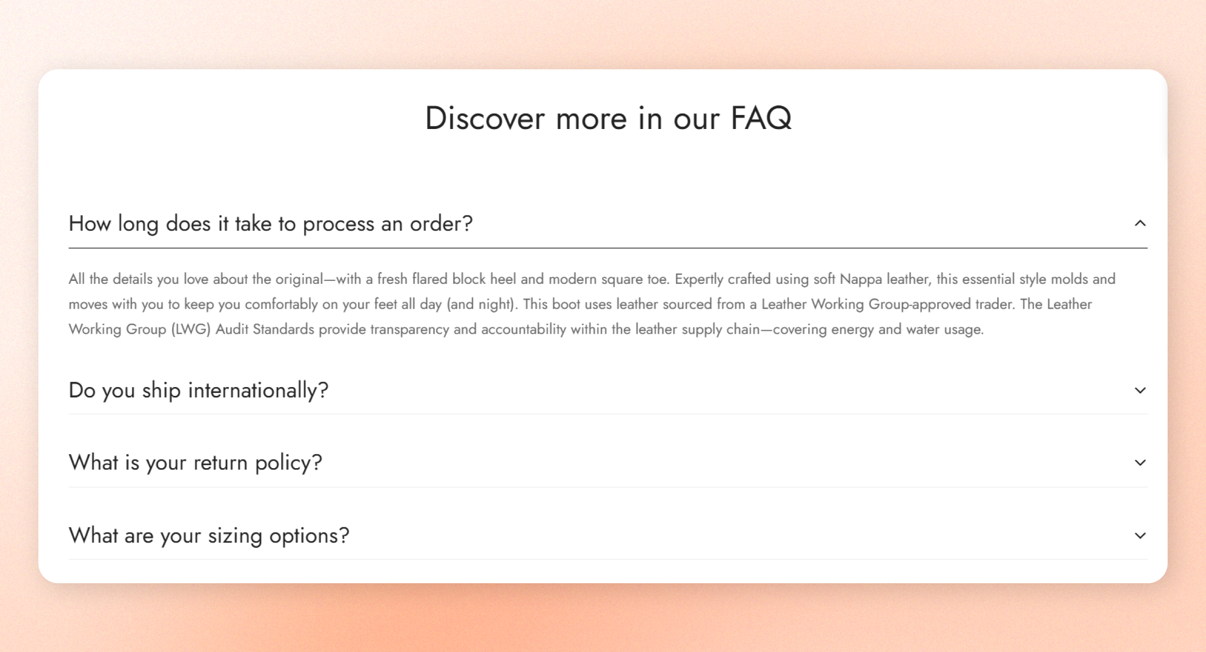
Answer common questions and share details without making customers scroll through a wall of text. The **Collapsible tabs** section shows a list of tabs that customers open one at a time, with an optional image beside them.
## How to add Collapsible tabs
1. Open the theme editor (**Edit theme**).
2. Click **Add section** under **Template** in the sidebar.
3. Select **Collapsible tabs**.
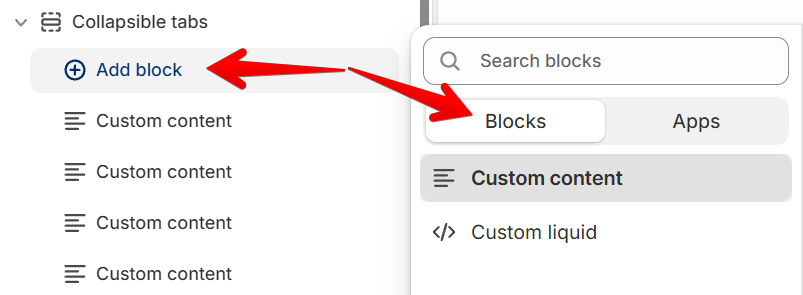
4. Click **Add block** under **Collapsible tabs**.
5. Select **Custom content**.
6. Enter the tab's title in **Collapsible tab**.
7. Enter the answer in **Accordion content**.
8. Repeat steps 4 to 7 for each tab.
9. Click **Save**.
If **Collapsible tabs** is already on the page, click it to edit it instead.
## Section settings
**Section header**, **Section Padding**, **Advanced**, **Custom Attributes**, and **Animations** work the same as in every section. See [Common section settings](https://docs.foxecom.com/minimog-theme/theme-sections/common-section-settings).
### Layout and image
These settings sit at the top of the section's settings. **Color scheme** works the same as in every section.
| Setting | Description | Options |
| ------------------ | ----------------------------------------- | -------------------------------------------------------------------------------- |
| **Container type** | The width of the section's content. | **Fixed width**, **Stretch width**, or **Narrow width**. |
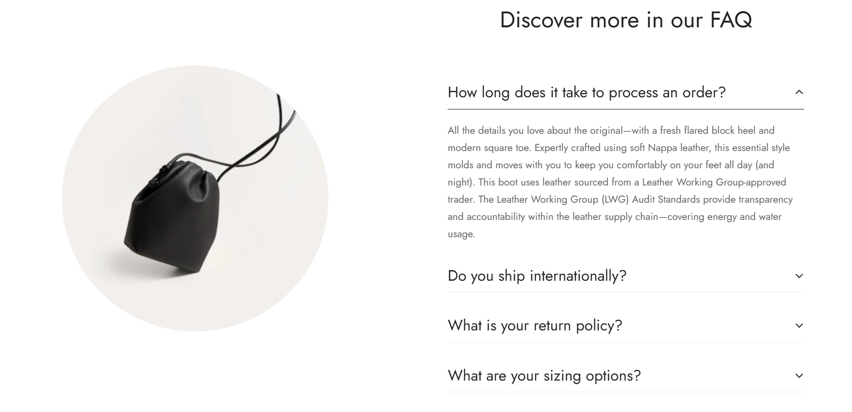
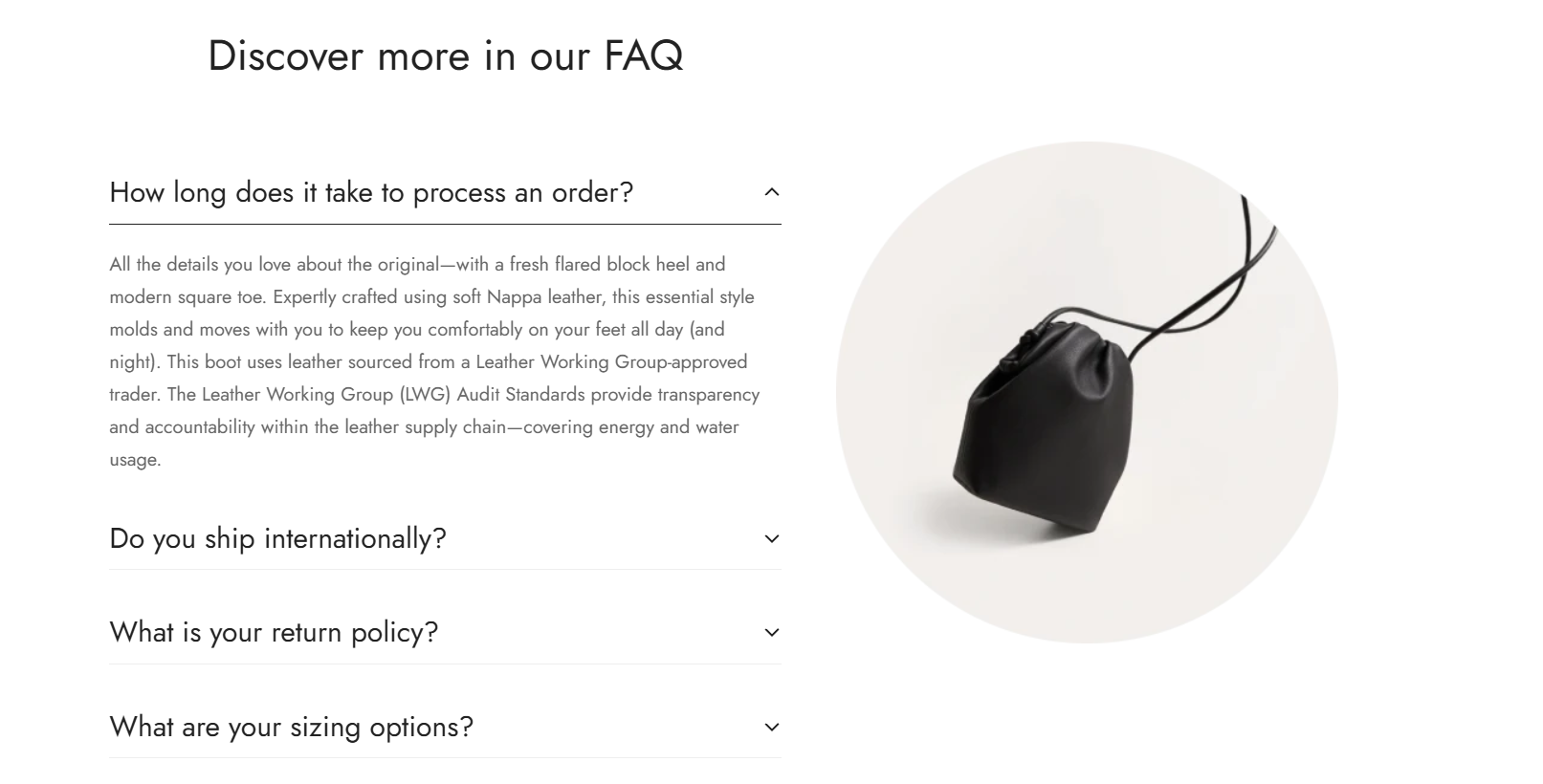
| **Image** | An image shown beside the tabs. | Click **Select** to choose an image.
*Leave blank to hide the image.* |
| **Image position** | Which side of the tabs the image sits on. | **Left** or **Right**. |
| **Column gap** | The space between the image and the tabs. | **0 to 150 px.** |
## Blocks
Each block is one tab. To add one, click **Add block** under **Collapsible tabs** in the sidebar, then choose **Custom content** or **Custom liquid**.
 ### Custom content
A tab with your own text, or the content of one of your store's pages.
| Setting | Description | Options |
| ------------------------- | ------------------------------------------------ | --------------------------------------------------------------------------------------------------- |
| **Collapsible tab** | The tab's title, shown before customers open it. | Enter text, such as `How long does it take to process an order?`. |
| **Text size** | The size of the tab's title. | **Heading xs**, **Heading sm**, **Heading md**, **Heading lg**, **Heading xl**, or **Heading 2xl**. |
| **Accordion content** | The text shown when the tab is open. | Enter text. |
| **Tab content from page** | A store page whose content shows in the tab. | Click **Select** to choose a page. |
| **Default open** | Keeps the tab open when the page loads. | **On** or **Off**. |
Use **Accordion content** or **Tab content from page**. If you fill in both, the tab shows both.
### Custom liquid
A tab with your own Liquid code, for content that the other settings can't show.
| Setting | Description | Options |
| ----------------- | ------------------------------------ | --------------------------------------------------------------------------------------------------- |
| **Tab heading** | The tab's title. | Enter text. |
| **Text size** | The size of the tab's title. | **Heading xs**, **Heading sm**, **Heading md**, **Heading lg**, **Heading xl**, or **Heading 2xl**. |
| **Custom liquid** | The code shown when the tab is open. | Enter Liquid code. |
Custom code can change how your store looks or works. Add code only from a source you trust, and test it before you publish.
Your tabs show in the theme editor preview, and opening one shows its content.
## Related articles
Common section settings
Collection tabs