Featured collection

Learn how to display products from a selected collection in an engaging and attractive section.

Featuring collections can help promote sales and new collections.

circle-check

Section header:

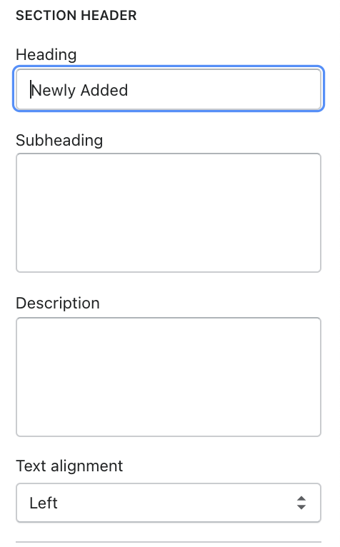
Use the provided text field to add a suitable heading/subheading/description. Leave any of the fields blank if you do not want to display them. Adjust the text alignment (left/center).

General

Select the container type, background color, and add a preferable collection.

Flash sale

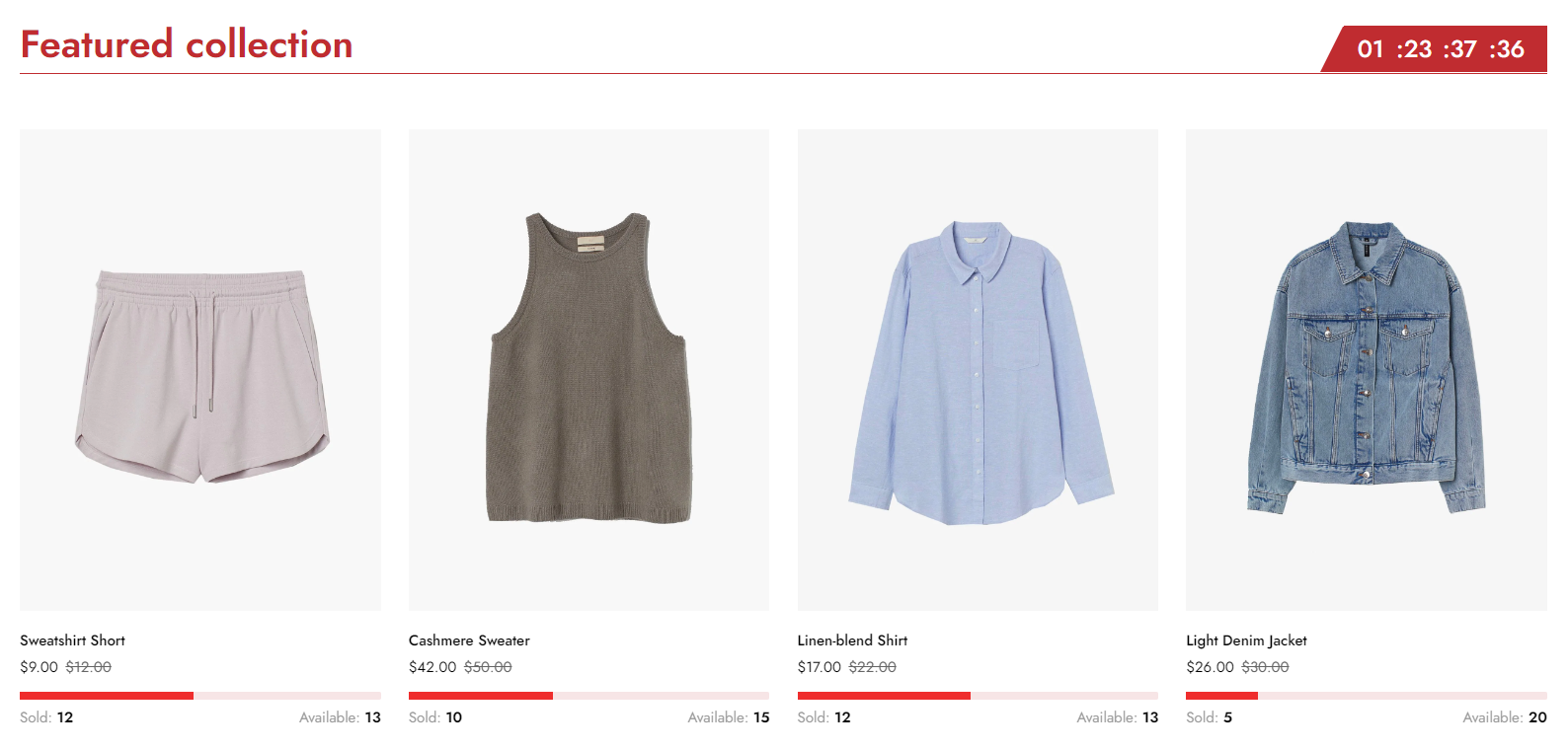
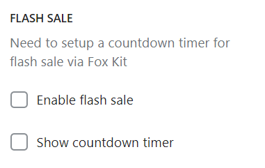
A flash sale creates urgency because of limited stock and/or limited time frame. This creates a sense of scarcity of the product and boosts your store conversions.

circle-info

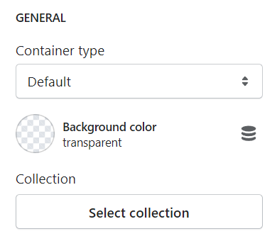
To enable flash sales for your featured collection, see Countdown timerarrow-up-right.

The Countdown type must be Fixed time and Applies to option is Specific collection.

Grid settings and Product cards

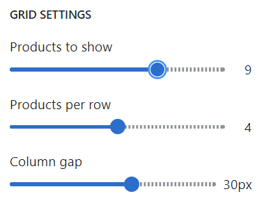
Adjust the number of shown products (between 2 and 12), products per row (between 2 and 6), and the column gap.

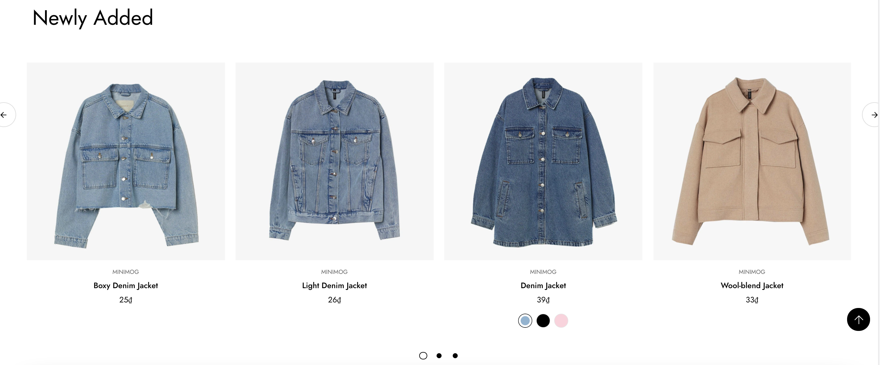
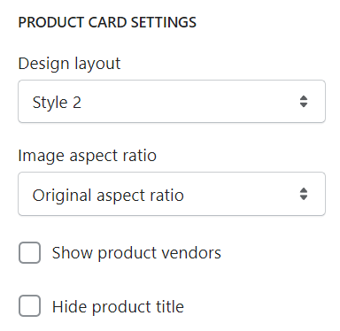
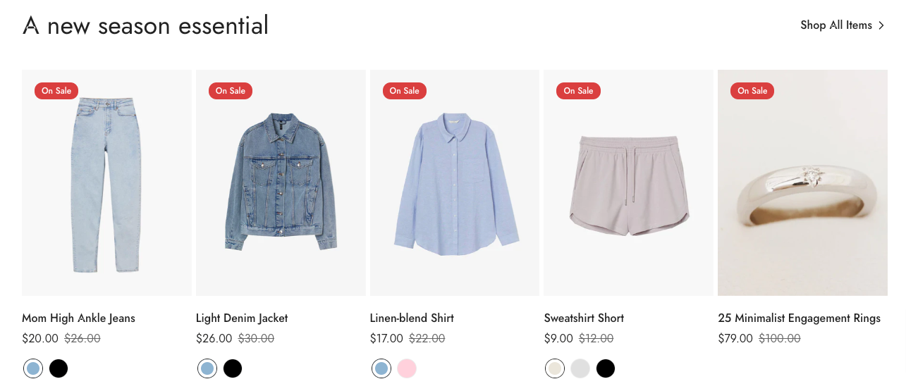
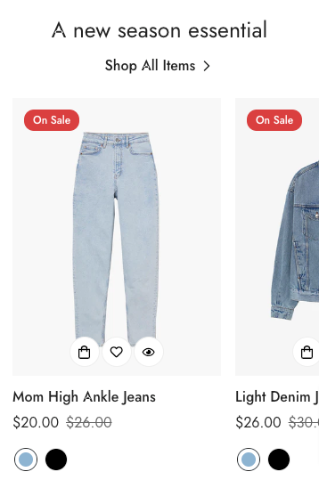
Choose the product card design as you prefer and the image aspect ratio. You can also enable/disable showing product vendors and product titles in this section.

Slider settings

Enable/disable slider. You can also display navigation and pagination alongside the slider.

Button settings

Add a call-to-action button to direct customers to collection pages or add a load more products button.

circle-info

The load more products button only works when the slider is disabled.

This button can be positioned on the header on both desktop and mobile.

For example:

Infinite loading

Use when the slider is not enabled. It loads products continuously while customers scroll down.

Product card

Each product is displayed in a sequence of cards with an add-to-cart, a Quickview feature, etc. It also includes the design layout and image ratio for the product cards.

Please refer to the link below for further info.

Product cardchevron-right

Last updated