# Before/ After image slider

<figure><img src="https://1997835572-files.gitbook.io/~/files/v0/b/gitbook-x-prod.appspot.com/o/spaces%2F-MlL6sK9D7unq8F2VPPp%2Fuploads%2FjQlkQW5S8YTF6xf1EjUC%2Fimage.png?alt=media&#x26;token=3bd0b1a9-cd1f-48a2-89eb-64c6fa176521" alt=""><figcaption></figcaption></figure>

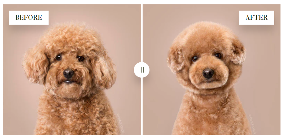
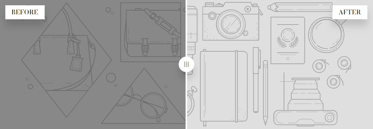
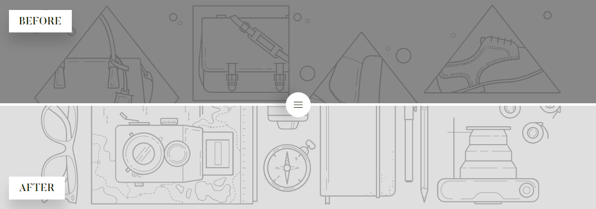
With Minimog's Before/ After image slider section, you can create horizontal or vertical sliders for your Shopify store, unleashing the creative potential of your site.&#x20;

Using a Before/ After image slider can bring you several benefits such as:&#x20;

* boosting engagement on your Shopify store through interaction;
* creating compelling visual stories;
* showcasing impressive or persuasive presentations.

In this article, we will show you how to add and customize a **Before/ After image slider** section.

{% hint style="success" %}
Steps:

1. In the theme editor **(Customize)**, click **Add section.**
2. Select **Before/ After image slider.**
3. Make necessary changes.
4. **Save** the settings.
   {% endhint %}

## Section settings

### General settings&#x20;

Select the section's container type as **Default**/ **Full width**/ **Use a container box**.

Then, give your section a heading, subheading, and description. Leave any of the fields blank if you don't want to show the content.

You can either set your **Text alignment** as **Center** or **Left**.

<figure><img src="https://1997835572-files.gitbook.io/~/files/v0/b/gitbook-x-prod.appspot.com/o/spaces%2F-MlL6sK9D7unq8F2VPPp%2Fuploads%2FVgKveUx8tYHLJIDShX8D%2Fimage.png?alt=media&#x26;token=bbb114c8-5a17-4bf9-8764-e91da0c5a867" alt=""><figcaption></figcaption></figure>

### Slider settings

<figure><img src="https://1997835572-files.gitbook.io/~/files/v0/b/gitbook-x-prod.appspot.com/o/spaces%2F-MlL6sK9D7unq8F2VPPp%2Fuploads%2FODixpy6wsLI9VnZD69XL%2Fimage.png?alt=media&#x26;token=5bfa9842-a752-43a8-b86b-f5bfa1660bf2" alt=""><figcaption></figcaption></figure>

The layout settings let you decide whether to have your images slide horizontally or vertically.

{% tabs %}
{% tab title="Horizontal" %}

<figure><img src="https://1997835572-files.gitbook.io/~/files/v0/b/gitbook-x-prod.appspot.com/o/spaces%2F-MlL6sK9D7unq8F2VPPp%2Fuploads%2FfJMYLUzW2CO46AFzd2v0%2Fimage.png?alt=media&#x26;token=7ab8e957-59e1-4d07-af95-b4a5aa12545f" alt=""><figcaption></figcaption></figure>
{% endtab %}

{% tab title="Vertical" %}

<figure><img src="https://1997835572-files.gitbook.io/~/files/v0/b/gitbook-x-prod.appspot.com/o/spaces%2F-MlL6sK9D7unq8F2VPPp%2Fuploads%2F89vHxDpIohzG67bXfa6Y%2Fimage.png?alt=media&#x26;token=b3029751-c75d-4ac4-966d-5651d96ff605" alt=""><figcaption></figcaption></figure>
{% endtab %}
{% endtabs %}

Set the section's image height as **Adapt to image**/ **Small**/ **Medium**/ **High**.

## Block settings

There are two blocks of images within a Before/ After image slider. You need to fill in both blocks to make the slider work.&#x20;

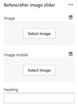
In each block, you can add a separate image for the desktop/ laptop/ tablet view, a separate image for the mobile view, and also the heading for that image.&#x20;

<figure><img src="https://1997835572-files.gitbook.io/~/files/v0/b/gitbook-x-prod.appspot.com/o/spaces%2F-MlL6sK9D7unq8F2VPPp%2Fuploads%2FTW6M32XoliWBWssZVKWh%2Fimage.png?alt=media&#x26;token=e10a1588-ad97-462e-a9dc-ac275afbfe05" alt=""><figcaption></figcaption></figure>

<figure><img src="https://1997835572-files.gitbook.io/~/files/v0/b/gitbook-x-prod.appspot.com/o/spaces%2F-MlL6sK9D7unq8F2VPPp%2Fuploads%2FGeIkBQFI4LGjyGqhvlet%2Flivechat883x471%20(1).png?alt=media&#x26;token=9168d917-bd02-4cd6-a7af-eb9896c7a5ef" alt=""><figcaption><p><a href="https://apps.shopify.com/xflow?utm_source=foxecom&#x26;utm_medium=help_center_minimog&#x26;utm_campaign=banner">Install XFlow Back In Stock Automation FREE</a></p></figcaption></figure>
