Product list banners can help online stores promote sales and new collections with an attractive banner image.
#How to add a Product list banner
Steps:
- In the theme editor (Customize), click Add section.
- Select Product list banner.
- Make necessary changes.
- Save the settings.
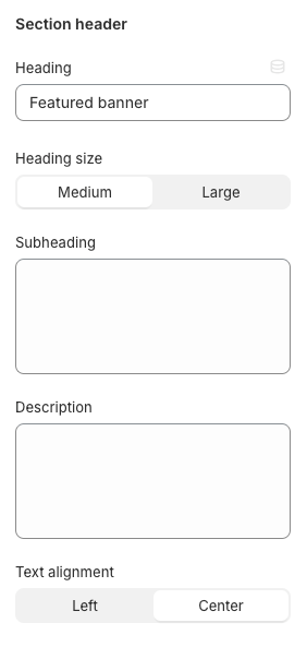
#Section settings
Use the provided text fields to add a suitable Heading/ Subheading/ Description.
Leave them blank if you do not want to display them.
Adjust the Heading size (Medium/ Large) and Text alignment (Left/ Center).
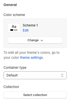
#General
Adjust the Container type (Default/ Full width/ Use container box) and color scheme, and add a preferable Collection for this section.
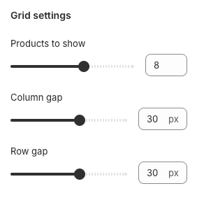
#Grid settings
Adjust the number of Products to show (between 2 and 12), the Column gap, and the Row gap.
✨ Pro tip: The column gap and row gap should be the same for a symmetrical design.
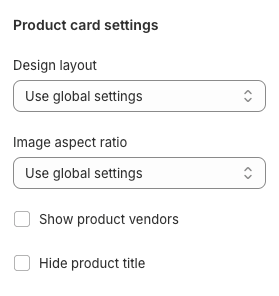
#Product card settings
Choose the product card Design layout you prefer:
- Use global settings
- Style 1
- Style 2
- Style 3
- Style 4
- Style 5
and the Image aspect ratio:
- Use global settings
- Original aspect ratio
- 1:1
- 3:4
- 4:3
- 16:9
You can also enable/ disable Showing product vendors and product title in this section.
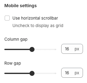
#Mobile settings
Determine the Column gap and the Row gap between columns.
Moreover, you can also change the layout from grid to slider on mobile by enabling the Use horizontal scrollbar checkbox.
✨ Pro tip: The column gap and row gap should be the same for a symmetrical design.
#Block settings
You can only add a maximum of one block for the section.
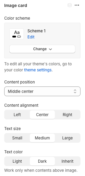
#Image card
Adjust the Color scheme for this block.
Change the Content position and Content alignment (Left/ Center/ Right) to make the block look reasonable in the section.
In addition, you can also change the Text size (Small/ Medium/ Large) and Text color (Dark/ Light/ Inherit) of the block.
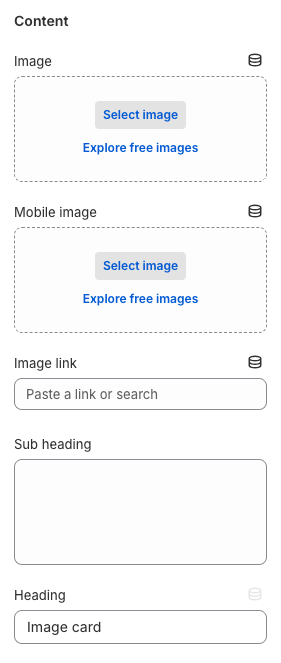
#Content
You can add banner images for desktop and mobile versions separately.
To direct customers to a specific page > add a link to the Image link input field.
- Leave it blank if you want to redirect to the current page.
Use the provided text fields to add a suitable Heading/ Subheading.
- Leave them blank if you do not want to display them.
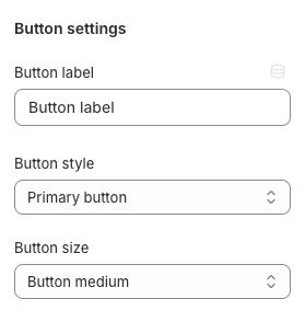
The call-to-action button will get the link from the provided Image link above.
Give the button a label, a specific Button style
- Primary button
- Secondary button
- Underline button
- White button
and the Button size
- Button small
- Button medium
- Button large