# Product options design
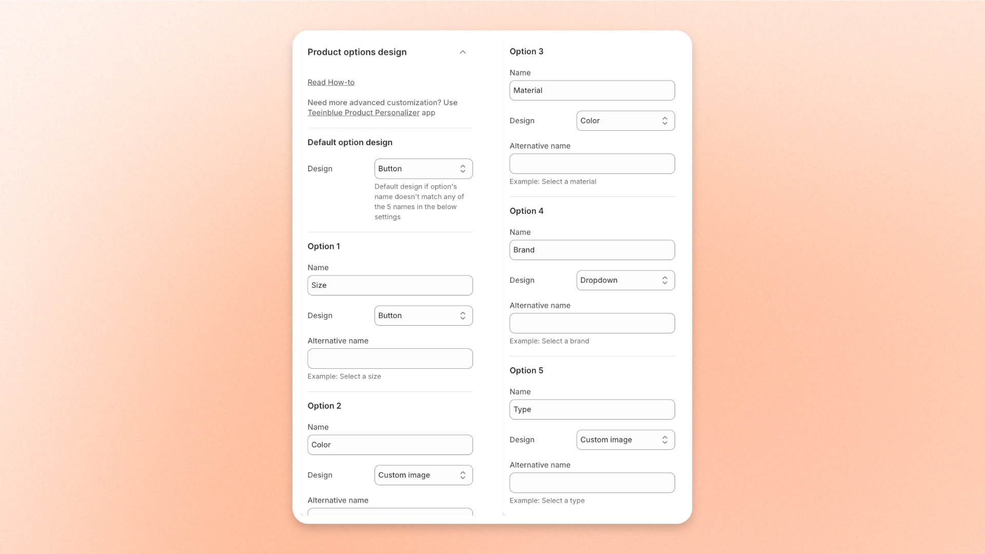
Choose how product options such as size, color, or material appear on your product pages: as buttons, color swatches, variant images, custom images, or a dropdown. The **Product options design** settings let you set a design for up to 5 option names, plus a default design for every other option.
## How to edit Product options design
1. Open the theme editor (**Edit theme**) and go to **Theme settings**.
2. Open **Product options design**.
3. Adjust the settings described below.
4. Click **Save**.
## Settings
### Default option design
| Setting | Description | Options |
| ---------- | ---------------------------------------------------------------------------------------- | ---------------------------------------------------------------------------- |
| **Design** | The design used for any option whose name doesn't match one of the 5 option names below. | **Custom image**, **Color**, **Variant image**, **Button**, or **Dropdown**. |
### Option 1 to Option 5
Set a design for up to 5 option names. Each option has the same three settings.
| Setting | Description | Options |
| -------------------- | -------------------------------------------- | ---------------------------------------------------------------------------------------------------------------------------------------------------------------------------------------------------------------------------------------------------------------------------------------------------------------------------------------------------------------------------------------------------------------------------------------------------------------------------------------------------------------------------------------------------------------------------------- |
| **Name** | The option name the design applies to. | Enter the name exactly as it appears in **Shopify Admin > Products**, such as `Size` or `Color`. |
| **Design** | How this option appears on the product page. | **Button:** Shows each value as a text box. Lets shoppers scan all sizes or variants at a glance.
**Color:** Shows each value as a color swatch, so customers see the actual product color.
**Variant image:** Shows each value as its variant image. Helps shoppers tell styles, patterns, or models apart.
**Dropdown:** Puts all values in one drop-down menu. Saves space and suits long lists of values.
**Custom image:** Shows each value as a custom image swatch you upload. Shows surface details that variant images can't. |
| **Alternative name** | A label shown instead of the option name. | Enter a label, such as `Select a size`. Leave blank to show the option name. |
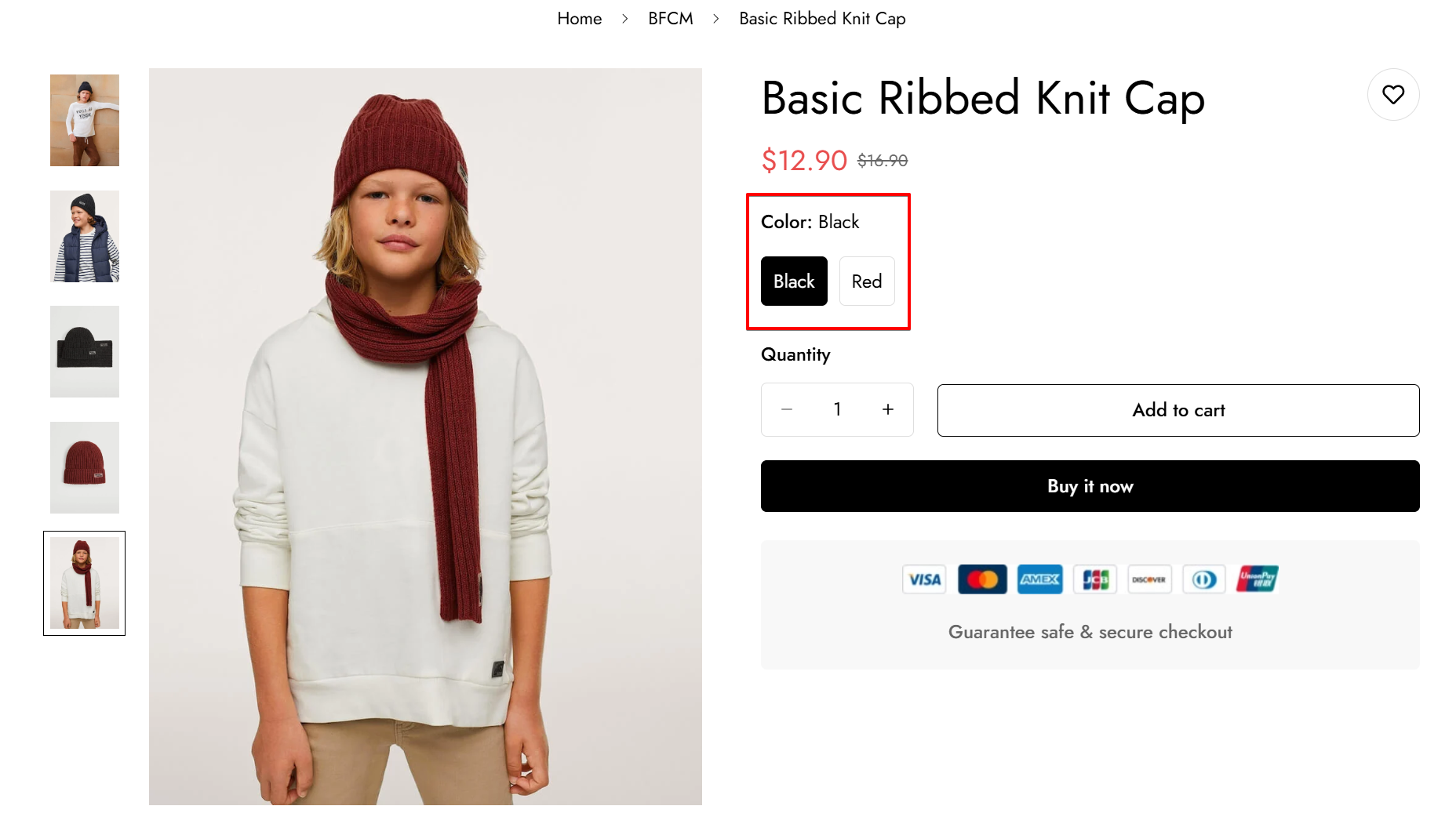
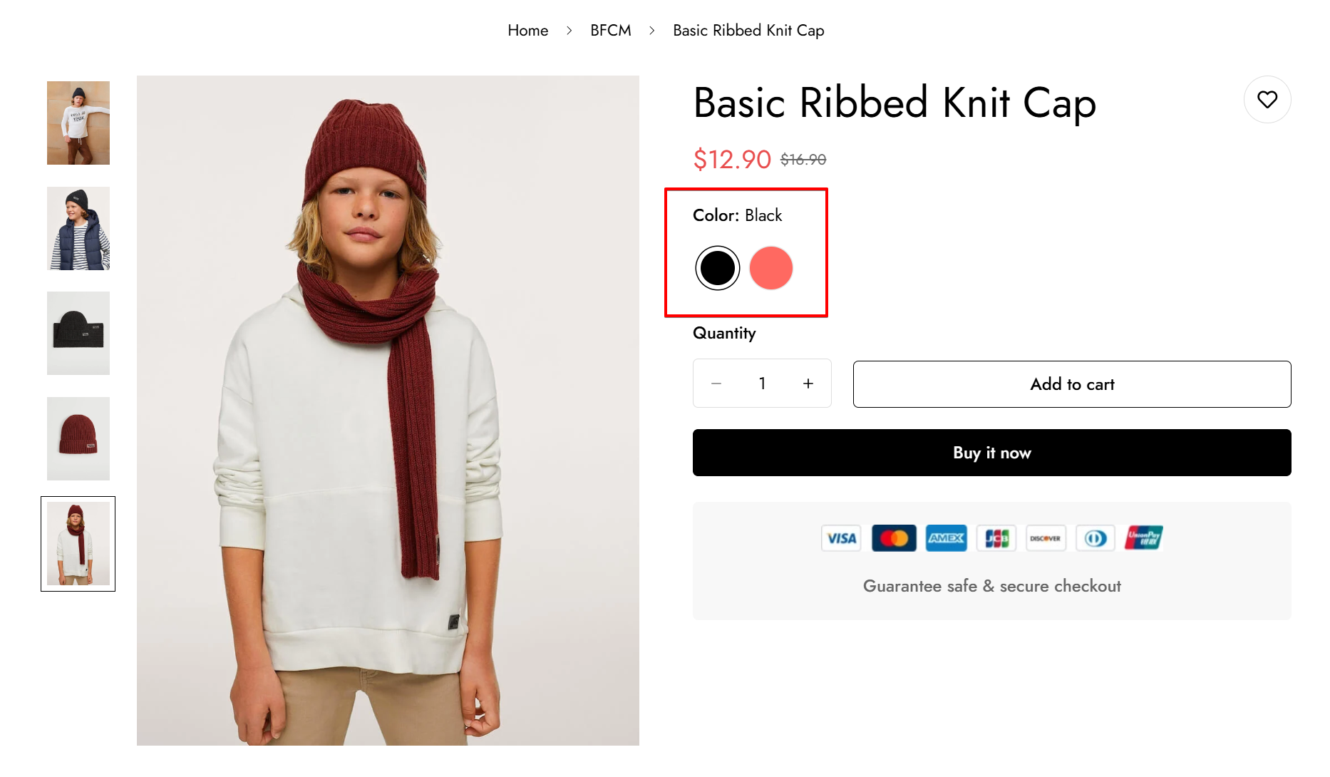
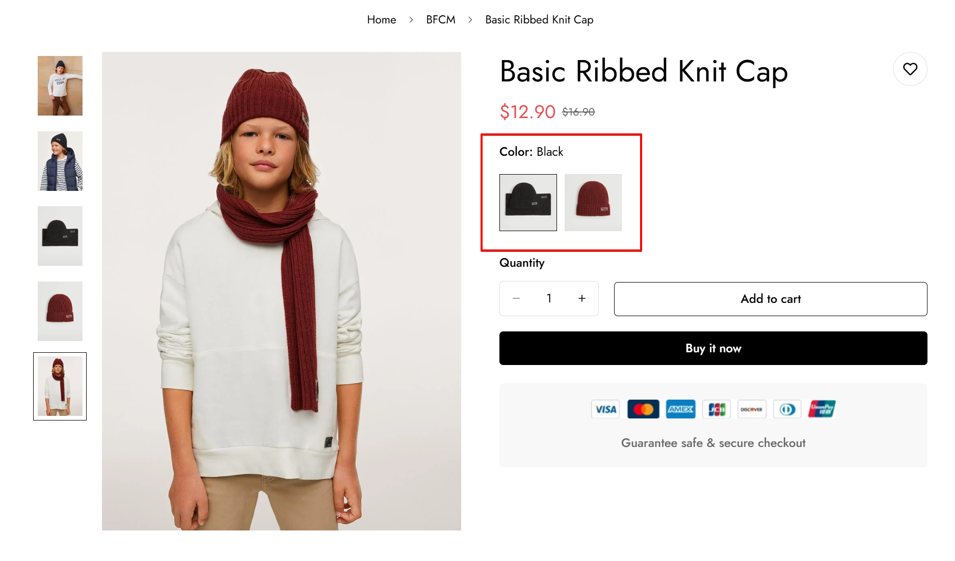
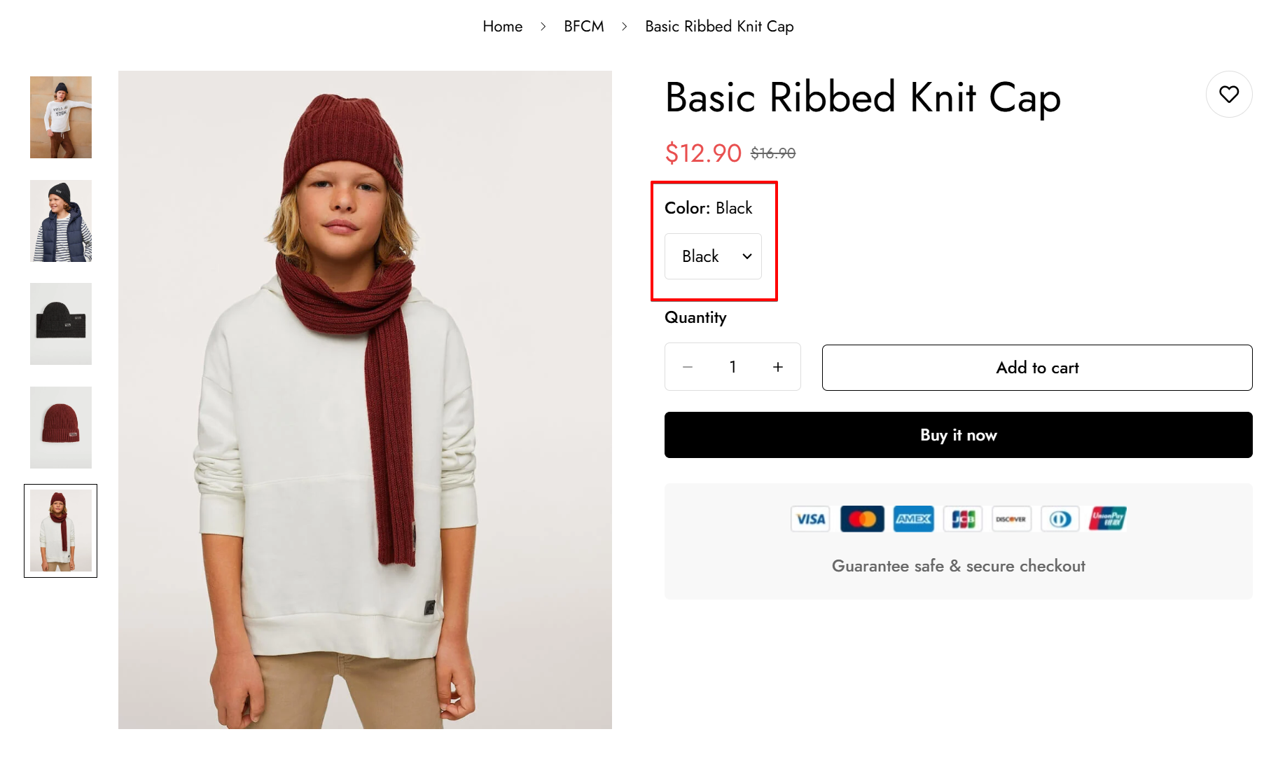
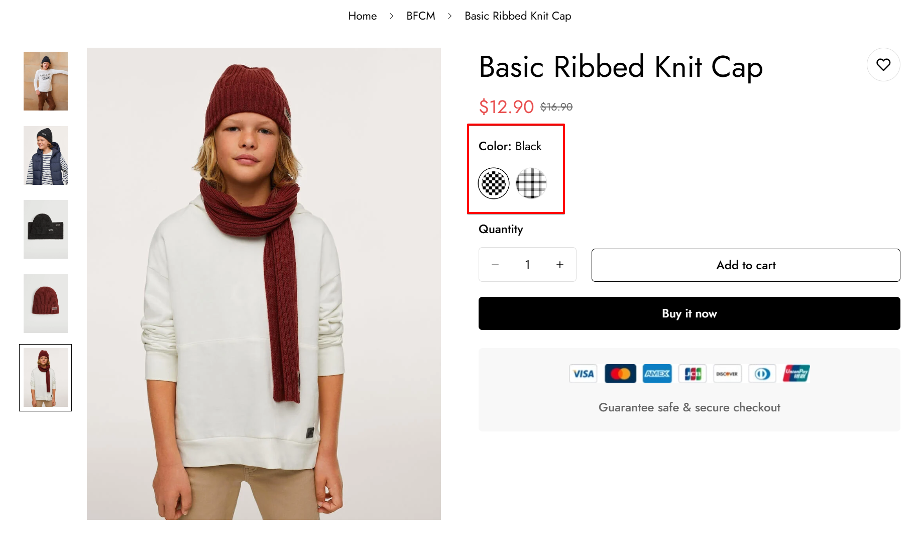
If **Name** doesn't exactly match the option name on your product, that option uses the **Default option design** instead.
Upload custom image swatches in **Theme settings >** [**Product options swatches**](https://docs.foxecom.com/minimog-theme/theme-settings/product-options-swatches).
For more advanced option customization, use the [Teeinblue Product Personalizer](https://teeinblue.com/install/teeinblue?ref=foxecom) app.
## Tips and best practices
* Use **Button** for sizes, so shoppers see every size at a glance.
* Use **Dropdown** for options with long lists of values, to save space.
* For color options, use **Color** when a solid color is enough, or **Custom image** to show patterns or textures.
## Related articles
Product options swatches