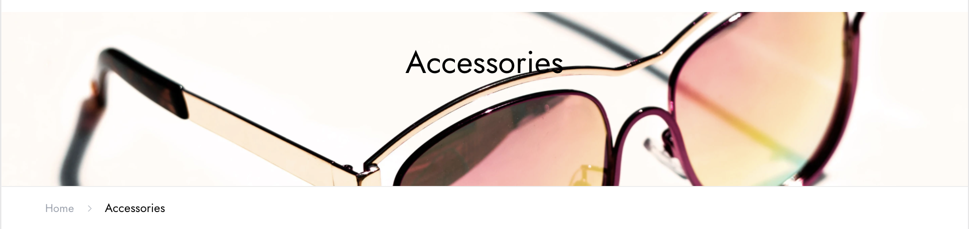
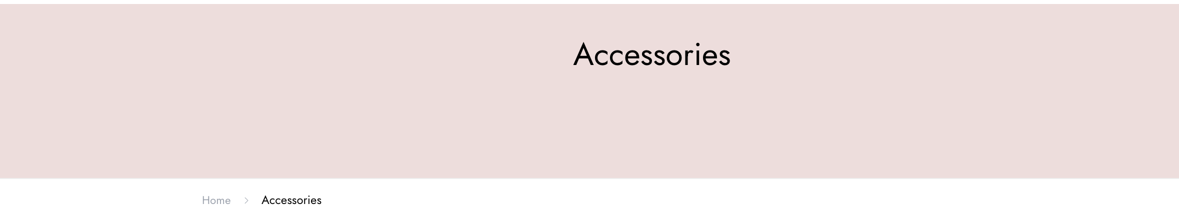
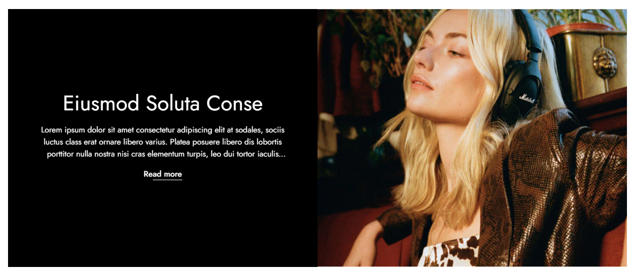
Display a banner or background with the highlighted features or offers in the particular collection page can boost your sales.
#How to add the Collection banner section to your Shopify store
Steps
- In the theme editor (Customize), open the template selector
- Select Collections, then Default collection.
- On the left-side bar, add Collection banner.
- Make necessary changes.
- Save the settings.
#How to edit a Collection banner section
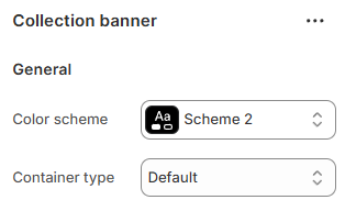
#Section settings
#General
You can choose your Container type for the Collection banner as:
- Default;
- Full width;
- Use container box.
Select the Color scheme for the section.
Set up your Color schemes anytime in the Theme settings >
Colors.
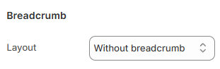
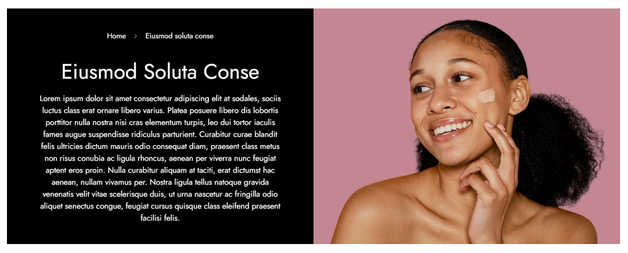
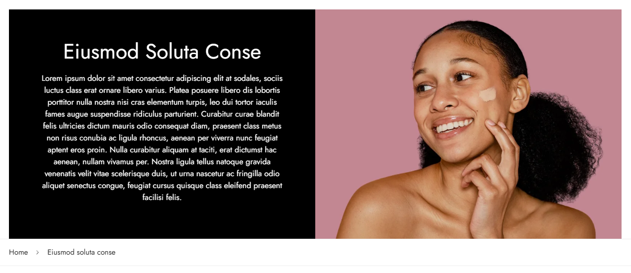
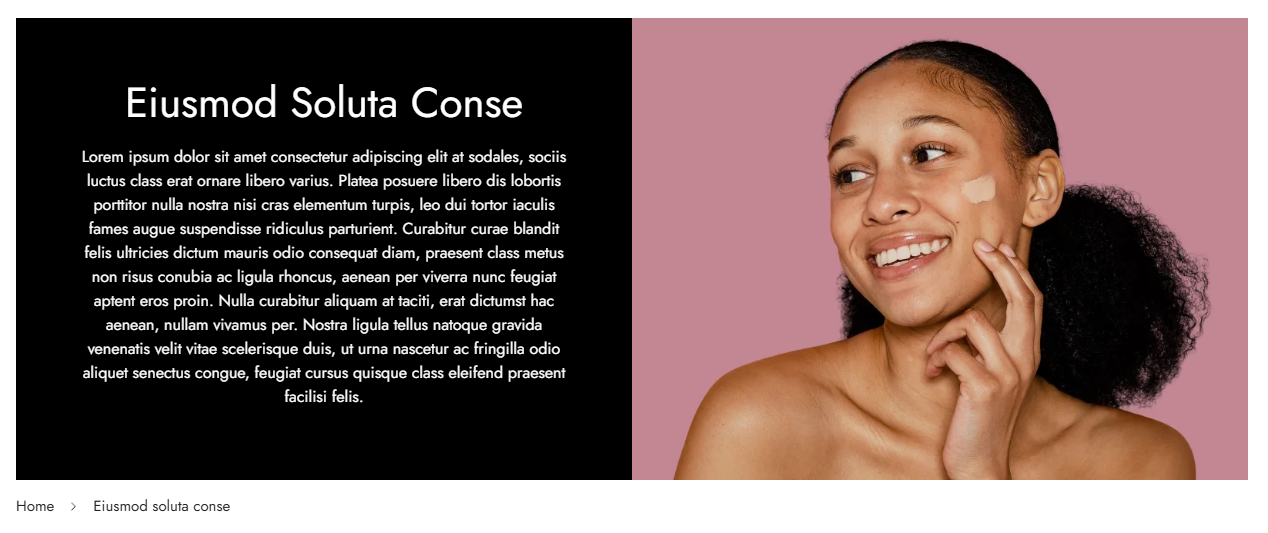
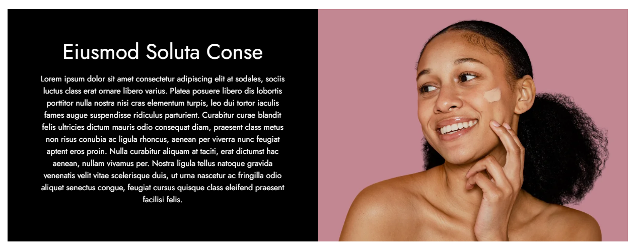
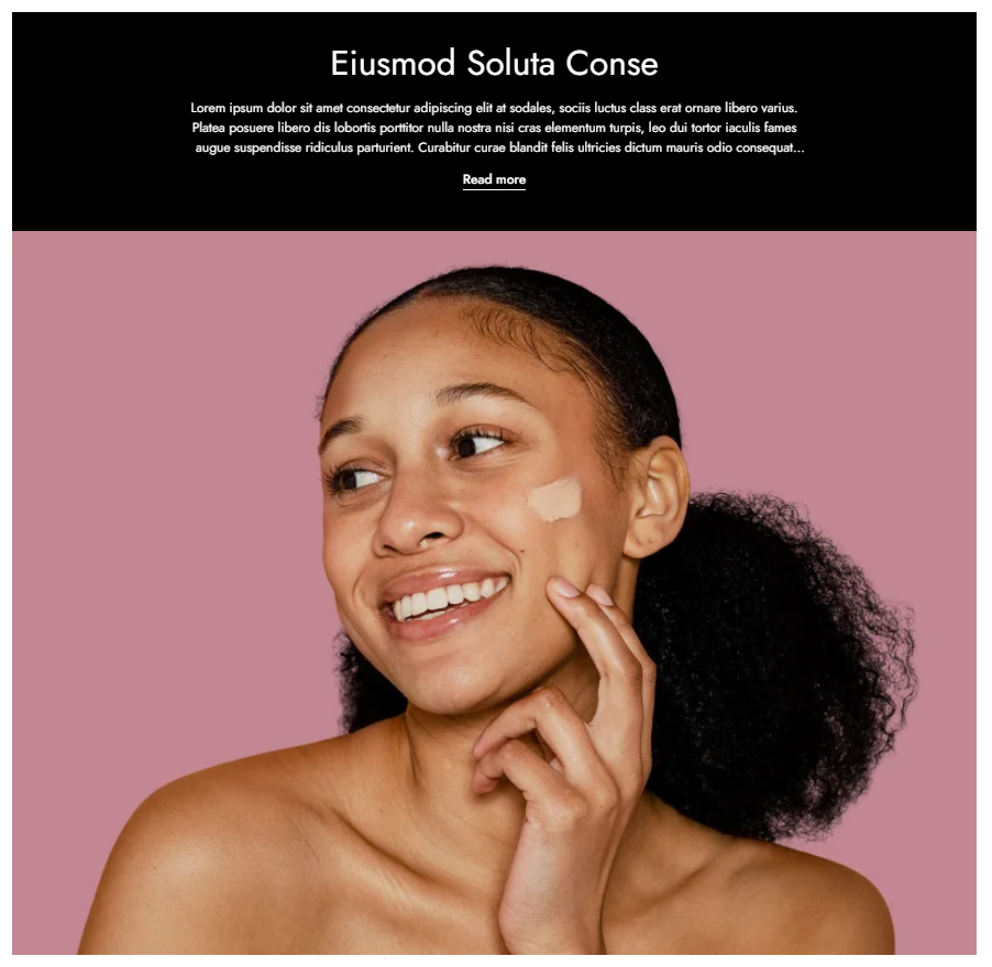
#Breadcrumb
Control how breadcrumbs are displayed on the collection page:
- Breadcrumb inside - Breadcrumb appears inside the banner.
- Breadcrumb outside - Breadcrumb appears outside the banner.
- Breadcrumb outside no border - Breadcrumb outside without a divider.
- Without breadcrumb - Hides breadcrumbs completely.
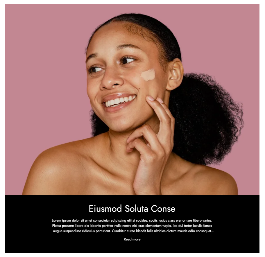
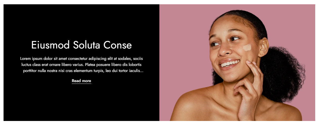
#Settings
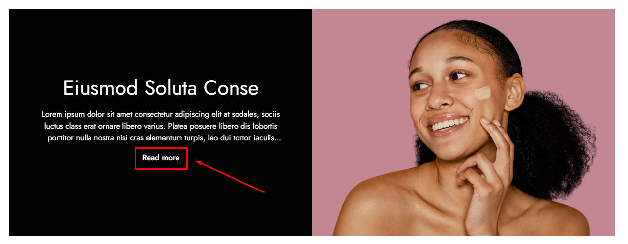
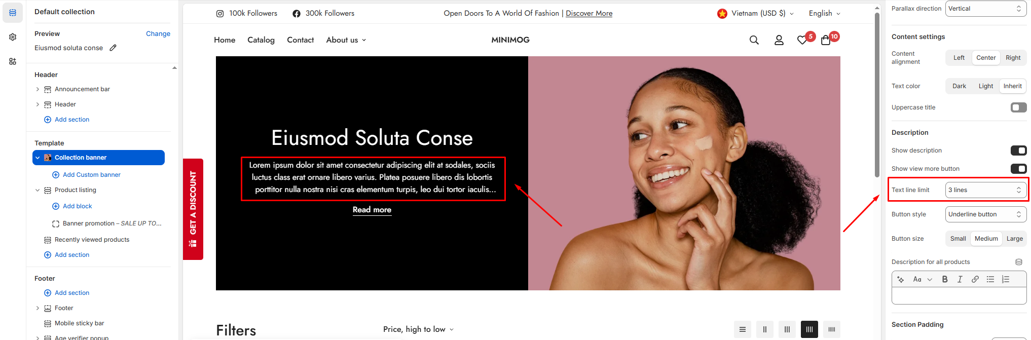
These options control how the image is displayed inside the Collection Banner.
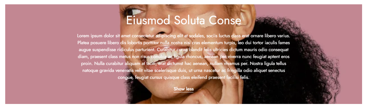
Image
Select the image used in the banner.
Image position
Controls where the image appears in relation to the banner content.
Available options:
- Top
- Right
- Bottom
- Left
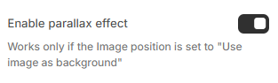
- Use image as background
Enable parallax effect
Adds a subtle scrolling animation to the banner image.
This option works only when Image position is set to Use image as background.
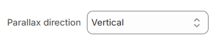
Parallax direction
Controls how the image moves when scrolling:
- Vertical - Image moves up and down
- Horizontal - Image moves left and right
- Zoom - Image gently zooms in/out
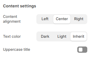
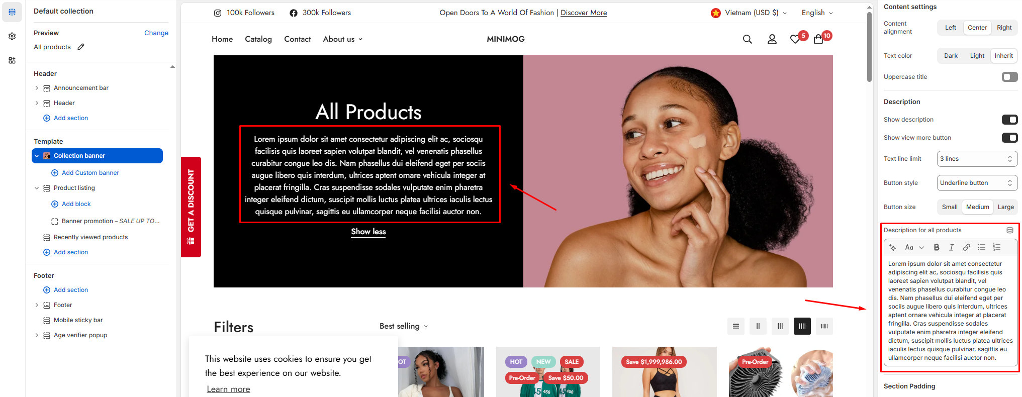
#Content settings
Content alignment: Defines how the banner text is aligned within the banner area.
Text color: Controls the color of the banner text.
- Dark
- Light
- Inherit (uses color scheme default)
Uppercase title: Forces the collection title to display in uppercase letters.
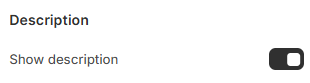
#Description
Show description
Toggles the visibility of the collection description.
- When enabled, the description is pulled from:
Products → Collections → Description
- When disabled, no description text is displayed in the banner.
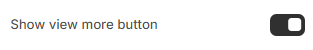
Show view more button
Adds a Show more / Show less button when the description is longer than the visible area.
- Helps keep the banner compact
- Recommended for longer descriptions
This option works only when Show description is enabled.
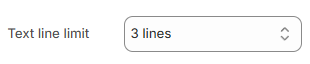
Text line limit
Sets how many lines of text are visible before the description is collapsed.
Available options:
- 1 line
- 2 lines
- 3 lines
- 4 lines
If the description exceeds the selected limit, it will be hidden behind the Show more button.
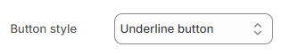
Button style
Controls the appearance of the Show more / Show less button.
Available styles:
- Primary button
- Secondary button
- White button
- Underline button
Choose a style that matches your banner design and background.
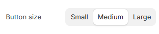
Button size
Sets the size of the Show more / Show less button:
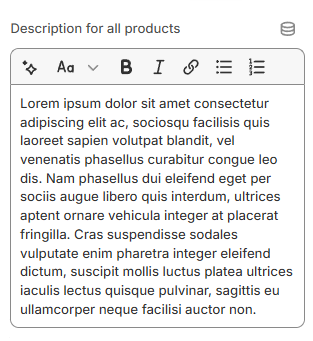
Description for all products
Use this field to add a custom description that appears only on the “All products” page.
- Only affects the All products collection
- Does not change other collections
- Replaces the default description on the All products page
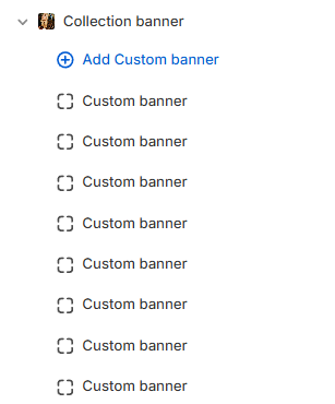
#Block settings
You can add multiple Custom banner blocks to the Collection banner section.
If a Custom banner matches the current collection, it will override the default banner image set in the section settings.
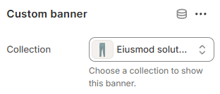
#Collection
Select the collection where this Custom banner should appear.
This setting is required.
The banner will not display unless a collection is selected.
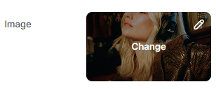
#Image
Upload or select the image used for desktop devices.
- Overrides the default banner image
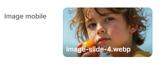
#Image mobile
Optional image displayed on mobile devices.
- Helps ensure proper cropping and performance on smaller screens
- If not set, the desktop image will be used