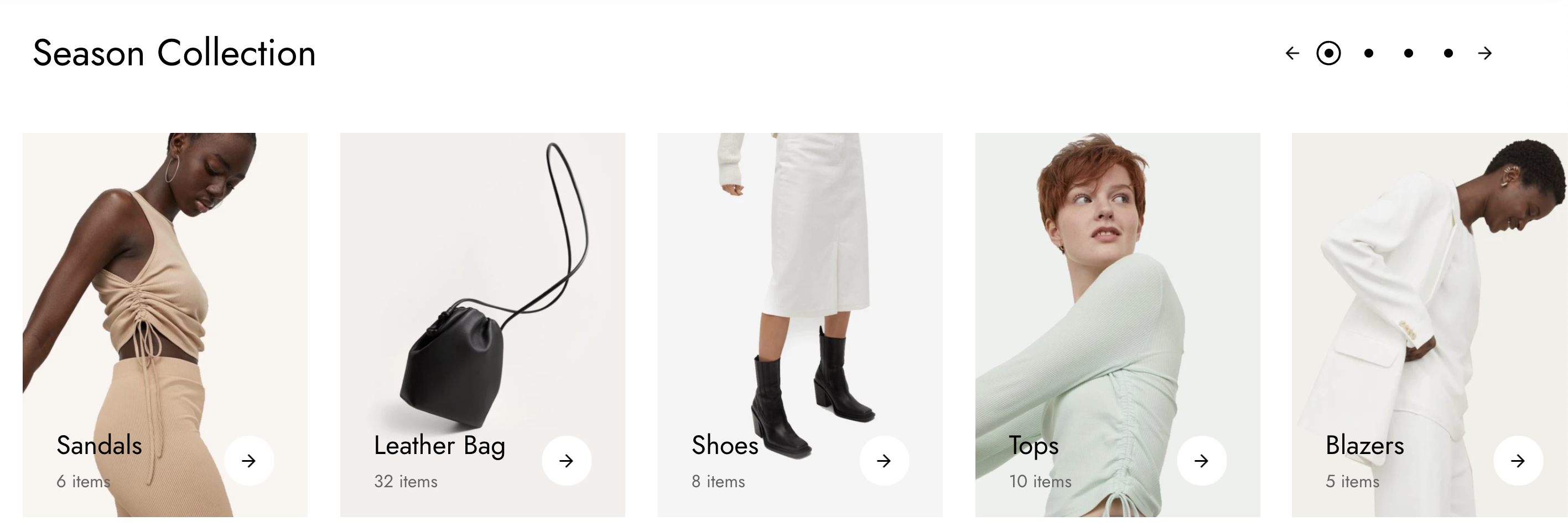
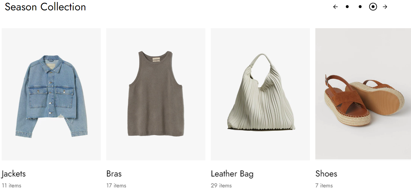
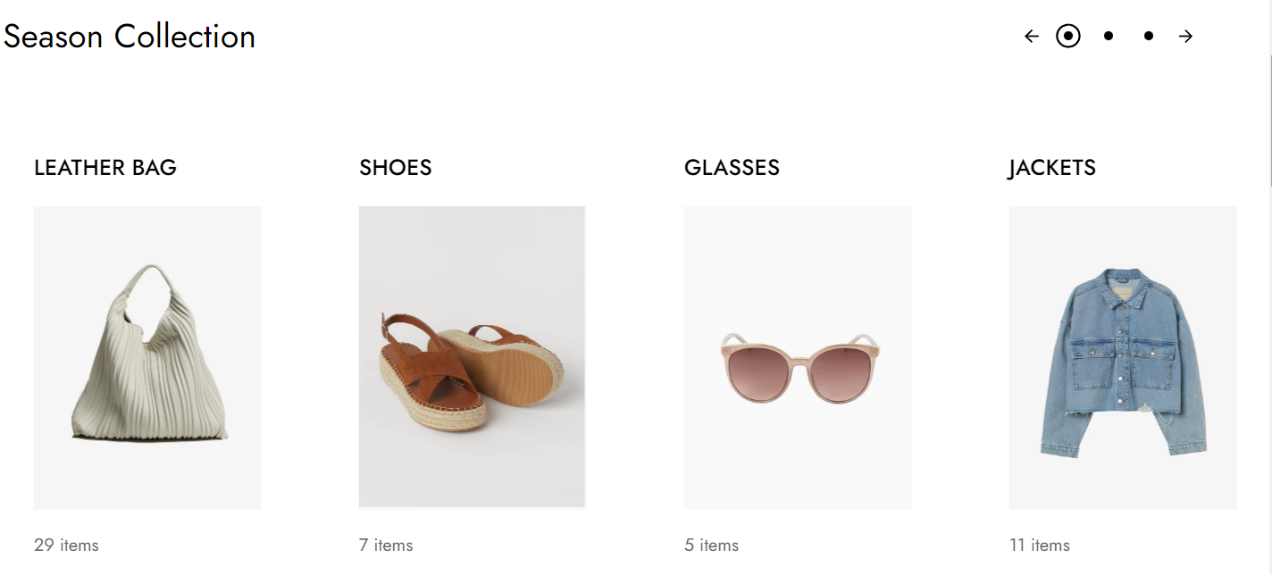
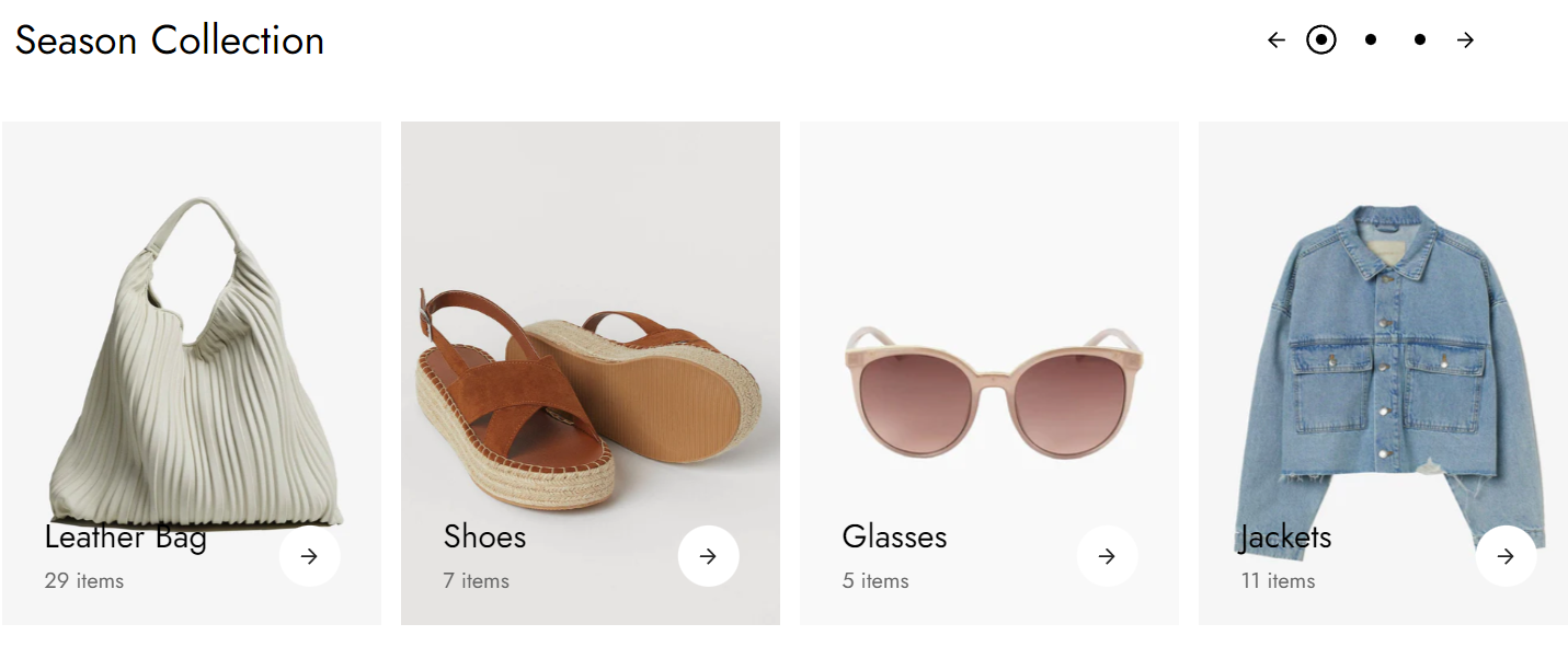
The collection list displays a quick list of desired collections to catch visitors' attention.
#How to add a Collection list section to your Shopify page
Steps
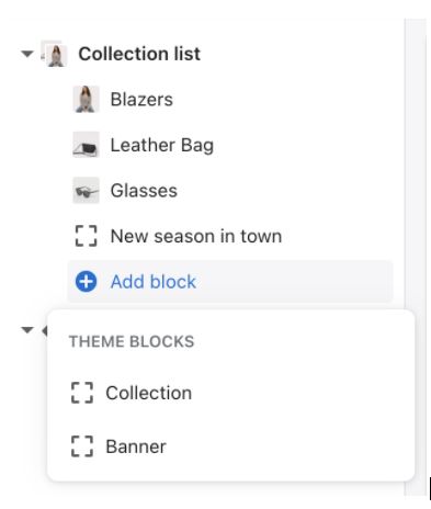
- In the theme editor (Customize), click Add section
- Locate Collection list
- Save.
The collection list consists of collections and banner blocks. The banner block shows only text.
#How to edit the Collection list section
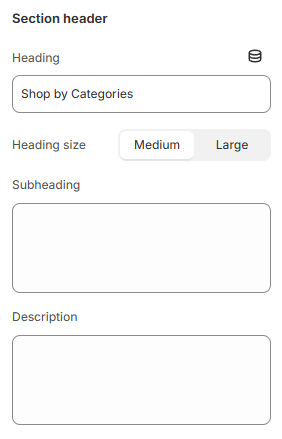
#Section header and General:
Use the provided text fields to add a suitable Heading/Subheading/Description. Leave any of the fields blank if you do not want to display them.
You can also change the Heading size to Medium/Large and adjust the Text alignment (Left/Center).
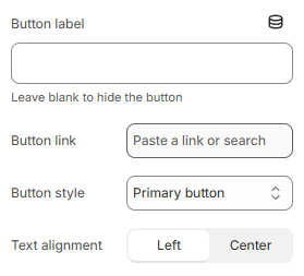
You can also display a call-to-action button to redirect customers to your desired pages on the Section header.
Add a Label and Link for one or both, then choose a Button style (Primary button/ Secondary button/ Underline button).
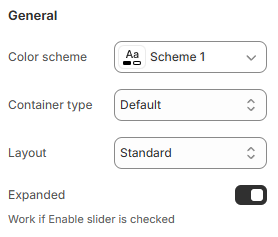
#General
You can choose your Container type for the collection list as:
- Default;
- Full width;
- Use container box.
Select the Color scheme and suitable Layout (Standard/Heading left side) for the section.
Moreover, you can expand the Collection list slider by enabling the Expanded toggle. This option works if Enable slider option is checked.
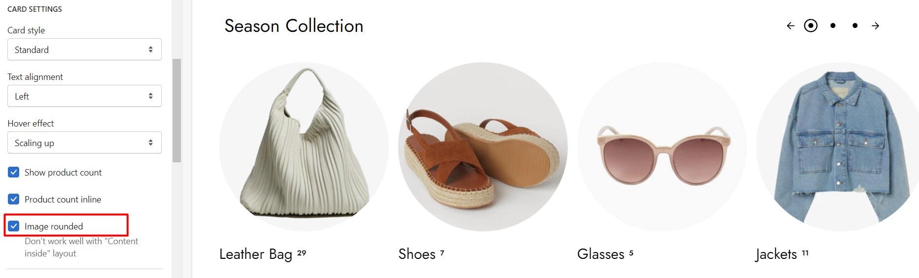
#Card and Grid settings:
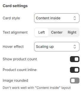
#Card settings
Modify the card style, text alignment (left/center), and hover effect by selecting options in the dropdown.
Card style includes:
- Standard
- Boxed
- Content inside
The hover effect includes:
You can enable showing product count and decide whether the numbers are in the same line with the collection titles or in a different line.
You can also make the collections' images rounded, images will then be cropped.
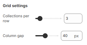
#Grid settings
Determine the number of collections shown per row and the gap between columns.
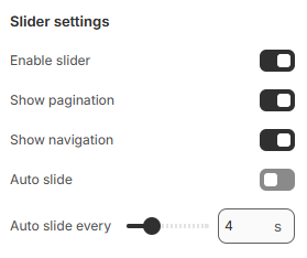
#Slider settings
Select Enable slider and Auto slide options to run the list automatically. The duration time to change slides is between 2-10 seconds.
You can also use pagination or navigation for your collection list.
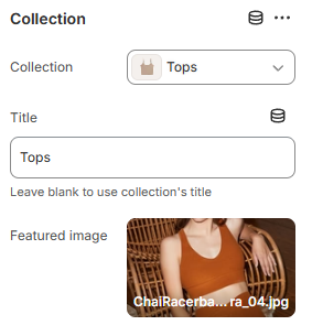
#Collection/banner block settings
Each collection/banner block has its own settings such as title, image, and collection link to choose from.