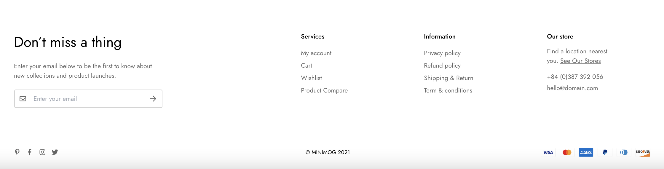
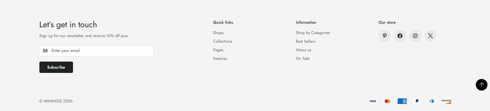
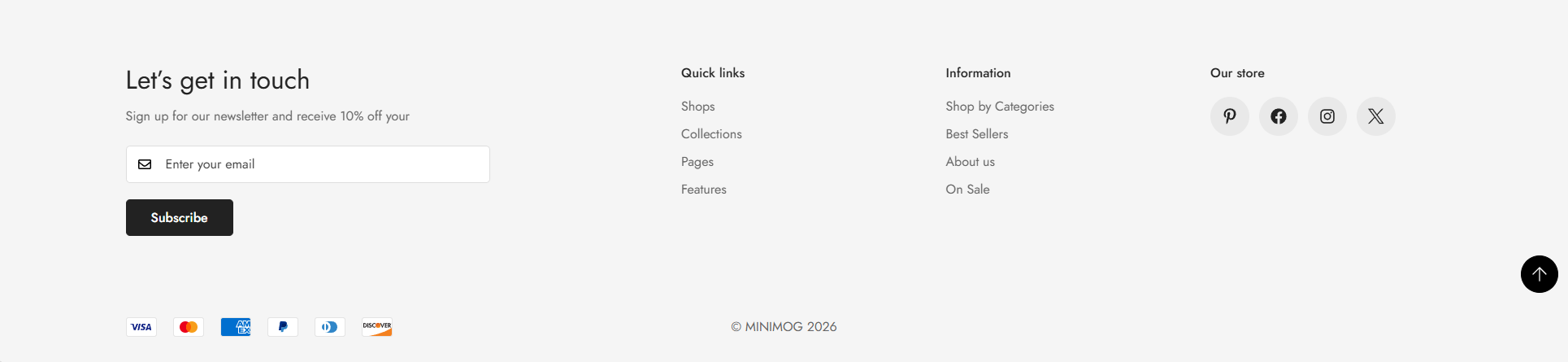
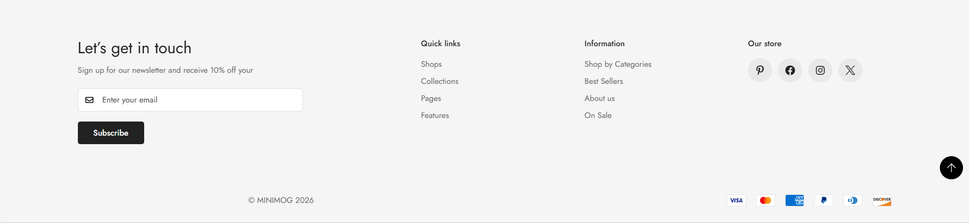
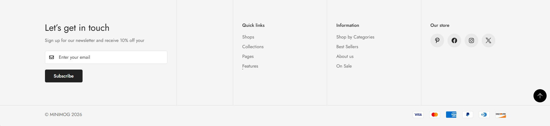
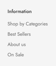
The footer is the section of content at the bottom of a web page. The footer menu typically contains quick links to your homepage, about us page, blogs page, contact page, policy page, etc.
A great website footer will help visitors navigate your site, leading to a greater eCommerce experience.
#How to add the Footer section to your Shopify store
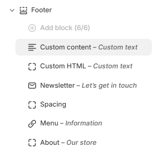
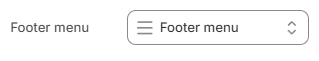
You can freely customize the footer section to suit your business needs, such as adding a footer menu, a newsletter, and other blocks.
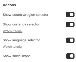
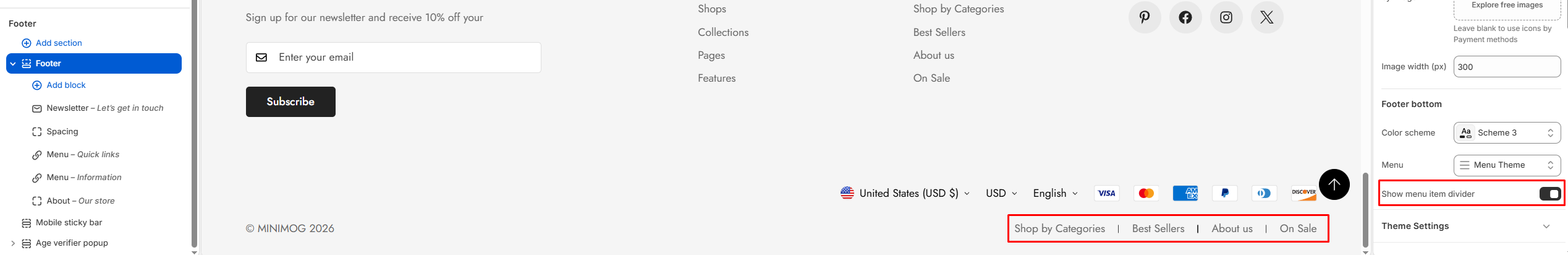
Similar to the header section, this element provides extra information for the footer such as social media icons, language selector, etc. by ticking/unticking the corresponding checkboxes.
Social media icons: To display icons for any social media platforms that you've entered a profile link for in your Theme settings > Store contact.
Country/region selector: Display a country selector for stores using Shopify Markets.
Currency selector: Allow customers to switch currencies. Watch tutorial
Language selector: Allow customers to switch languages. Watch tutorial
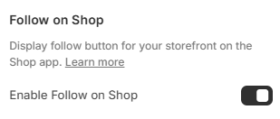
Follow on Shop allows customers to follow your store on the Shop app.
Customers who follow your store can receive personalized recommendations and notifications about your products, creating a more personalized shopping experience for your customers.
Follow on Shop button is available on Minimog version 3.5.0 and above (see Changelog).
Providing various purchasing methods makes checkout easier for your customers and enhances your brand perception.
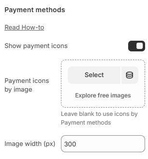
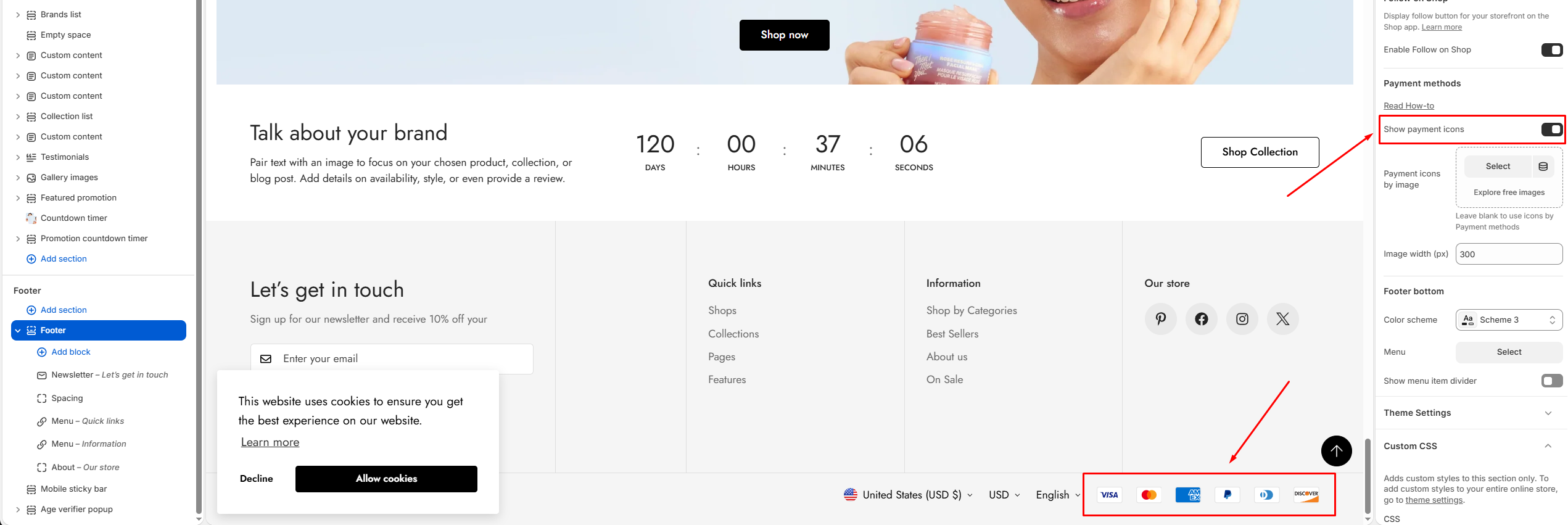
Enable Show payment icons to display accepted payment methods.
You can also upload a custom Payment icons by image instead of using Shopify payment icons.
Adjust the Image width (px) to control the display size of the payment image.
The payment methods here reflect the settings configured in Payments. Only payment options accepted throughShopify Payments will automatically display their icons when enabled.
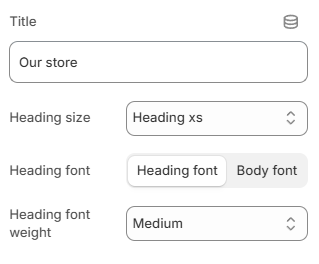
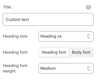
The About block helps customers learn more about your business.
Content settings
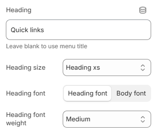
Enter a Title for the block.
Choose the Heading size:
Heading xs
Heading sm
Heading md
Heading lg
Heading xl
Heading 2xl
Choose the Heading font:
Heading font
Body font
Select the Heading font weight.
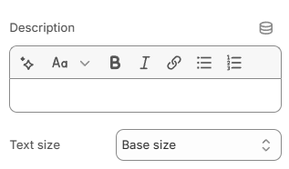
Add content using the Description rich text editor. This area can be used to describe your business, share your story, or provide helpful information for customers.
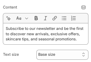
Choose the description Text size:
Small
Base size
Large
Extra large
Default
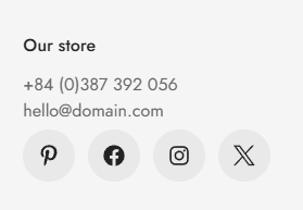
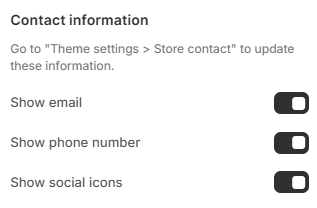
Contact information
Enable or disable the following options:
Show email: Display your store email address.
Show phone number: Display your store phone number.
Show social icons: Display social media icons configured in your store contact settings.
This makes it easy for customers to connect with your brand across different platforms.
To add or update store contact information, go to Theme settings > Store contact.
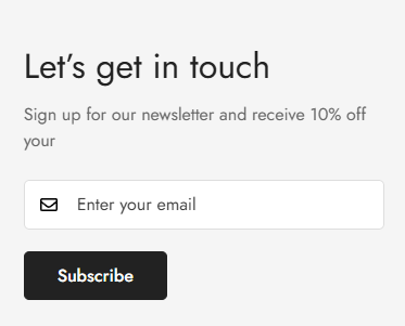
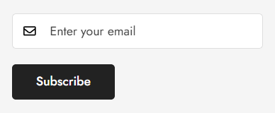
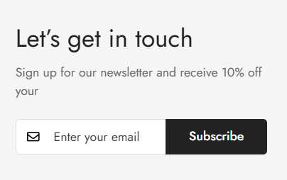
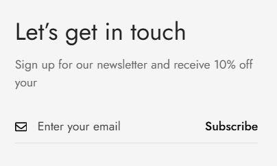
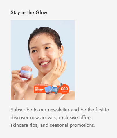
The Newsletter block helps you collect email subscribers directly from the footer, making it easier to grow your audience and stay connected with customers.
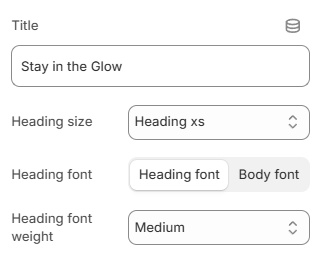
Enter a Title and optional Description to encourage visitors to subscribe.
Choose the Heading size:
Heading xs
Heading sm
Heading md
Heading lg
Heading xl
Heading 2xl
Choose the Heading font:
Heading font
Body font
Select the Heading font weight.
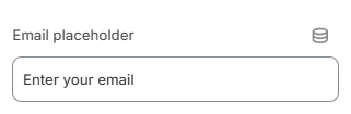
Customize the Email placeholder text displayed inside the email input field.
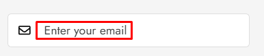
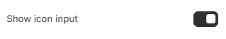
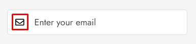
Enable Show icon input to display an email icon inside the input field.
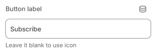
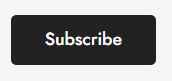
Customize the Button label. Leave the button label blank to display an icon-only submit button.
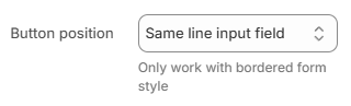
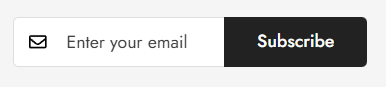
Button position: Choose where the subscribe button appears:
Same line input field
Under input field
Button position option only works with bordered form style.
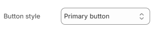
Choose the Button style of the subscribe button:
Primary button
Secondary button
Plain button
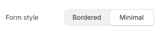
Form style: Choose the newsletter form appearance:
Bordered
Minimal
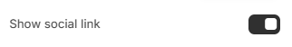
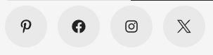
Show social link: Enable this option to display your store's social media icons below the newsletter form.
Social media links are managed in: Theme settings > Store contact.
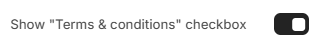
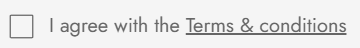
Show "Terms & conditions" checkbox: Enable this option to require customers to accept your terms and conditions before subscribing.