
Theme Settings
Layout settings
1 min read
- In the theme editor (Customize), click Theme settings.
- Locate Layout settings.
- Make necessary changes.
- Save.
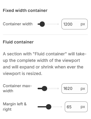
Container
- Container width provides a responsive fixed width container: has one fixed width for each screen size.
- Container max-width: known as a fluid container, will continuously resize as users change the width of their window/browser by any amount.
- Margin left & right: the blank space on the right and left side of the website.
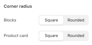
Corner radius
- Square: Sharp, defined corners for a classic look.
- Rounded: Smooth, curved corners for a modern feel.
Last updated