
Theme Sections
Collection tabs
2 min read
_iMwWkcpo.jpg)
This section is available on ✨ Zest version 7.0.0 onwards. See our Changelog
How to add a Collection tab section to your Shopify store
- In the theme editor (Customize), click Add section.
- Make necessary changes.
- Locate Collection tabs.
- Save.
How to edit a Collection tab
Section settings
| Setting | Description |
|---|---|
| Desktop image position | Choose whether the image appears on the left or right of the tabs (auto-adjusted for mobile). |
| Image ratio | Select aspect ratio: Adapt to first image, Square (1:1), Portrait (3:4), or Landscape (4:3). |
| Prefix header | Choose to show a tab prefix as Ordinal number (01, 02, 03...) or an Icon. If you want to use icons, upload the image icons later in the block settings. |
| Trigger open tab | Choose how a tab opens: on Click or Hover. |
| Auto-rotate content | Enable this to auto-rotate between tabs after a set interval (in seconds). |
| Change content every | Adjust the timing for auto-rotation (only visible when enabled). |
Block settings
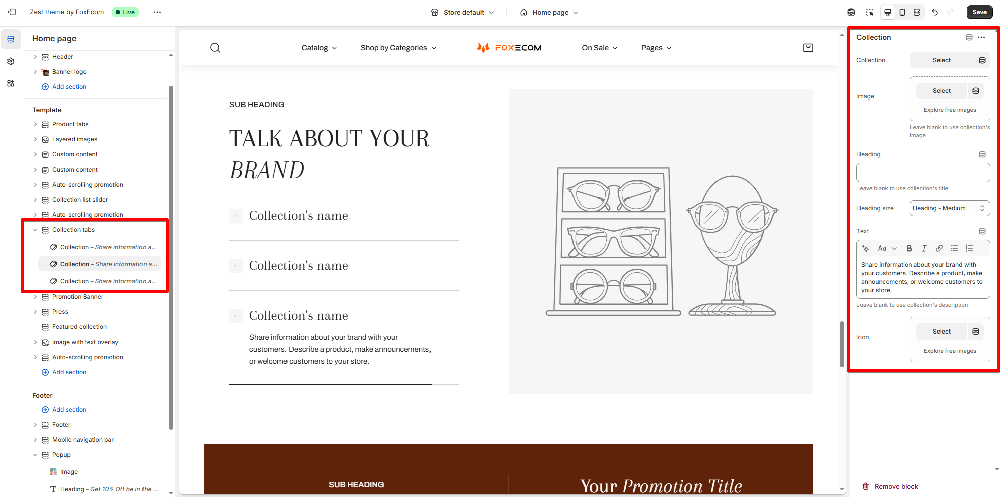
| Setting | Description |
|---|---|
| Collection | Select a Shopify collection to display. |
| Image | Upload an image (optional). If left blank, the collection’s default image will be used. |
| Heading | Optional custom title for the tab content. Leave blank to use the collection’s title. |
| Heading size | Choose heading font size (Small, Medium, Large, etc.). |
| Text | Add a short description or promotional copy. If left blank, it uses the collection’s description. |
| Icon | Upload an icon to represent this collection tab. If the Prefix header is set as icon. |
Last updated