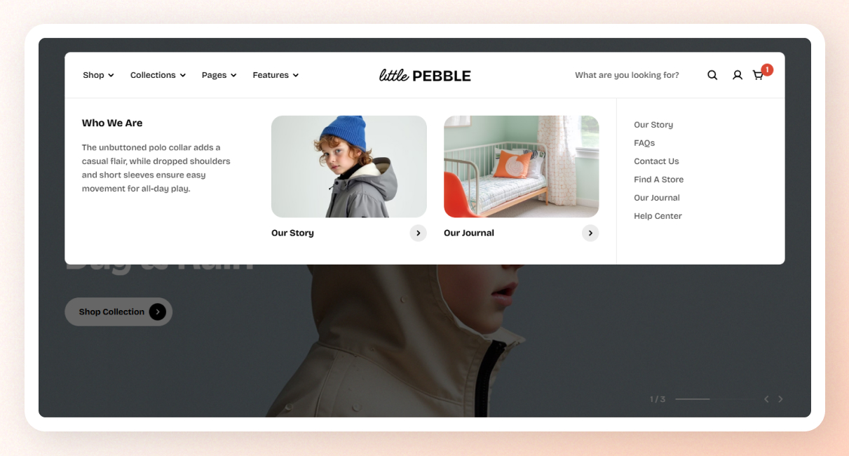
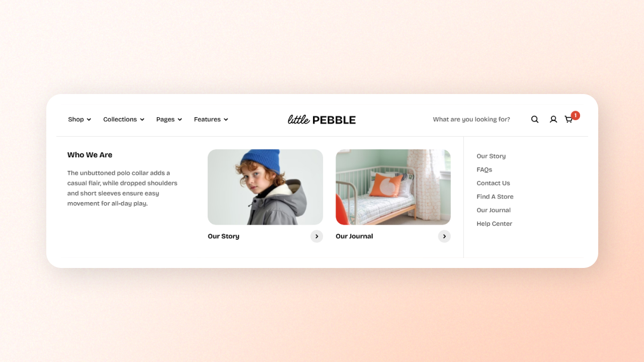
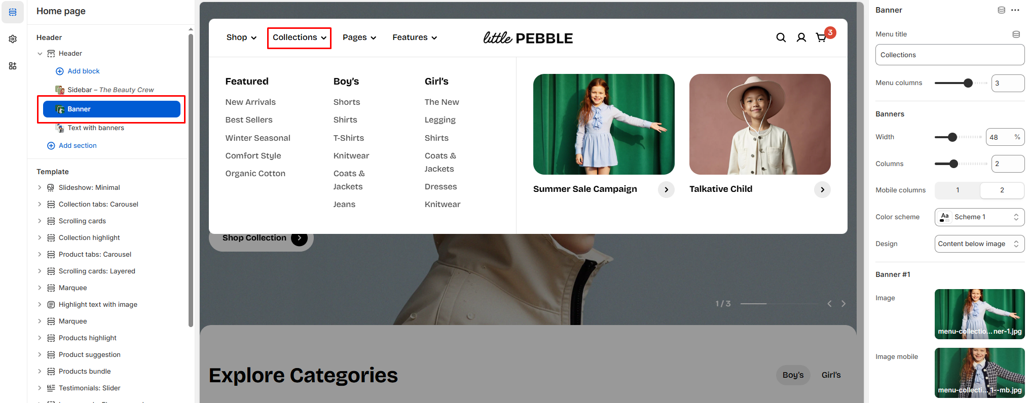
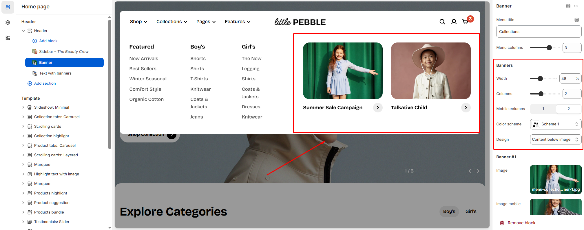
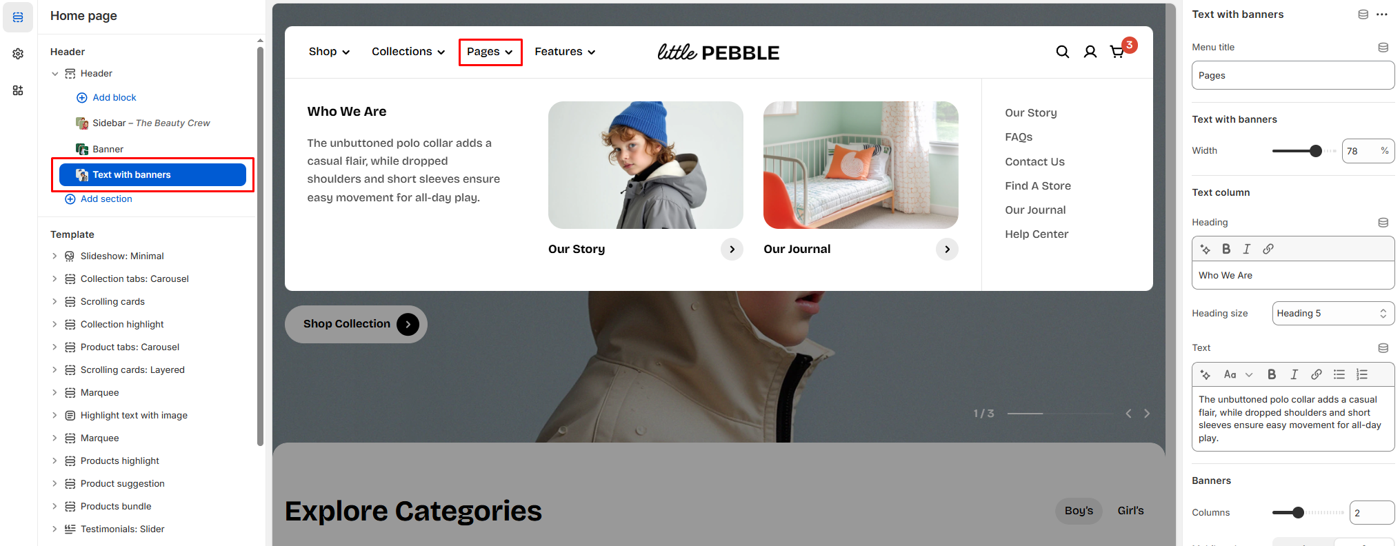
In addition to standard dropdown menus, Pebble offers a Mega menu feature. The Mega menu lets you create a highly functional and visually engaging navigation experience.
Build a flexible, modern mega-menu with multiple layouts that allow you to display menu links, category thumbnails, banners, or product cards within a single rich dropdown panel.
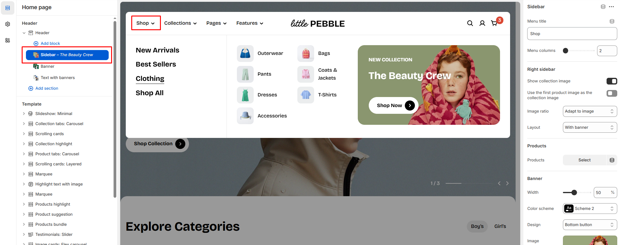
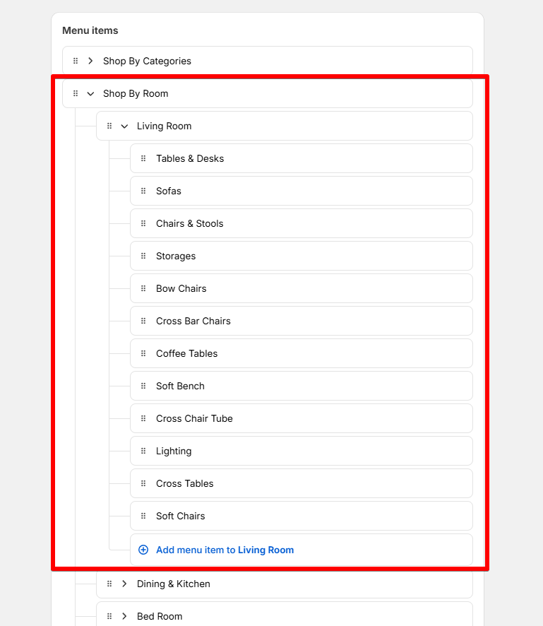
This works best when the 3rd-level menu items are collections.
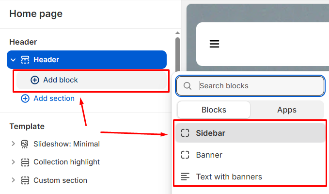
How the Sidebar mega menu chooses which image to display:
The menu automatically selects a collection image based on the following order.
Each step overrides the one before it:
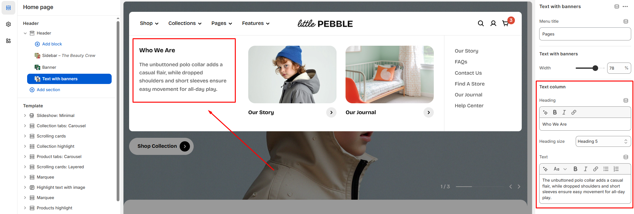
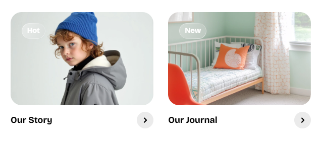
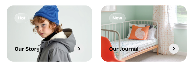
1 - Collection featured image: This is the default image shown when "Show collection image" is enabled.
2 - Custom metafield image: If you’ve added an image to the metafield foxtheme.collection_megamenu_image, this image will replace the featured image. Learn more
3 - First product image: If the option "Use the first product image as the collection image" is turned on, the menu will use the first product’s featured image instead.
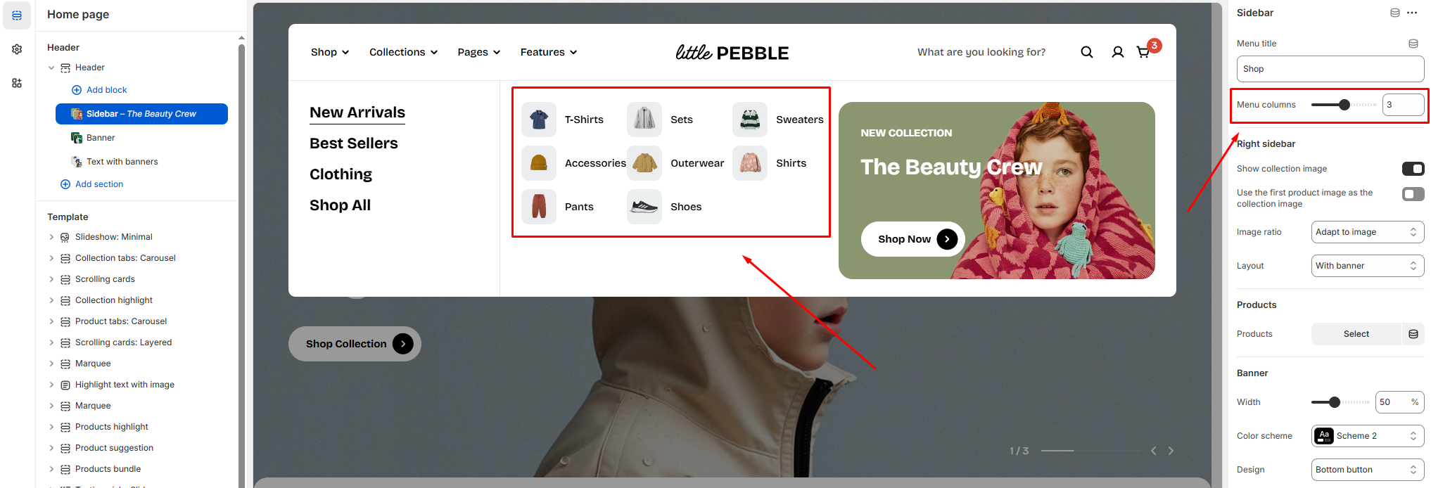
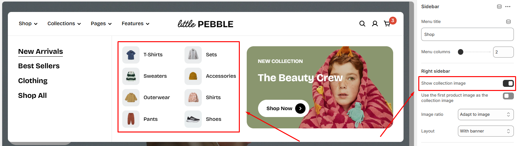
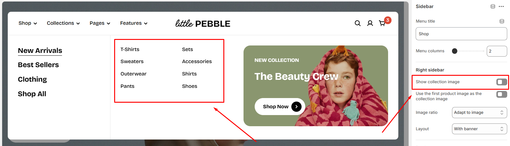
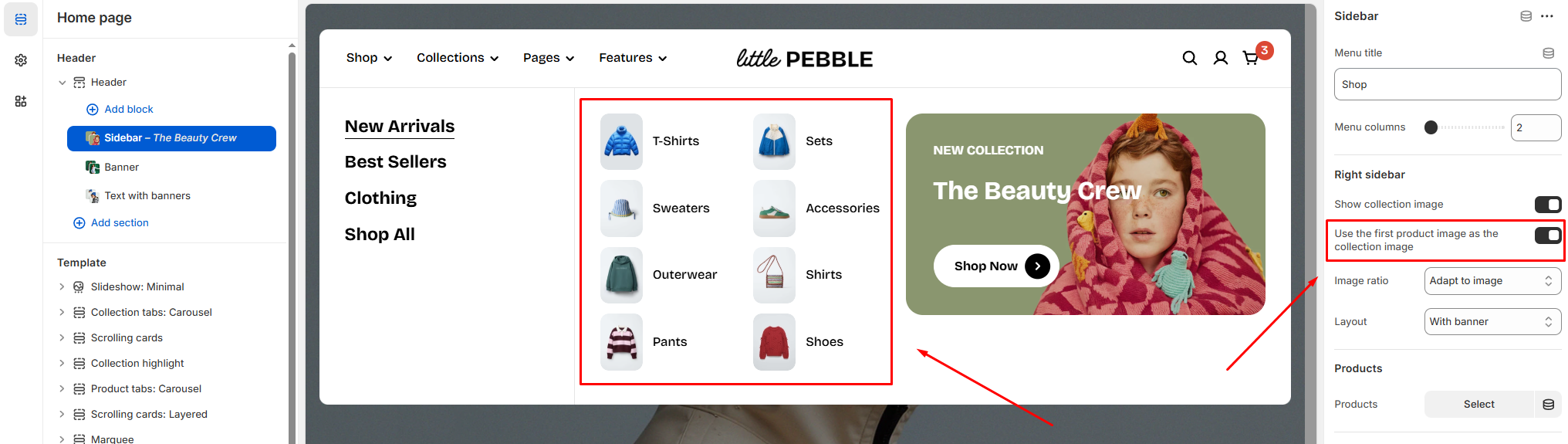
Show collection image
Enables the display of a collection image for each 3rd-level menu item, as long as those items are collections.
Use the first product image as collection image
Automatically uses the first product image from each collection as its thumbnail.
This works only when the Show collection image is enabled.
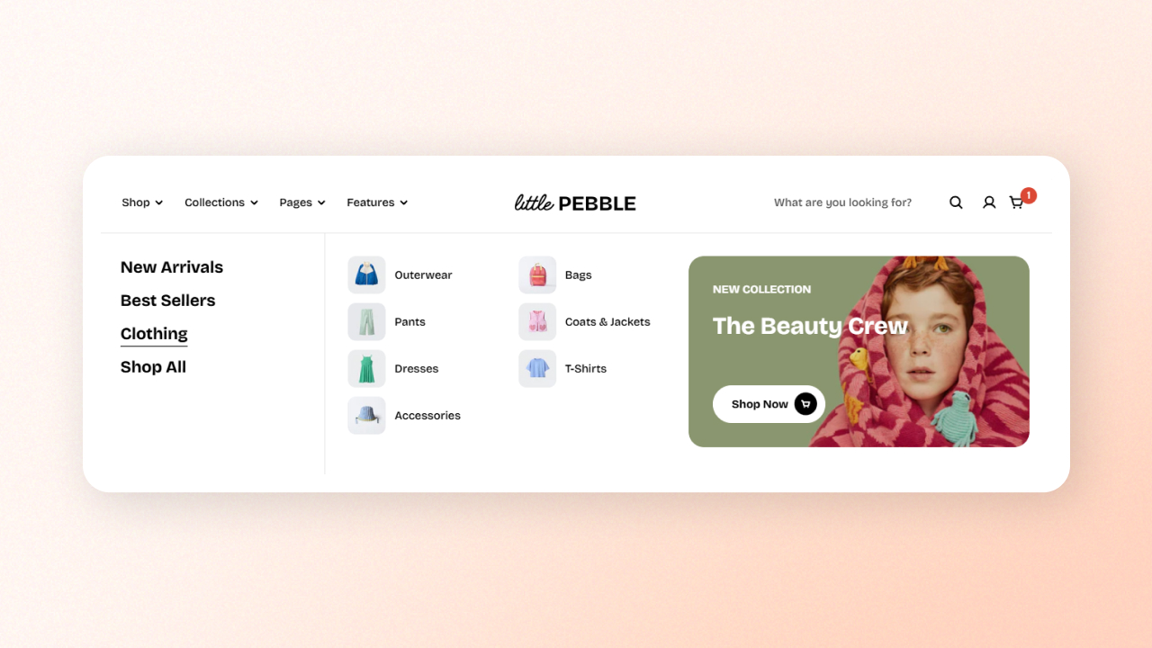
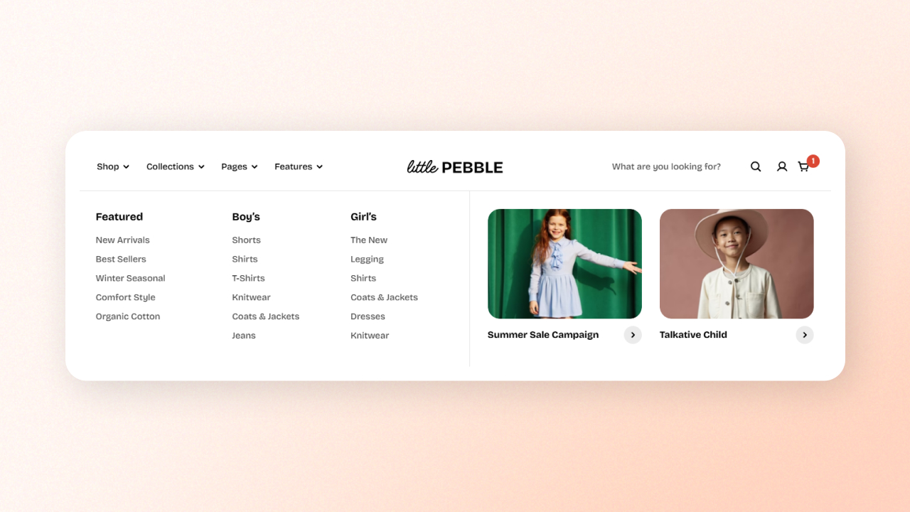
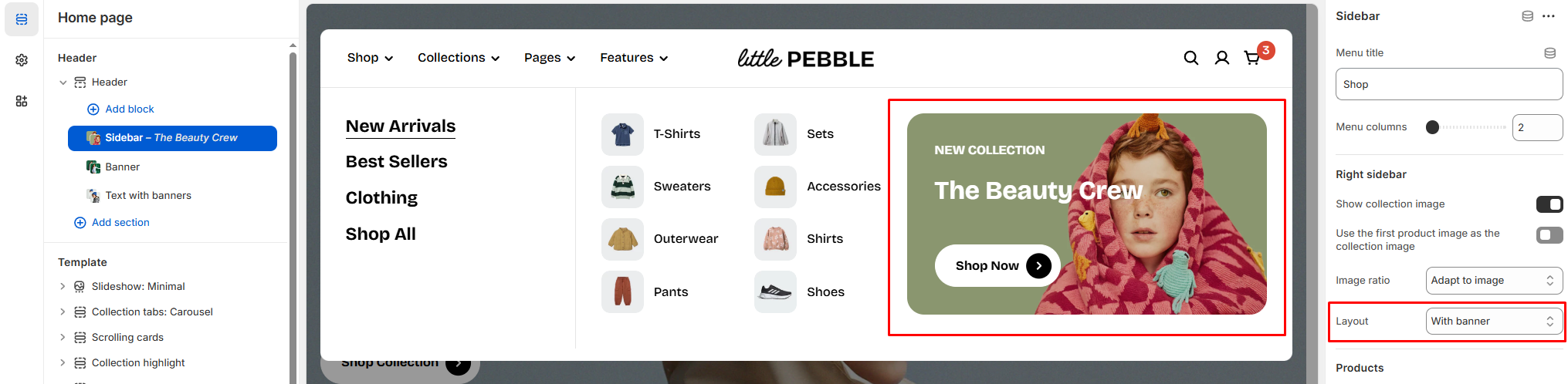
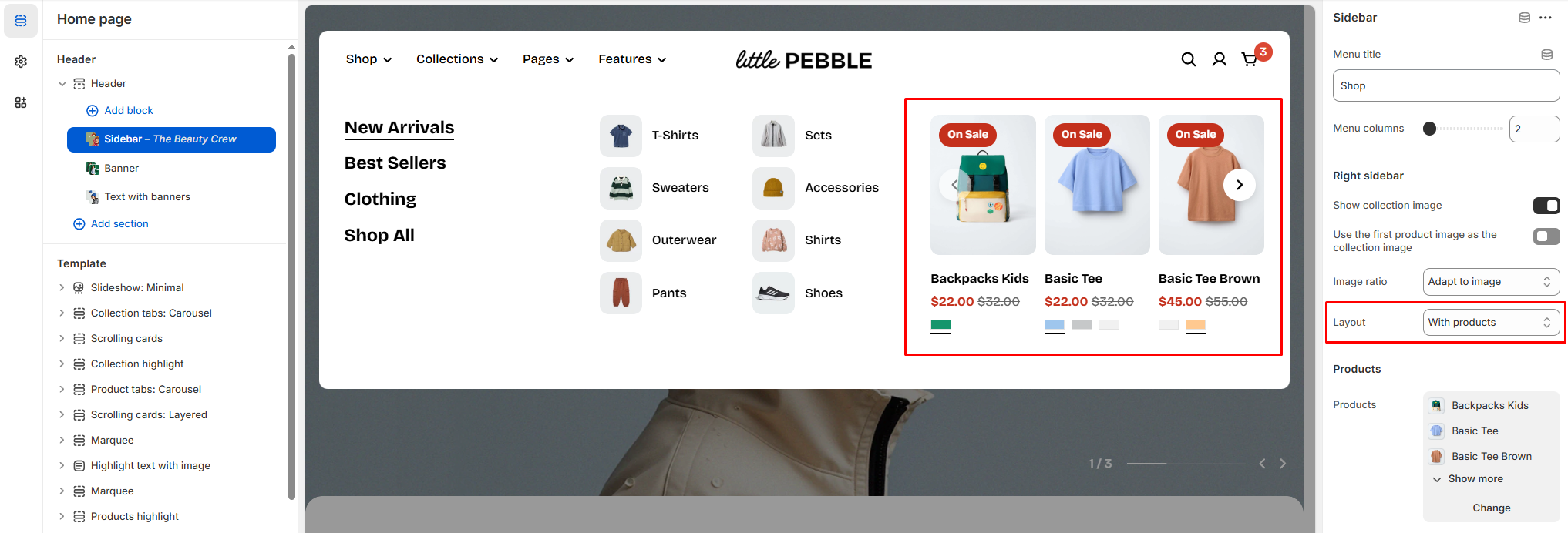
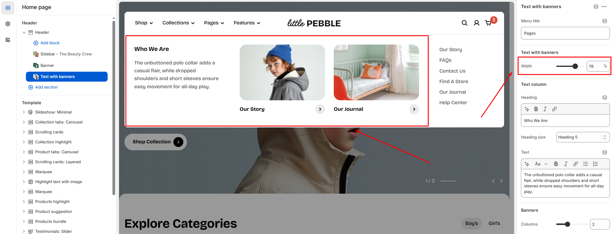
Layout
The right sidebar offers two main layouts:
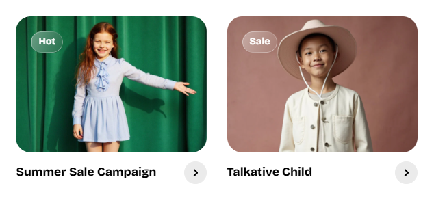
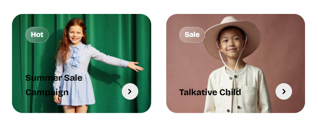
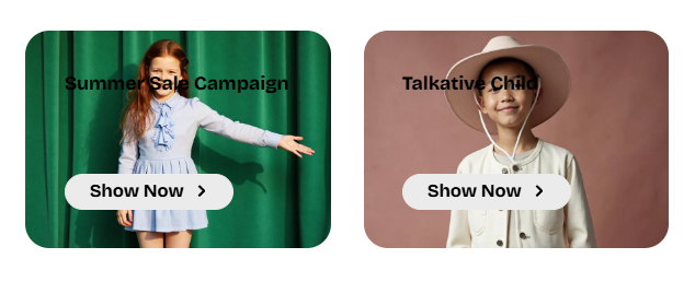
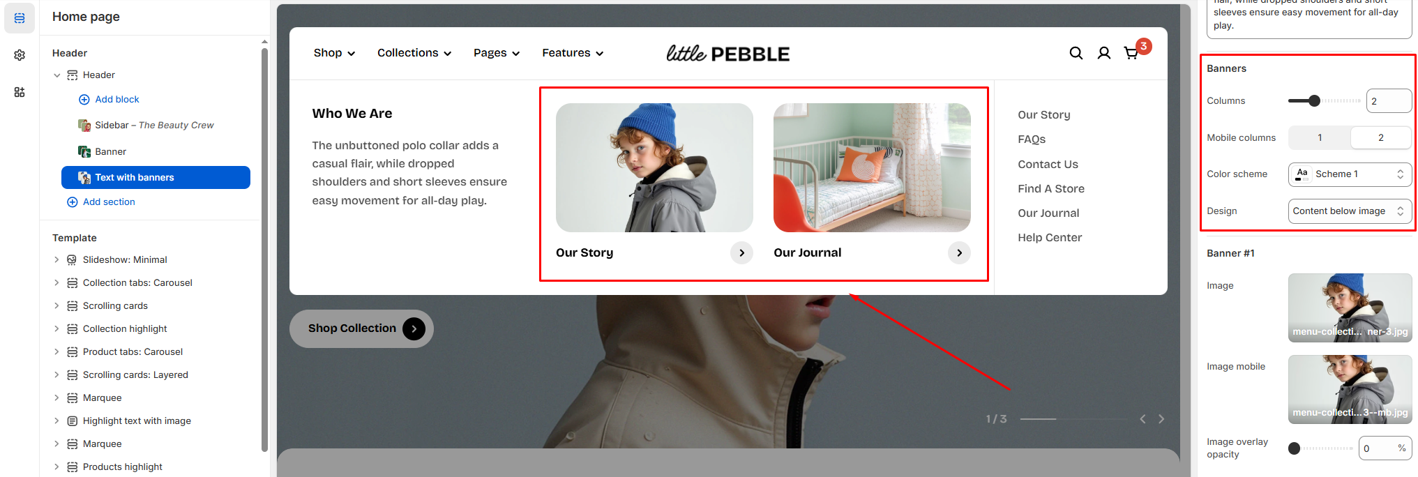
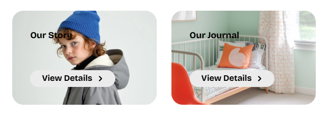
With banner: Shows a customizable banner on the right side.
With products: Shows featured product cards on the right side.