
Theme Sections
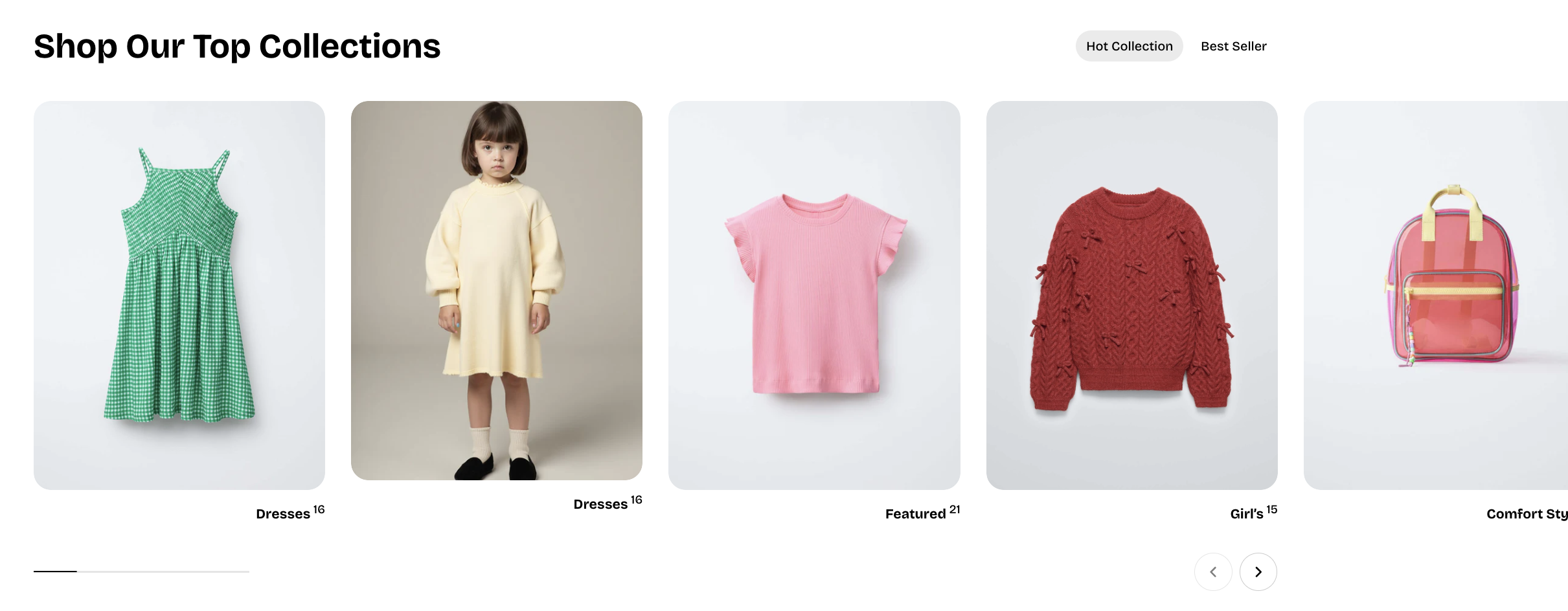
Collection tabs
2 min read
_xYn1mGmi.jpg)
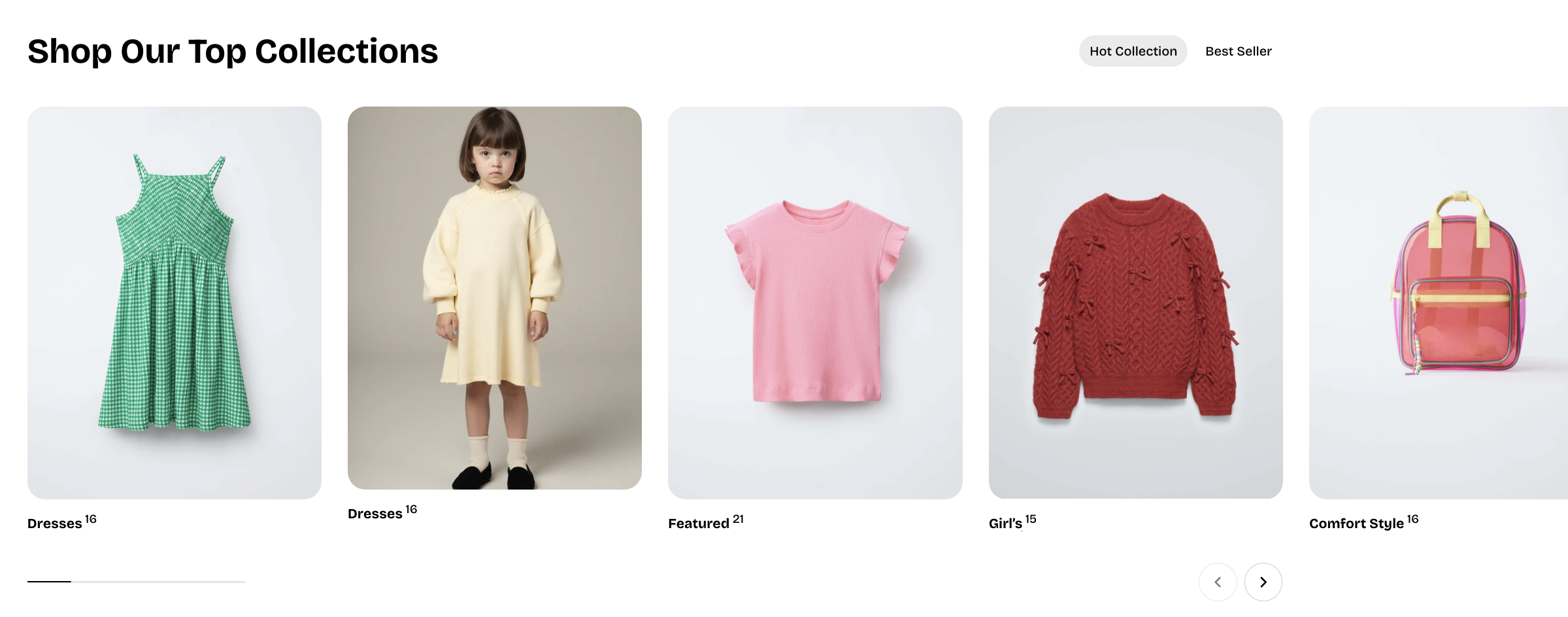
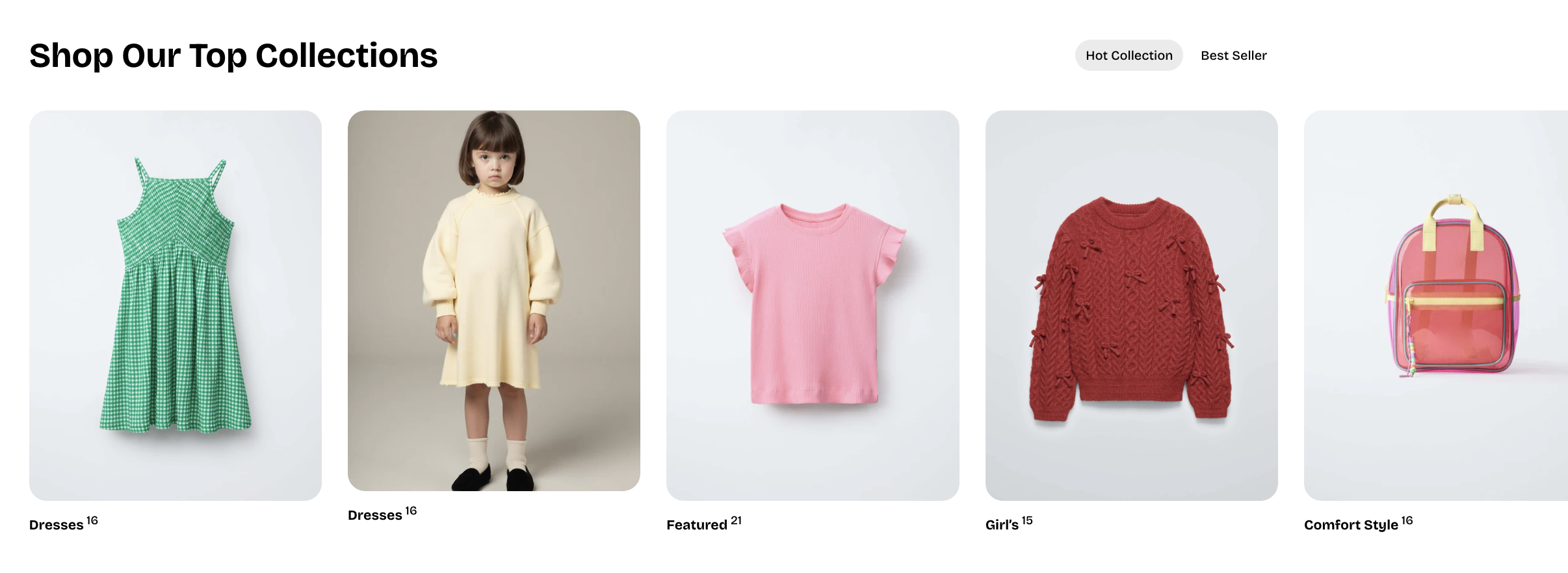
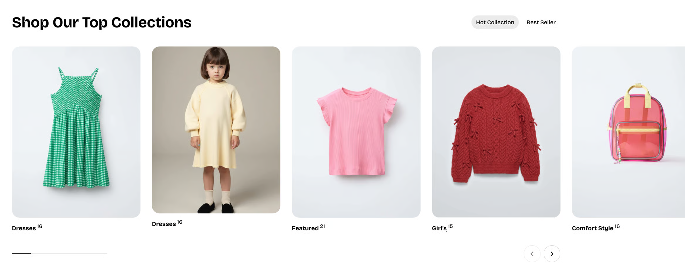
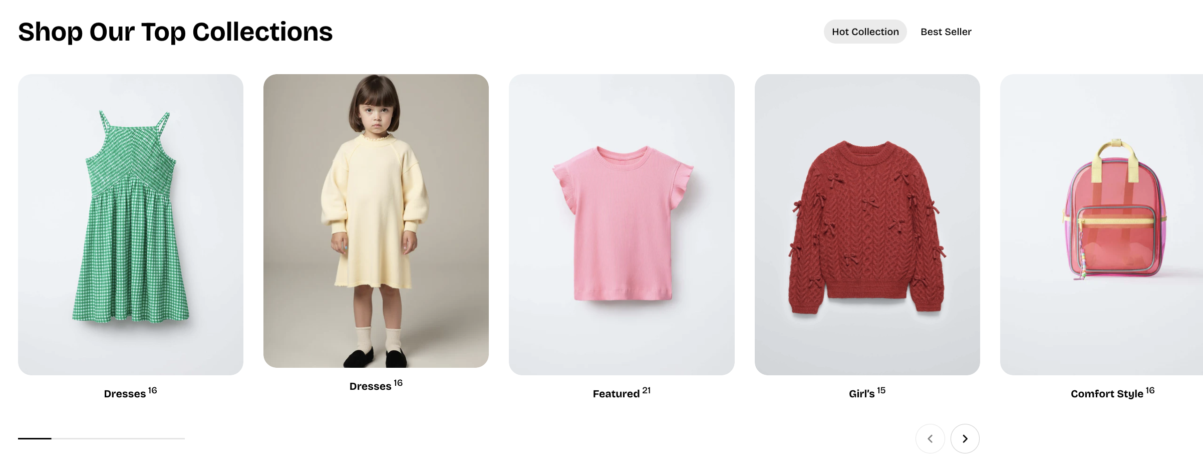
How to add a Collection tabs section to your Shopify store
- In the theme editor (Customize), click Add section.
- Select Collection tabs: Carousel/Collection tabs: Grid section.
- Make necessary changes.
- Save.
How to customize a Collection tabs section
_Cy1cobNt.jpg)
Section settings
- Container: Determines whether the section spans the full width of the page or stays within a fixed content width.
- Section header:
- Heading: The main title text displayed at the top of the section.
- Highlight style: Applies an optional animated highlight effect to any text wrapped in italics.
- Preset: Selects the text style for the heading
- Animation type: Determines how the heading appears on screen using visual entrance effects.
- Animation delay: Sets the delay (in milliseconds) before the heading animation begins.
- Layout:
- Type: Sets the layout style to either a grid or a carousel.
- Columns: Determines how many products appear per row in grid mode.
- Horizontal gap: Controls the spacing between products from left to right.
- Vertical gap: Controls the spacing between product rows from top to bottom.
- Control type: Selects the carousel navigation style, such as default arrows or a floating control (only available when using the carousel layout).
- Card settings:
- Alignment: Controls the horizontal alignment of the collection title.
- Show product count: Toggles whether the number of products in the collection is displayed.
- Mobile layout:
- Enable swipe on mobile: Allows horizontal swiping to navigate products on mobile.
- Mobile columns: Sets how many products appear per row on mobile devices.
- Horizontal gap (mobile): Controls left-to-right spacing between products on mobile.
- Vertical gap (mobile): Controls top-to-bottom spacing between product rows on mobile.
Block settings
Collections
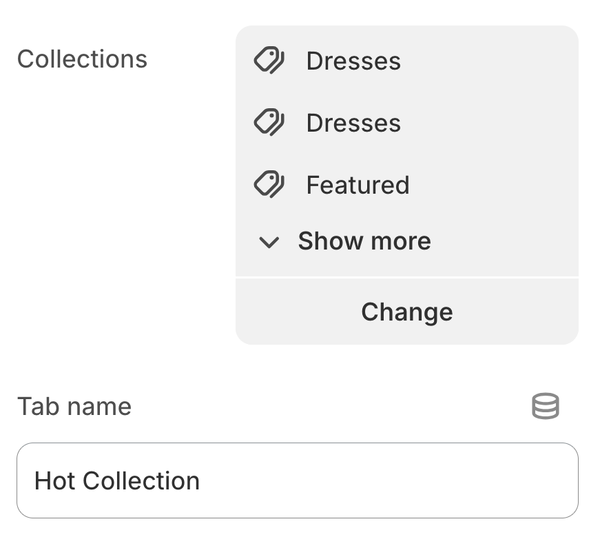
- Collection: Selects the product collections to display in this tab.
- Title: Allows you to set a custom tab title; leave it blank to use the collection’s default name.
Last updated